A wellness clinic is not somewhere you visit once. Guests come back monthly, they arrive early, and a drip takes an hour, so the plan is set by dwell time rather than by throughput. The daylight side of the floor plate is given entirely to waiting and recovery, the clinical rooms are pushed to the core, and every corner in between is turned rather than cut, so the whole route reads soft before it reads medical.
Project facts
Location — Chaengwattana, Bangkok
Typology — Wellness clinic and IV drip lounge
Scope — Interior design, bespoke joinery, FF&E
Area — 260 sq m
Lighting design — Lightenna
Completed — 2025
Client — BKK Wellness Club
Images — Gratitude Design
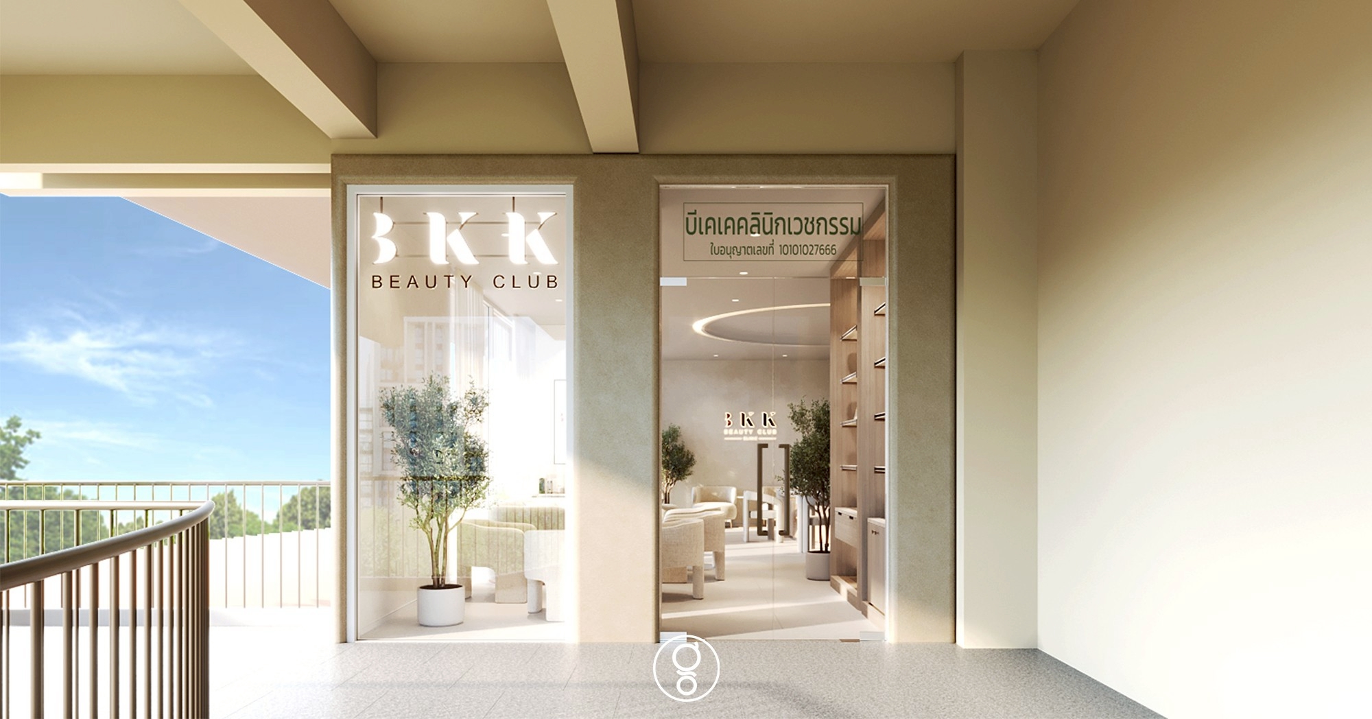
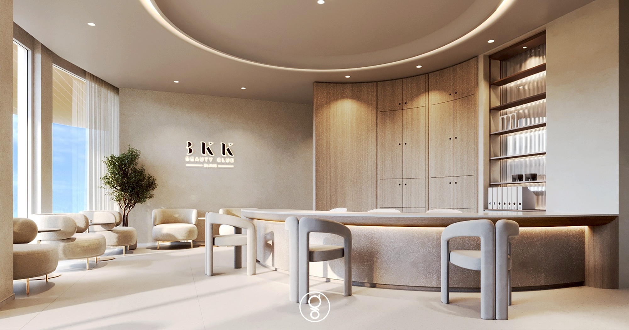
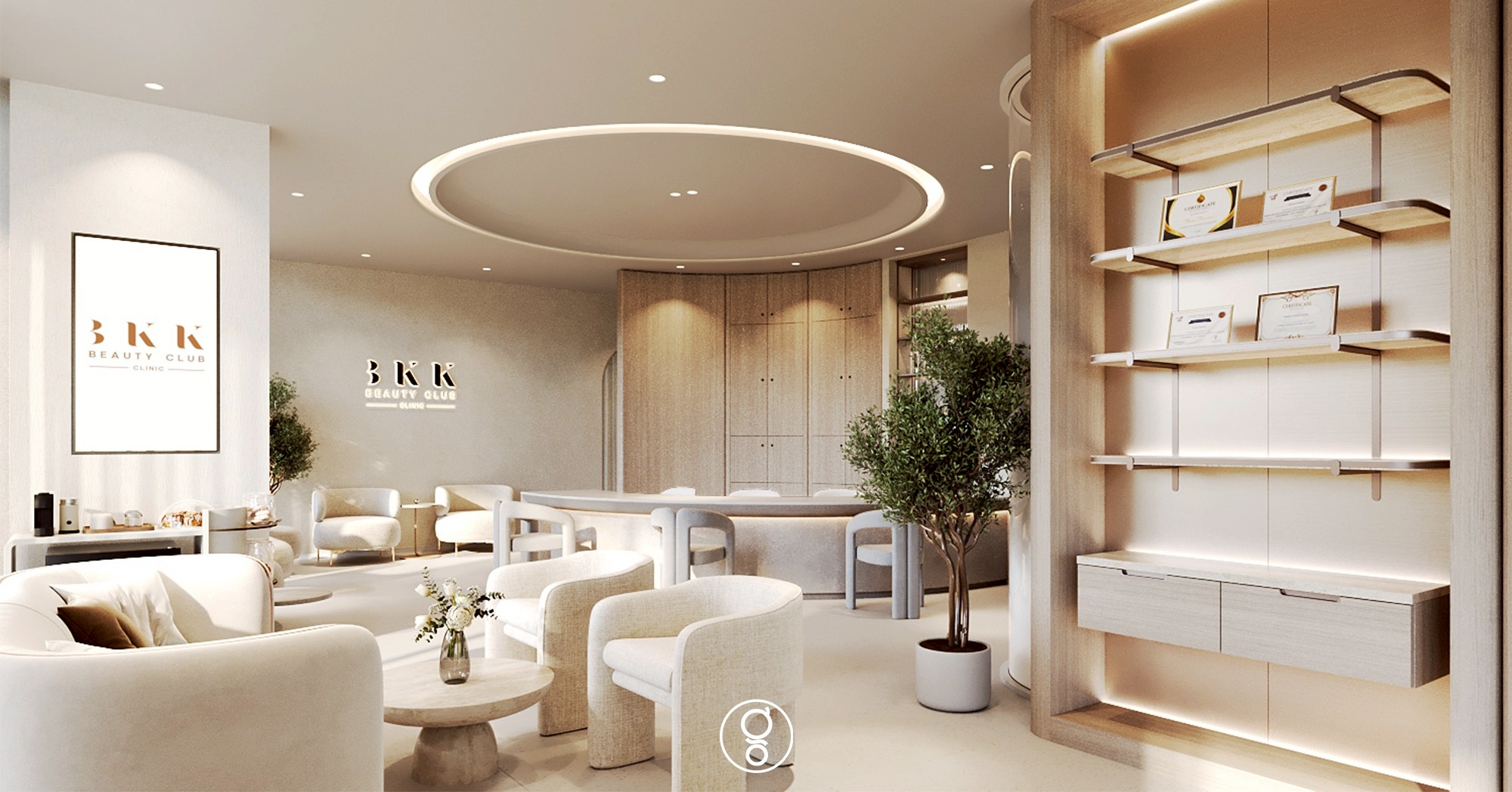
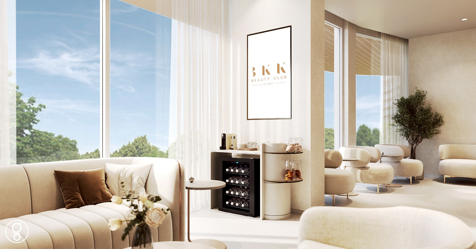
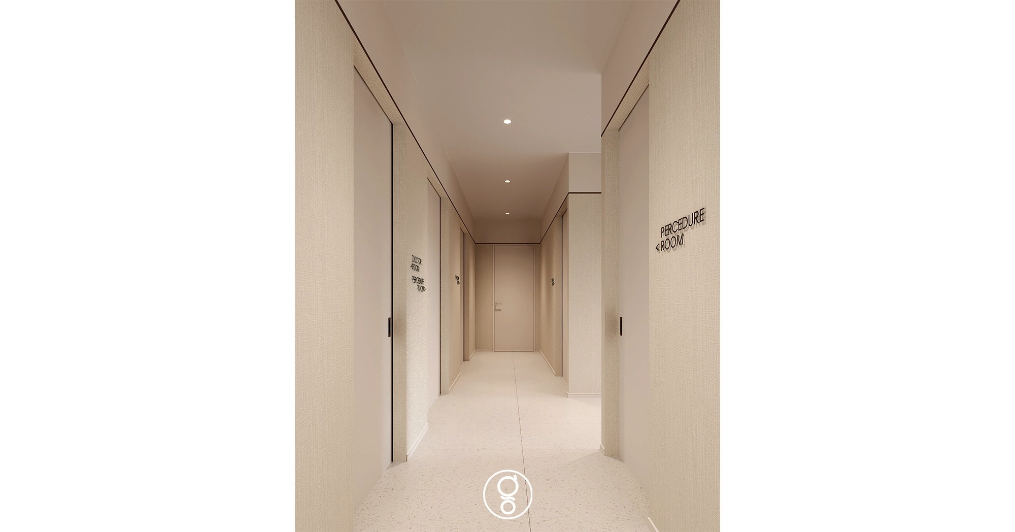
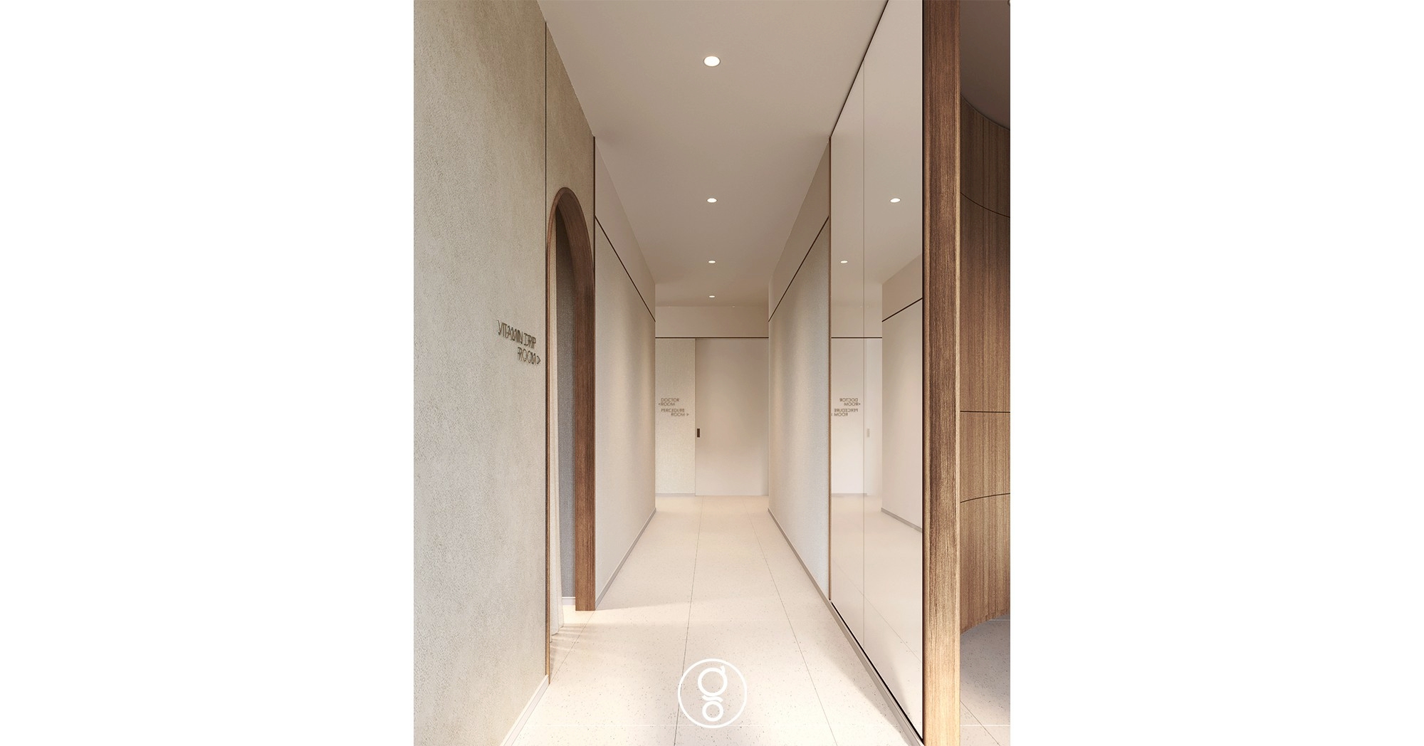
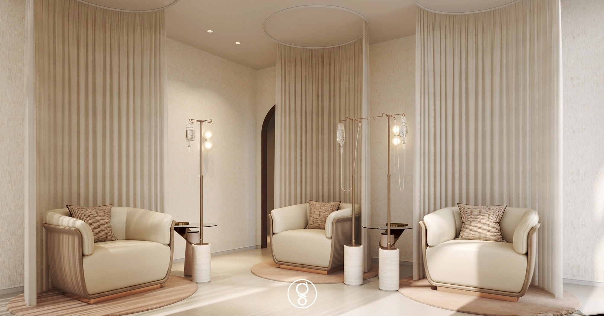
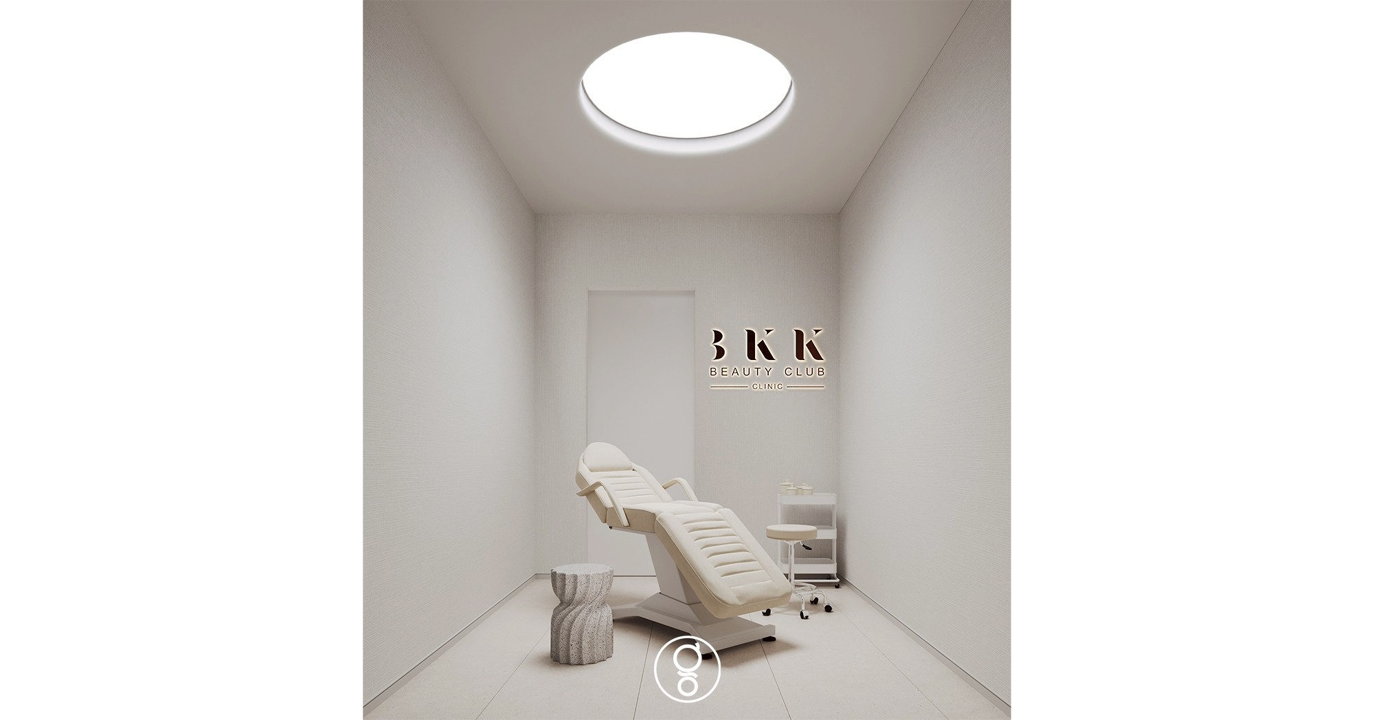
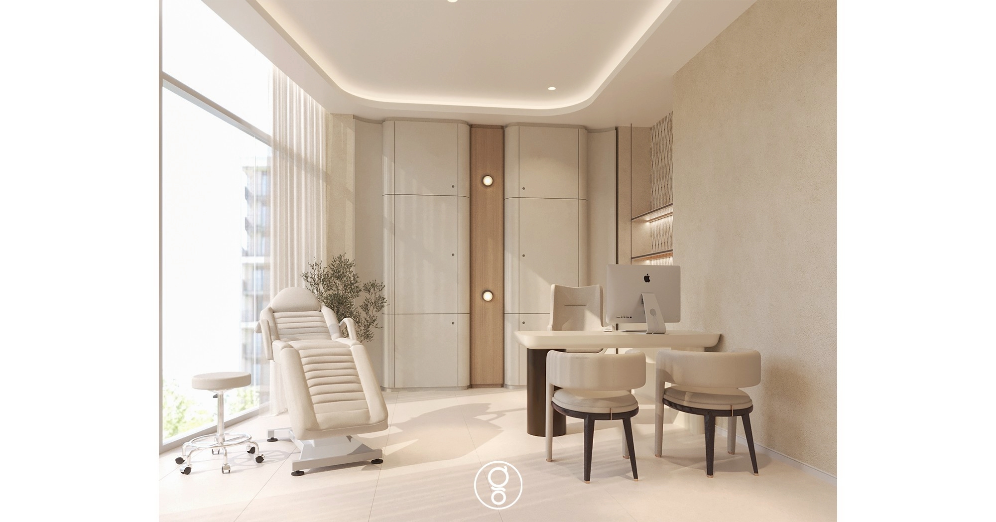
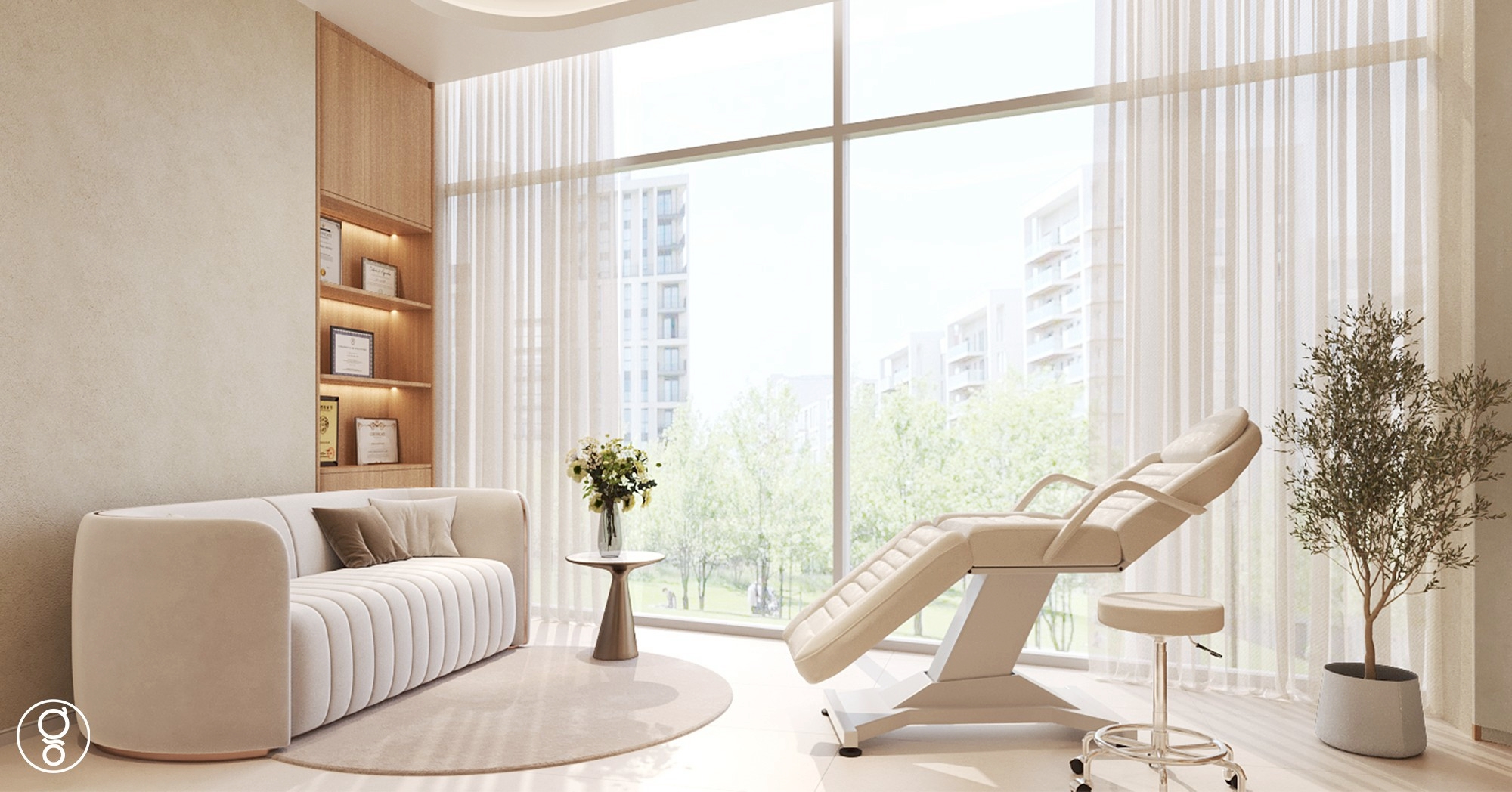
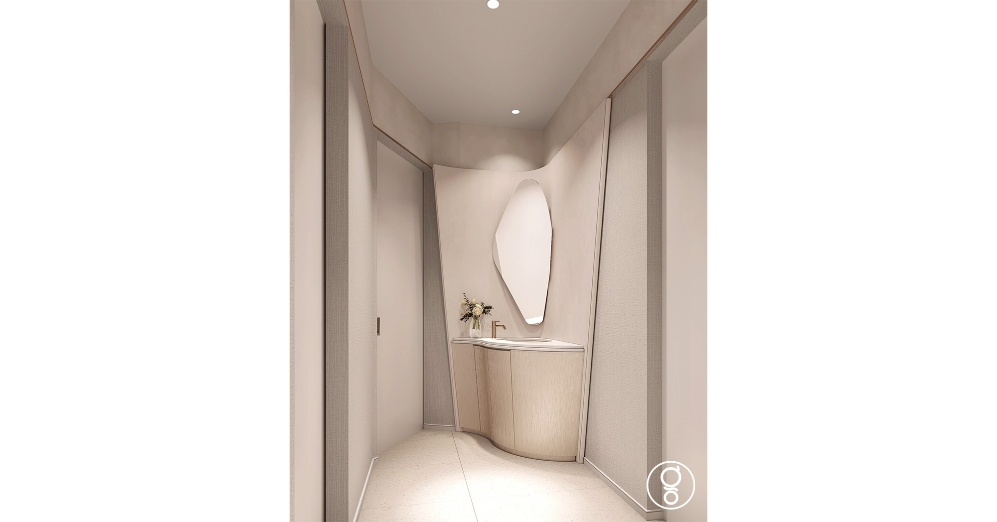
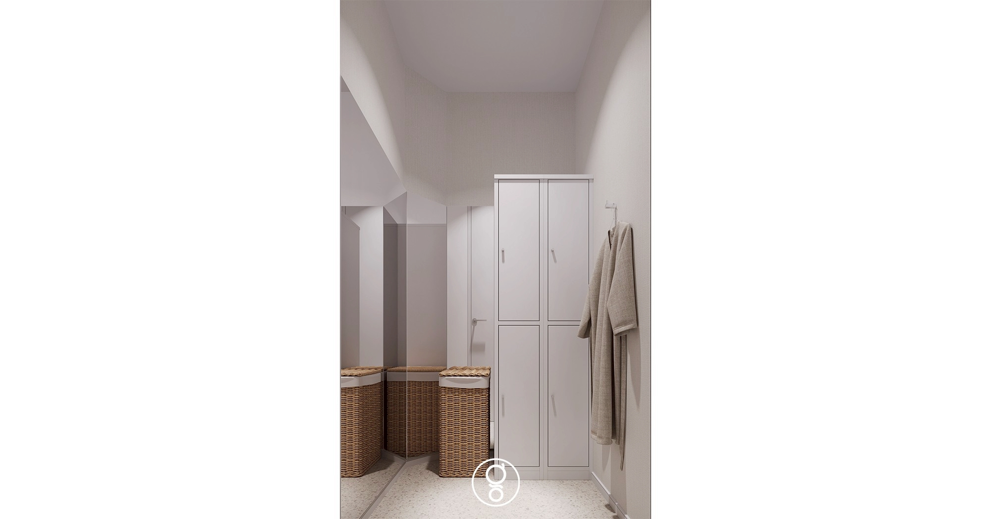
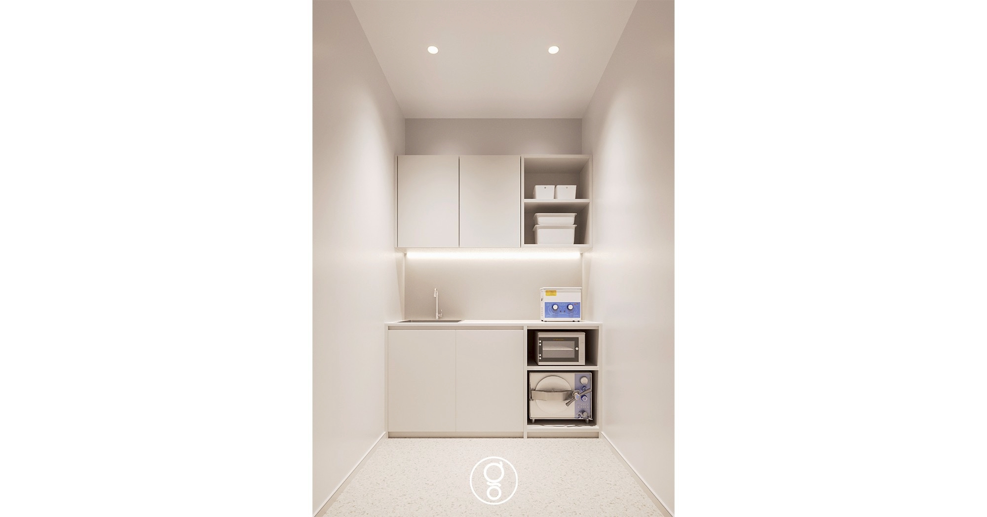
Frontage. The shopfront is kept as two tall panes of clear glass so the olive tree and the lounge do the advertising, and the illuminated logo is sized to be read from the far side of the atrium rather than from the door. The licence board sits on the second pane at eye height, where regulation requires it and where nobody has to look at it twice.Reception. The counter is drawn as one continuous curve so there is no corner for a queue to form against, and it is lit from beneath rather than above to keep glare off a guest’s face at the moment of arrival. Behind it, the timber wall carries all the storage the front of house needs, so the desktop can stay empty.Reception and display. A single illuminated ring holds the centre of the plan and does the work a dropped ceiling grid would otherwise do, keeping the ceiling quiet across the whole open area. Certificates are given a lit shelf near the entry, because in a clinic that is the first thing a new guest looks for and the last thing anyone wants to hunt for.Lounge. The lounge is pushed hard to the glass and given a coffee station within reach of the seats, so a wait that may run past the appointment time is spent in daylight with something to do. Seating is loose and low-backed rather than ranked, which lets a guest sit alone without sitting in a row.Corridor. The corridor is finished in the same warm plaster as the lounge, so the change from public to clinical is not announced by a change of material. Room names are set small and flush to the wall: legible at walking pace, invisible from the lounge.Corridor to the drip lounge. Mirrored joinery is used on one side of the tight corridor to give the return the width it does not physically have, and to carry borrowed light deeper into the plan. The arch marks the drip lounge, the only door on the route that guests open for themselves.Vitamin drip lounge. Rather than one open ward, the room is divided into curtained alcoves with a curved back to each, so three guests can sit for an hour without facing one another. The drip stands are specified with an integrated light, which removes the need for a downlight overhead and lets each bay be dimmed on its own.Treatment room. The ceiling is a single back-lit disc directly above the chair, because that is the one surface a guest looks at for the length of the procedure and a spotlight is the one thing they should not have to look into. Everything else in the room is left flat and pale so the practitioner reads skin tone accurately.Doctor’s room. The chair is set at the window and the desk turned away from the door, so an examination happens in daylight and a conversation cannot be followed from the corridor. Storage runs full height in curved cabinetry, which keeps consumables in the room and out of sight.Consultation room. This room is given the best view on the floor plate on purpose: a first consultation is a conversation, not a procedure, and a sofa and a park do more for it than a desk would. The certificate niche is lit from within so it registers without the room needing a feature wall.Consulting room. The smallest consulting room is turned to face away from the door and lit only by a wall wash and a single niche, which makes a tight footprint feel deliberate rather than left over. The desk is slim and open beneath, putting doctor and guest on the same side of the furniture.Powder room. The vanity follows the curve of the wall it sits against, so a leftover pocket of plan becomes the moment a guest sees themselves after a treatment. The mirror is cut as a soft organic shape rather than a rectangle, and lit from the ceiling in front rather than from behind.Changing room. A full-height mirror on the return doubles the apparent width of a room that is only as wide as a robe and a locker. Laundry is taken in woven baskets rather than bins, because the guest sees this room and housekeeping uses it.Sterilisation room. The prep room is planned as one continuous run — sink, clean counter, ultrasonic bath, autoclave — so instruments move in a single direction and never cross back. Under-cabinet light is continuous rather than spotted, which is what makes a dirty instrument visible.Meeting room. The staff meeting room is given the second window on the floor plate rather than an internal box, because it doubles as the room where suppliers and new practitioners are received. A bronze panel and a screen sit at the head of the table so the brand is present without the room becoming a showroom.
Wellness clinic interior design in Bangkok
Wellness clinic interior design in Bangkok sits between two briefs that rarely agree. The licensing requirements are fixed — minimum room dimensions, basin positions, clear door widths, wipeable finishes — while the commercial brief asks for something closer to a members’ club. The work is in satisfying the first so completely that a guest never has cause to notice it.
Dwell time is the planning tool that separates a wellness clinic from a treatment clinic. An injectable appointment is twenty minutes; an IV drip is an hour, and guests often book them together. That single fact decides where the daylight goes, how many seats the lounge needs, whether recovery happens in the treatment room or somewhere else, and how much back of house you can afford to give away.
Privacy is a matter of sightlines, not doors. Where the entrance sits, whether the lounge faces the corridor, and how far a guest walks between reception and a treatment room shape how a clinic feels far more than the colour of the walls does. We set the route first and decorate afterwards.
Light is the technical heart of the building, and it is worth a specialist. A practitioner assessing skin needs neutral, high colour rendering light with no cast in it; a guest looking in the mirror afterwards wants light that is kind; a drip lounge needs to go dim without going dark. Those are three different fittings on three different circuits. The lighting design here was developed with Lightenna, and separating those layers properly is the most common thing we are asked to correct in existing clinics.
Materials do quiet work. Surfaces near basins and trolleys are wiped with alcohol several times a day, so warmth is carried by plaster, lacquered joinery and terrazzo rather than by fabric, and floors are large format with as few joints as the setting out allows. Timber and bronze are kept to the guest route, where hands and solvents do not reach.
The commercial reality belongs in the brief from the start. A wellness clinic lives on treatment room utilisation, so the plan has to hold as many compliant rooms as the floor plate allows without making the front of house feel thin. Consumable storage, a clean route for laundry, sterilisation and somewhere for staff to eat are resolved at the same time as the reception, because those are what keep a clinic running on an ordinary Tuesday.
Planning a clinic, wellness club or spa? Talk to Gratitude Design about your floor plate, your licensing requirements and your opening date.
Related work
More clinic and wellness interior design from the studio: MEGA Clinic – G Tower. The full record is on the portfolio, and the studio’s approach is set out under clinic and wellness interior design.