
Ironfit

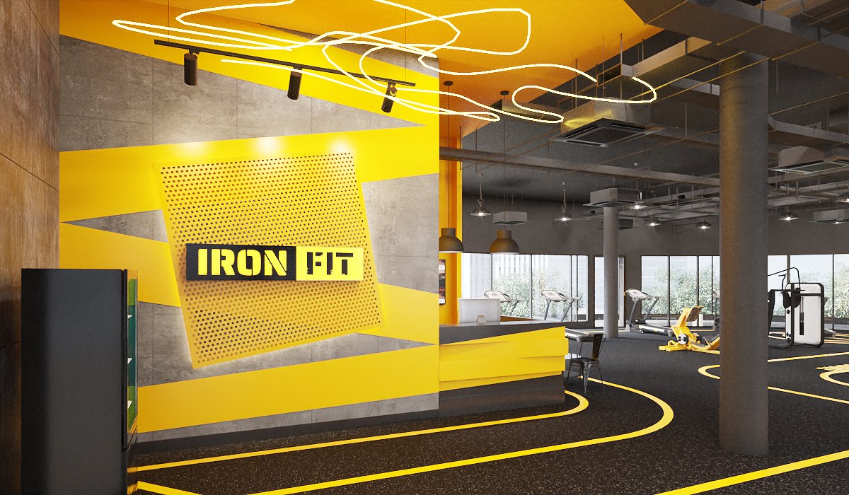
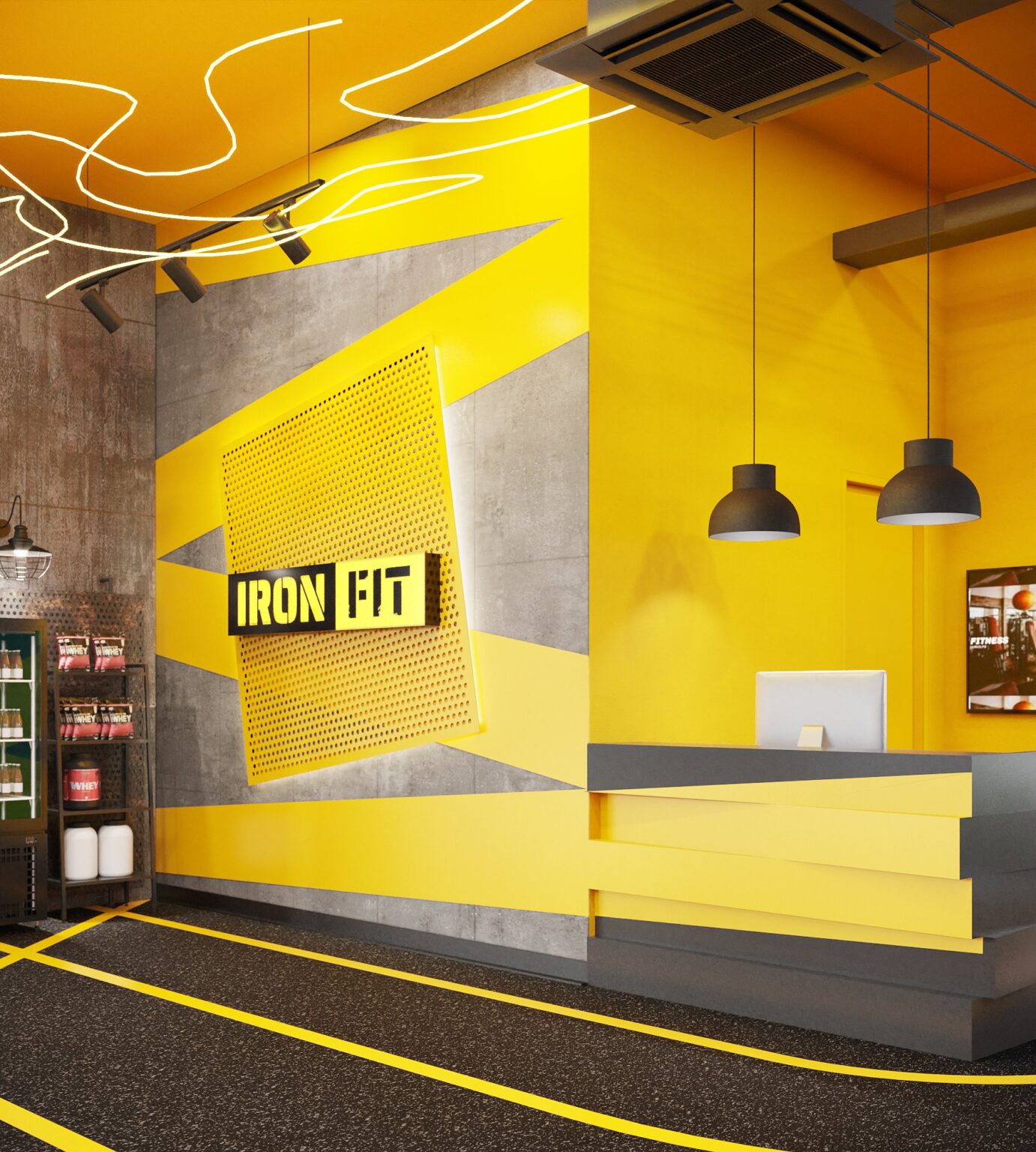
Ironfit gym reception — perforated yellow feature panel with IRON FIT logo on raw concrete, neon route across the ceiling and yellow lane lines on the floor, interior design by Gratitude Design

Ironfit interior design — a 230 sq m fitness club in Bangkok, planned, detailed and specified by Gratitude Design around a single idea: the gym as a competition track.

A gym is usually designed to look strong. Ironfit is designed to feel fast. The brief from Iron Fit asked for an energetic, competitive room for a club whose trainers coach both the workout and the plate — a place where members arrive with intent and leave having beaten yesterday. The answer is a track-and-field vocabulary carried across the whole floor: yellow lane lines painted over black rubber, hazard-stripe details, stencil lettering, and a neon route drawn across the ceiling like a running line. Raw concrete and exposed services keep the shell honest; the yellow does the coaching.


Project facts

  • Location — Bangkok, Thailand
  • Typology — Fitness club with personal training and nutrition coaching
  • Scope — Interior design and FF&E
  • Area — 230 sq m
  • Completed — 2022
  • Client — Ironfit
  • Images — Gratitude Design
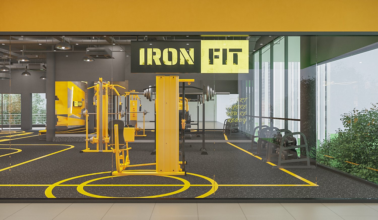
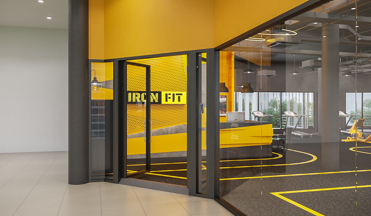
Ironfit gym Bangkok shopfront — full-height glazing with IRON FIT stencil signage, yellow lane markings on black rubber flooring and yellow training machines, interior design by Gratitude Design
From the mall corridor the club reads as one graphic: a yellow fascia, the stencil IRON FIT mark, and lane lines that run straight through the glass so the track appears to start at the passer-by’s feet.
Ironfit gym entrance — charcoal steel-framed glass doors under a yellow fascia, reception wall and running track visible beyond, interior design by Gratitude Design
Charcoal steel frames the entrance; the yellow fascia carries over the door so the threshold is the first line crossed. The reception wall is visible from the corridor, deliberately.
Ironfit reception wall close-up — backlit perforated yellow panel, stencil logo, black pendant lights and stepped yellow reception counter, interior design by Gratitude Design
The reception wall is the brand in one panel — a perforated yellow plate, backlit and tilted off the concrete, with the logo cut through it. Neon routes across the ceiling above like the trace of a run.
Ironfit reception desk — stepped charcoal and yellow counter, yellow feature wall with screen, supplement display and café seating, interior design by Gratitude Design
The counter steps in charcoal and yellow, low enough to talk across. A screen runs class schedules; the supplement shelf sits by the entrance where the trainers can advise on the way out.
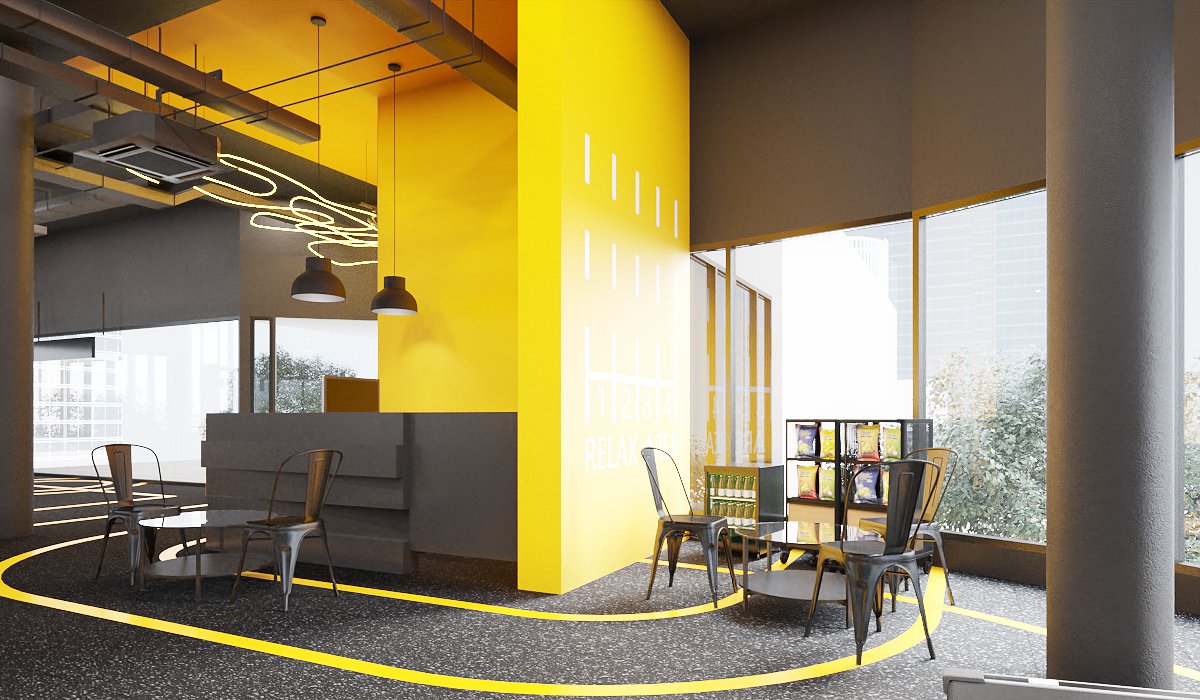
Ironfit relax area — yellow blade wall with graphic scoreboard, metal café chairs, snack display and full-height windows, interior design by Gratitude Design
The relax area is where the nutrition conversation happens: a blade wall carrying a graphic scoreboard, metal café chairs, a snack display, and the window. Lane lines loop round it so it stays part of the track.
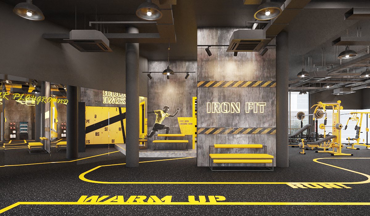
Ironfit warm-up zone — WARM UP and RUN lettering painted on the floor, concrete feature wall with neon IRON FIT sign and yellow benches, interior design by Gratitude Design
WARM UP and RUN are painted on the floor, not on the wall — the room explains itself underfoot. Yellow benches face a concrete pier with the neon mark and hazard stripes.
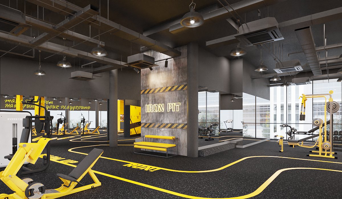
Ironfit training floor — yellow strength machines on black rubber flooring, exposed services ceiling, mirrored walls and hazard-stripe concrete wall, interior design by Gratitude Design
The main training floor: yellow strength machines on black rubber under an exposed-services ceiling, mirrors on two sides so the room doubles, and the lane lines threading between the stations.
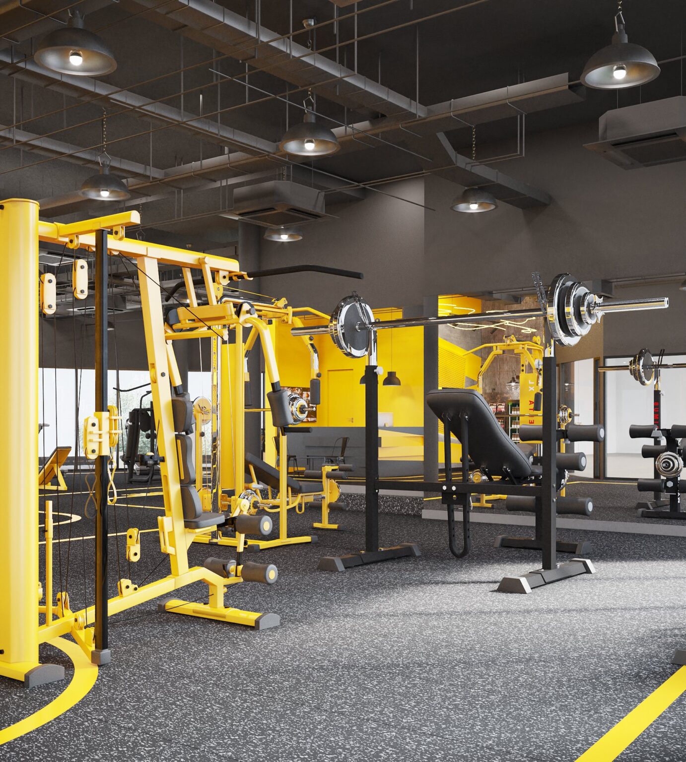
Ironfit free-weights area — yellow cable crossover machine, squat rack and benches under industrial pendant lights, interior design by Gratitude Design
Free weights sit at the back under industrial pendants — cable crossover, squat rack and benches — with the equipment itself specified in the brand yellow so nothing needs a sign.
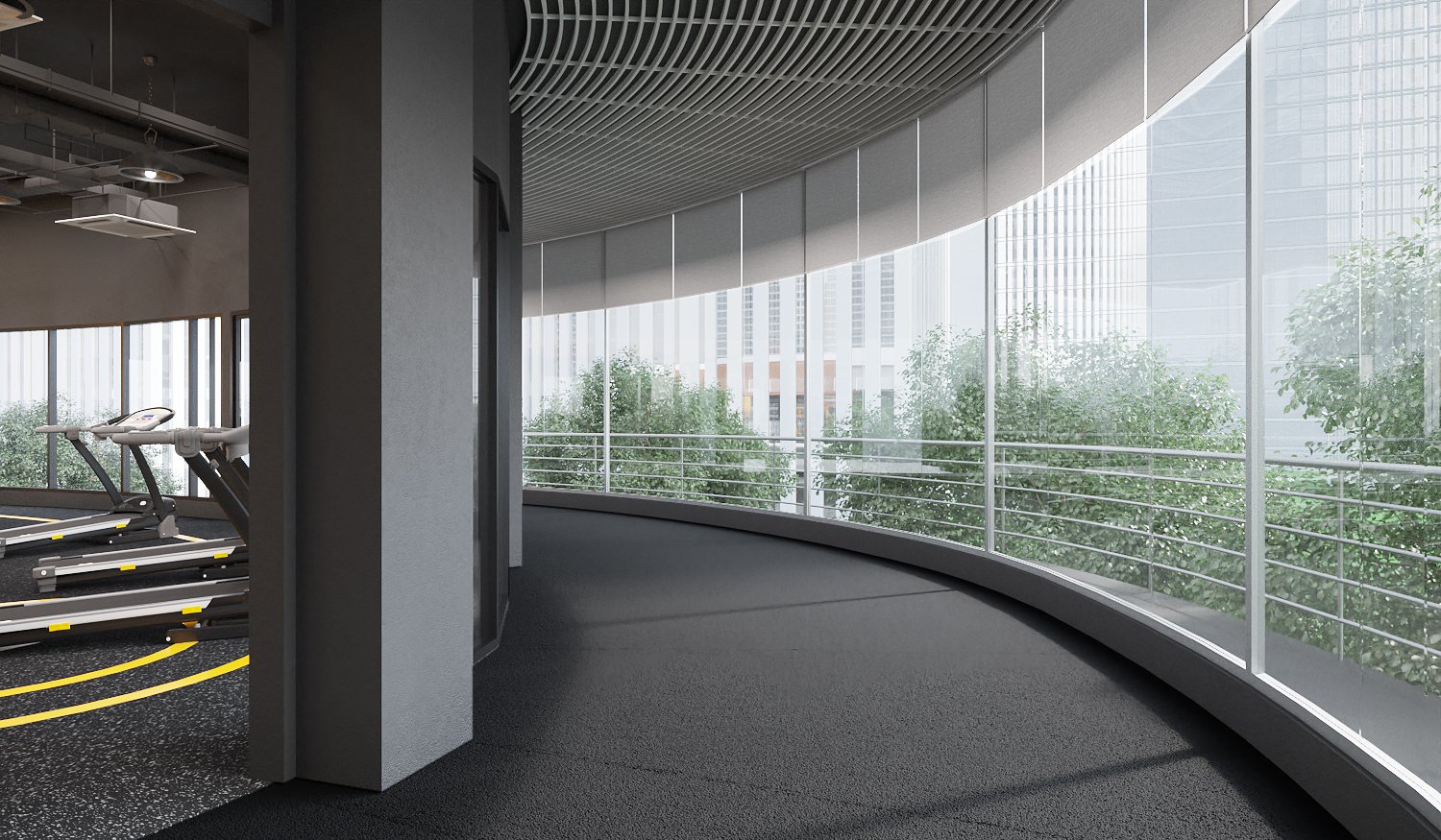
Ironfit indoor running track — curved lane along a full-height glazed façade with treadmills and city views, interior design by Gratitude Design
A curved indoor running lane follows the glazed façade, with treadmills alongside and the city as the backdrop. It is the one quiet stretch of the plan, and the reward for the rest.
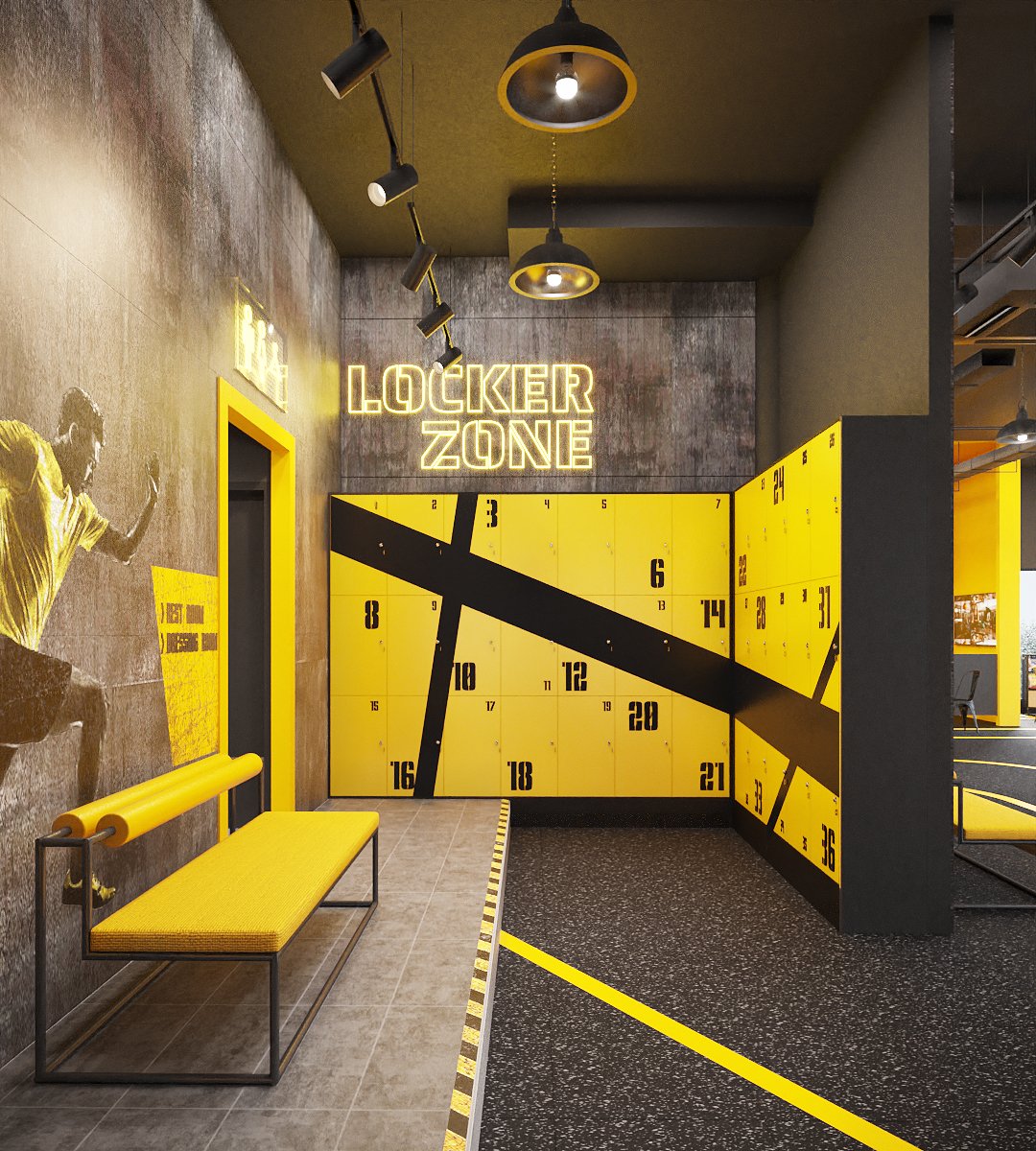
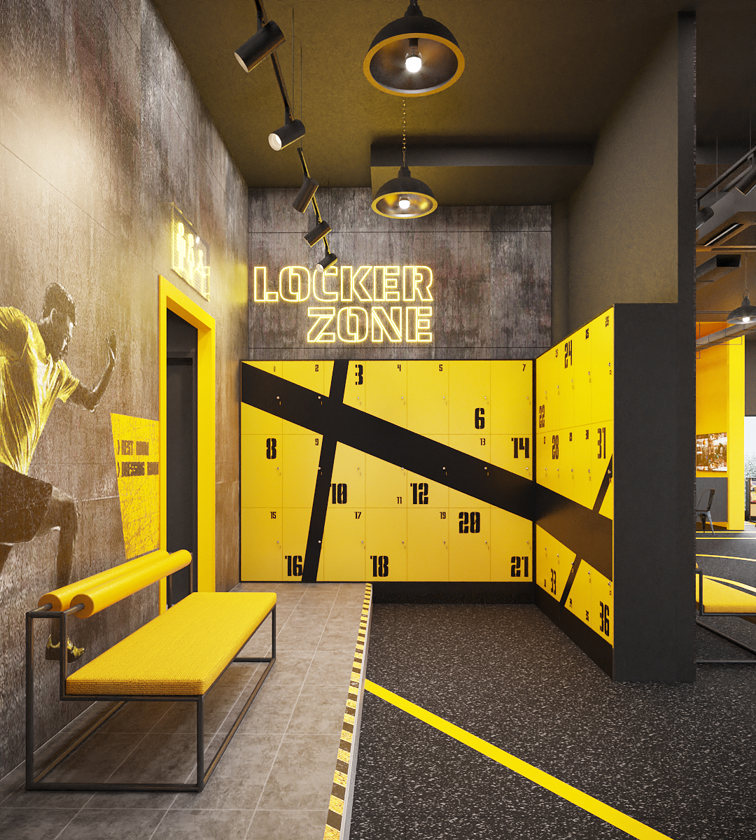
Ironfit locker zone — yellow lockers with black diagonal stripe, neon LOCKER ZONE sign, runner mural on concrete wall and yellow bench, interior design by Gratitude Design
The locker zone continues the graphic at full volume: yellow lockers crossed by a black diagonal stripe, a neon LOCKER ZONE sign, a runner mural on the concrete, and a bench upholstered like a hurdle.
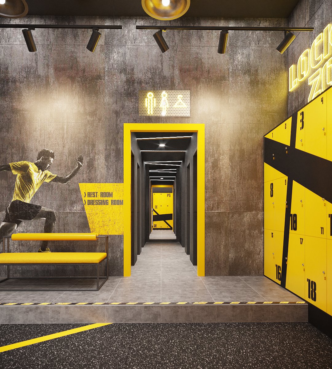
Ironfit locker zone entry — yellow-framed doorway to the changing corridor, restroom pictogram sign, runner mural and yellow bench, interior design by Gratitude Design
A yellow-framed opening leads to the changing corridor. The pictogram sign is cut from the same perforated plate as the reception wall — one family of details from front to back.
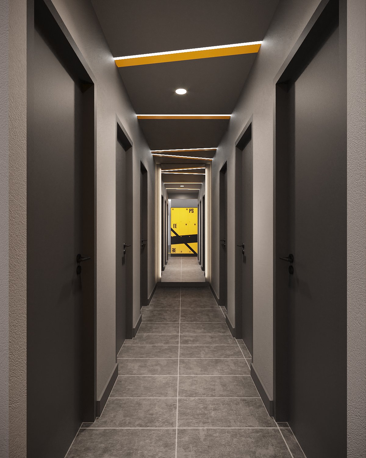
Ironfit changing corridor — charcoal doors with angled yellow light slots in the ceiling leading to the locker wall, interior design by Gratitude Design
The changing corridor drops to charcoal, with angled yellow light slots in the ceiling that keep the direction of travel. The locker wall closes the view.
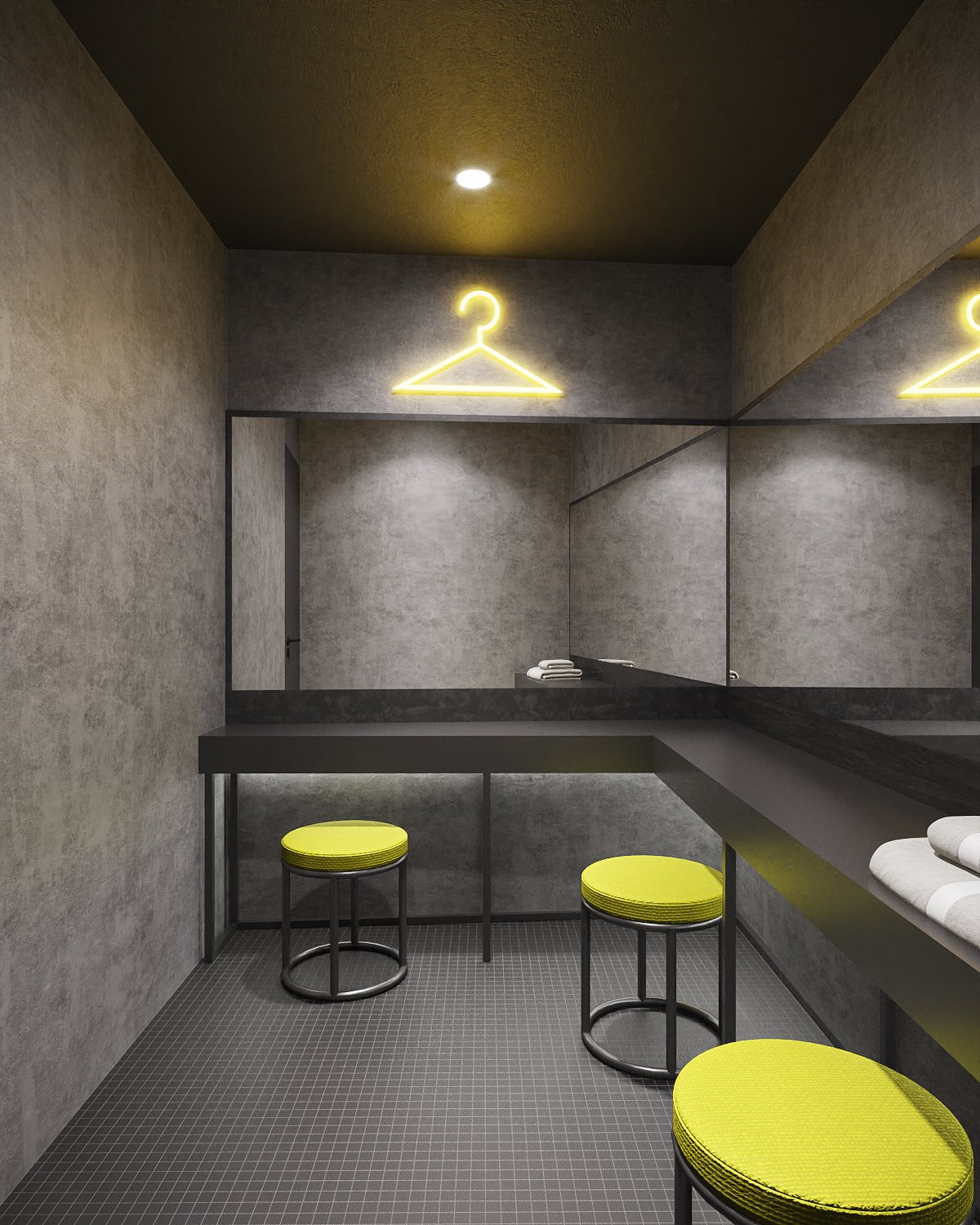
Ironfit dressing room — concrete-look walls, black vanity counter with mirrors, neon coat-hanger sign and lime stools, interior design by Gratitude Design
The dressing room is the only soft-lit room: concrete-look walls, a black vanity with mirrors, a neon coat-hanger and lime stools — a quiet minute at the end of the session.
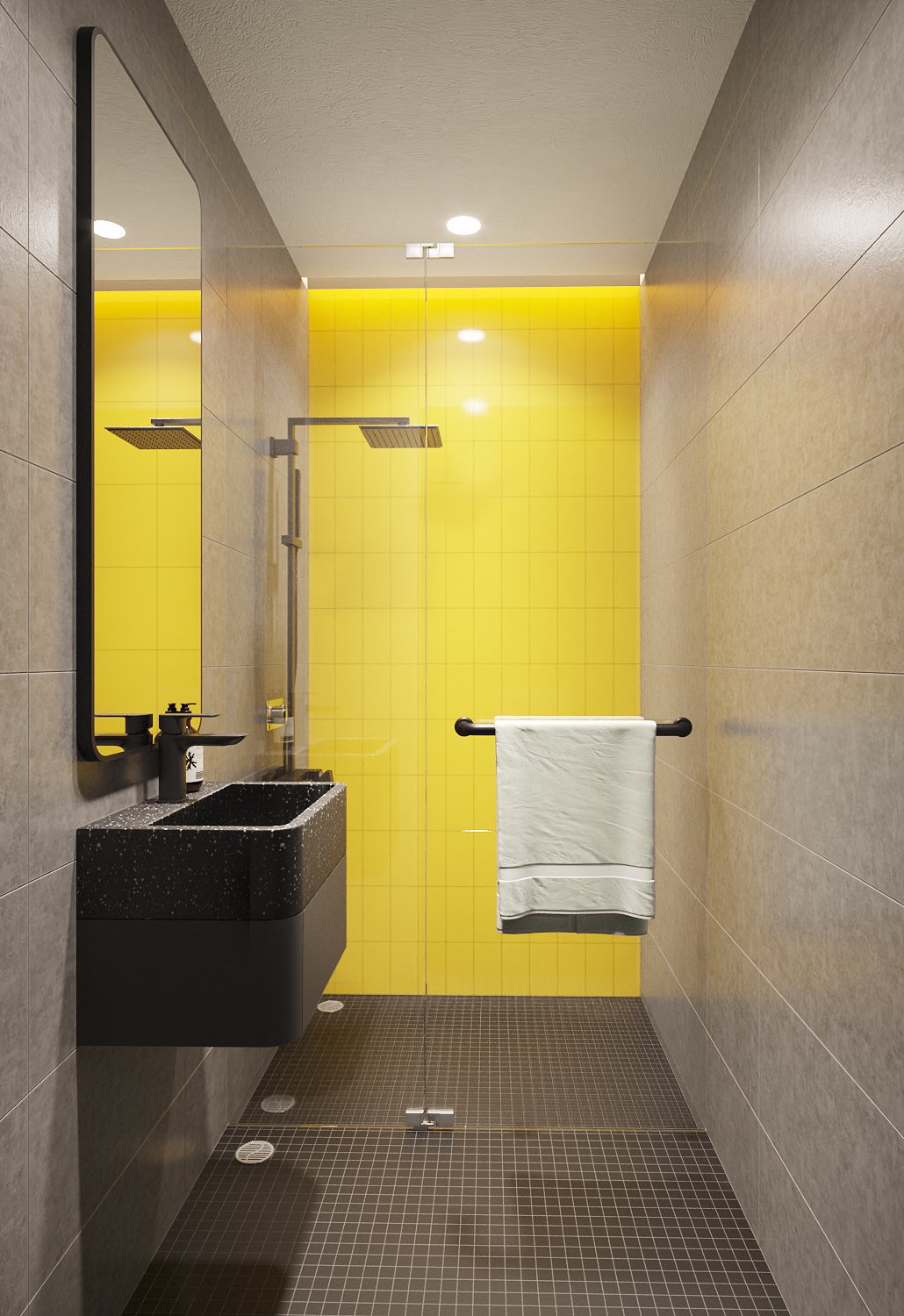
Ironfit shower room — glossy yellow tiled wall, black terrazzo basin, matte black fittings and grey mosaic floor, interior design by Gratitude Design
Showers in glossy yellow tile against grey — the brand colour used one last time, at the scale of a single wall, with a black terrazzo basin and matte black fittings.

Designing a gym that competes

Most gym interiors sell strength: dark rooms, heavy materials, the vocabulary of the iron. Ironfit interior design sells pace instead. The plan is sequenced like a course — shopfront, threshold, reception, warm-up, training floor, free weights, running lane, locker zone — and the floor graphics name each zone so a member moves through the club without a single directional sign. Yellow is rationed to what matters: the line underfoot, the machine in hand, the wall that carries the name. Everything else stays grey, so the eye always finds the next mark.

Gratitude Design carried the Ironfit interior design from concept through design development to full documentation — interior architecture, floor graphics, signage, bespoke joinery and complete FF&E specification — issued for construction by the owner’s contractor.


Planning a residence, hotel or restaurant interior in Bangkok? Talk to Gratitude Design about your project.


Commissioning Ironfit interior design

A fitness club in a commercial building is a fast, unforgiving fit-out: rubber flooring over a level screed, mirrors and machines that fix the plan early, and services — ventilation, lighting, power to every station — that have to be coordinated before a single wall is painted. The branding is not applied afterwards; it is drawn into the floor plan from the first sketch.

The scope on this club was interior design and FF&E — floor graphics, signage, joinery, lighting and loose furniture drawn and scheduled, with the training equipment specified in the brand colour so the machines become part of the interior rather than a purchase made after it. For an operator that means a fixed picture before fit-out starts: what 230 sq m will look like, what it will cost, and how many weeks the unit will be closed.

If you are opening a gym, studio or wellness club in Bangkok and want to understand what Ironfit interior design involved in practice — programme, cost frame and how to coordinate equipment suppliers with the contractor — talk to the studio. A first conversation costs nothing and commits no one.


Related work

More wellness interior design from the studio: BKK Wellness Club Chaengwattana and Fleur de Lys K Village. The full record is on the portfolio, and the studio’s wellness projects are collected under wellness interior design.

ไทย