
Retail and workplace interior design for a Thai footwear brand, planned so the head office and the flagship store could share one 600 sq m building without either one pretending the other is not there.
Most fashion brands keep the shop and the office in different postcodes, and the distance shows in the product. Here they were put in the same building: a flagship on the street and the studio that draws it directly behind. The brief was concrete, city and runway — a raw grey shell treated the way a street is treated, with one lit path cut through it. Downstairs that path is a mirror-polished plinth running the length of the floor under a ring of hammered steel. Upstairs the same logic is drawn in black steel and glass, so the studio reads as one continuous workroom rather than a corridor of closed doors. Nothing is finished twice. Concrete, stone-effect panel, brushed stainless and black steel do all the work, and the product is the only colour in the building.
Project facts
- Location — Bangkok
- Typology — Head office and flagship store, standalone building
- Scope — Interior design, FF&E
- Area — 600 sq m
- Completed — 2019
- Client — SHU
- Contractor — King Big Wood
- Images — Panoramic Studio
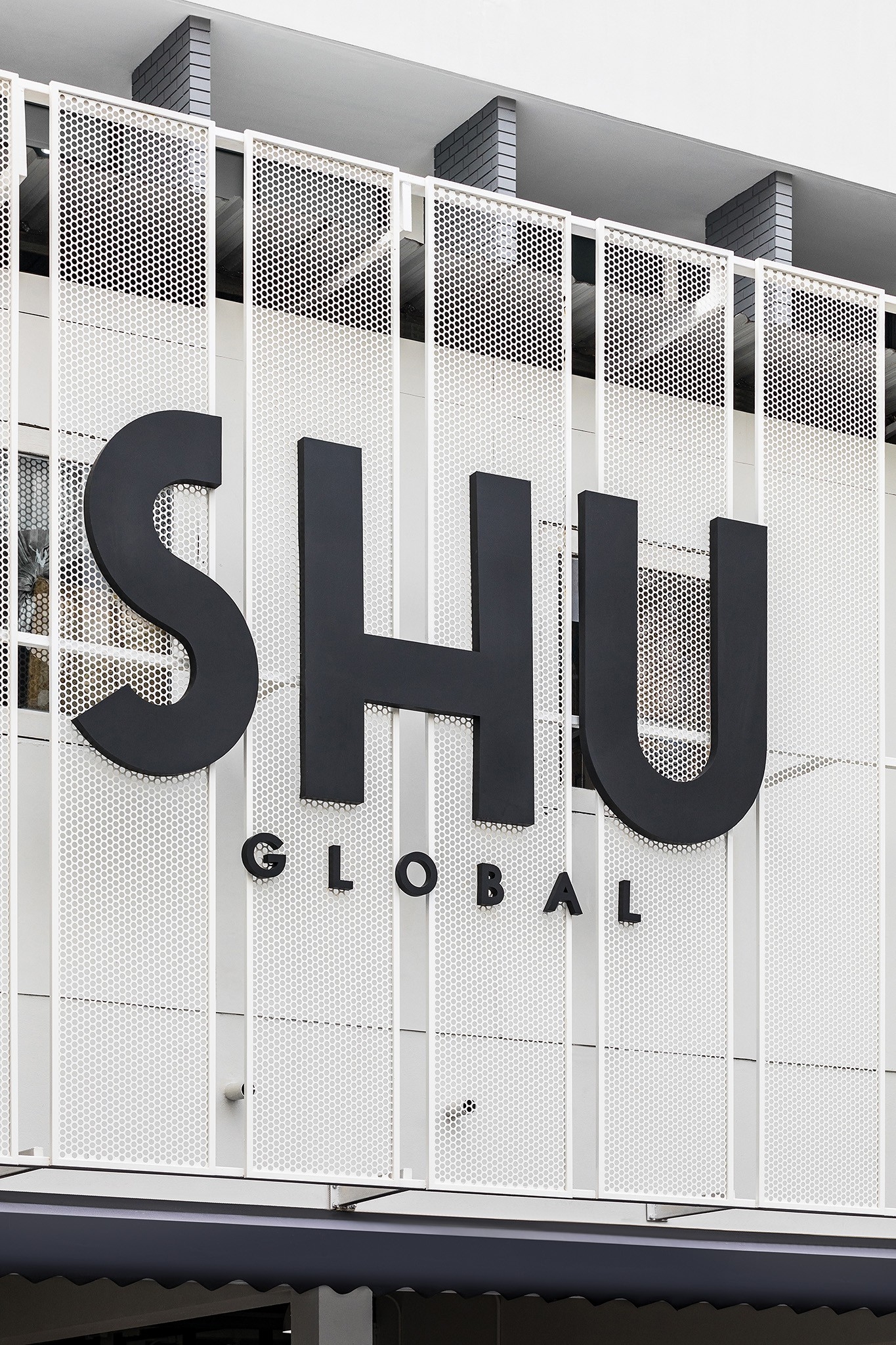
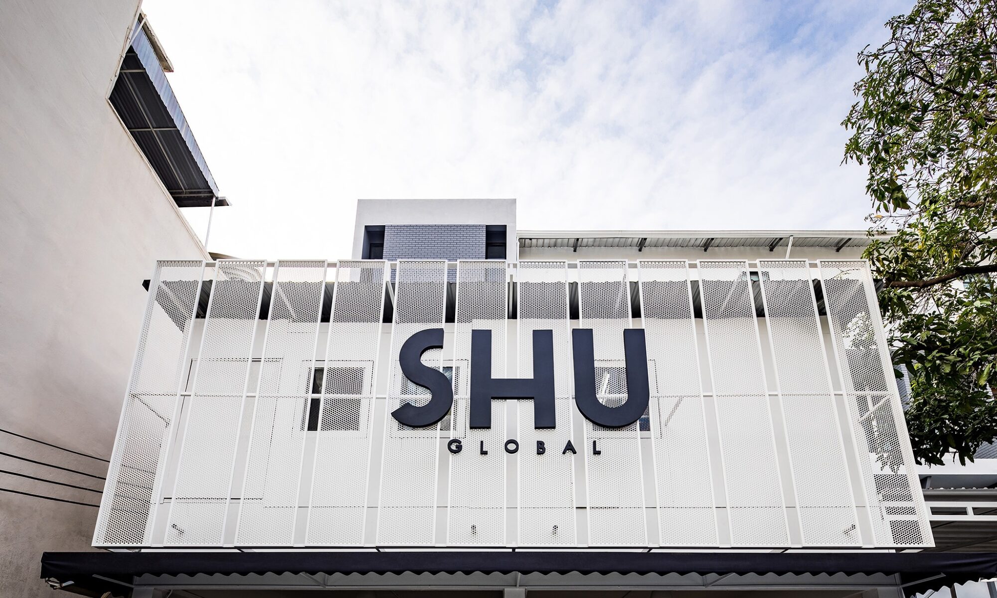
The screen is a single plane of perforated white metal with the mark standing proud of it. It shades the office glazing behind, hides the plant on the roof, and gives the building one identifiable elevation from the road — the thing a brand loses the moment it trades inside a shopping centre.
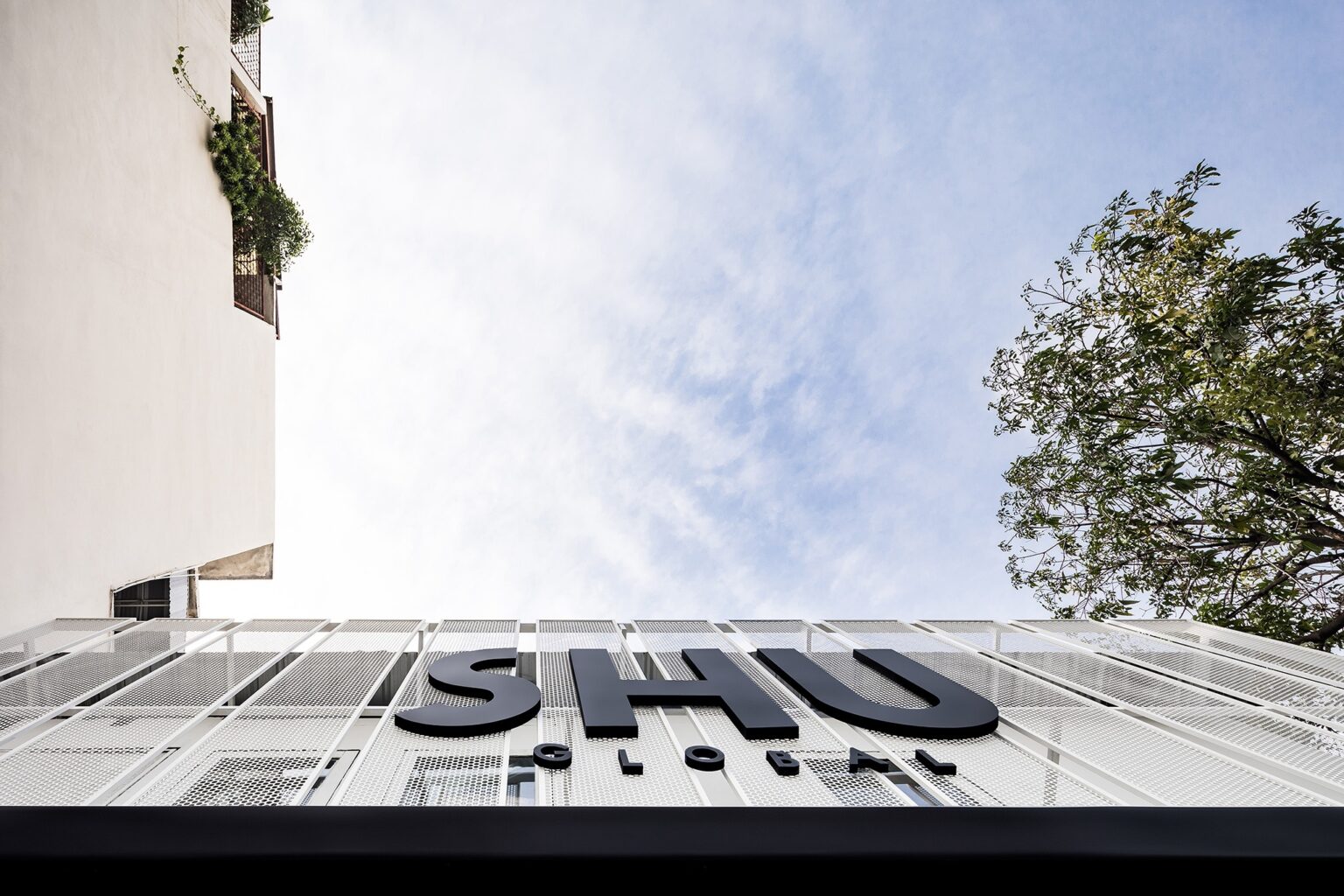
Seen from below the perforations close up and the building reads as a solid white mass. From inside it is almost transparent. One skin doing both jobs is what allowed a single gesture to carry the whole elevation.
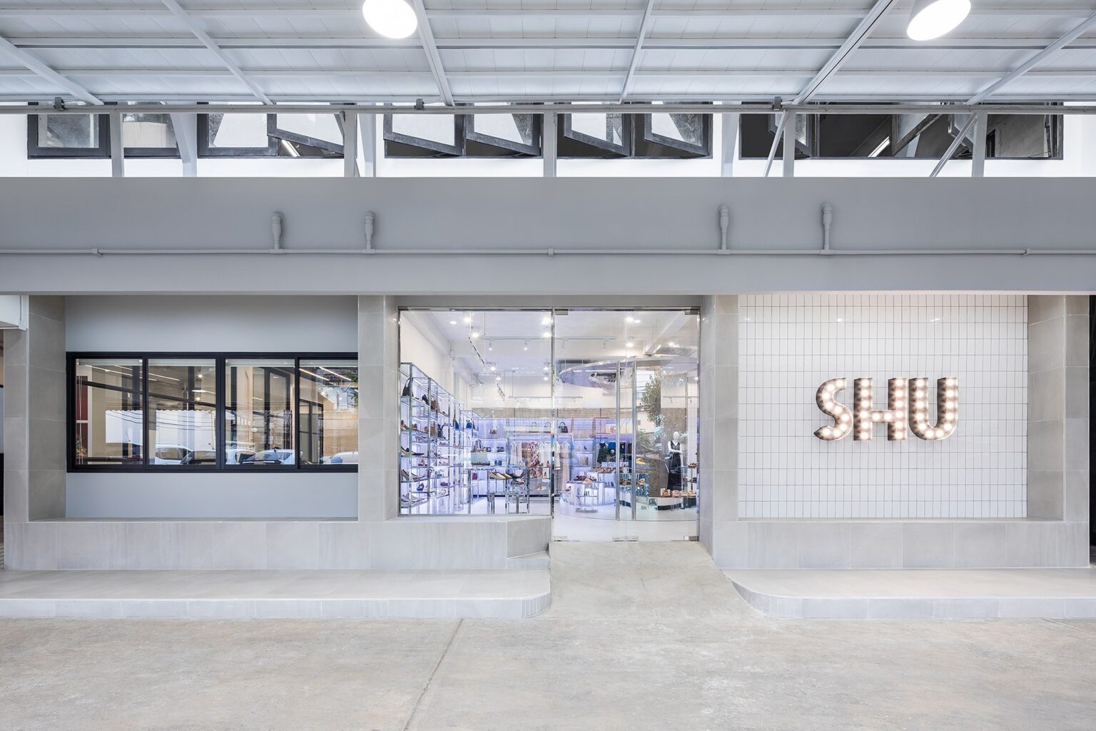
At street level the shopfront is left as grey board-formed concrete with one glazed opening and a bulb-lit sign on white tile. The concrete is not a backdrop for the brand, it is the reason the brand reads: everything behind the glass is white and lit, and the frame around it is not.
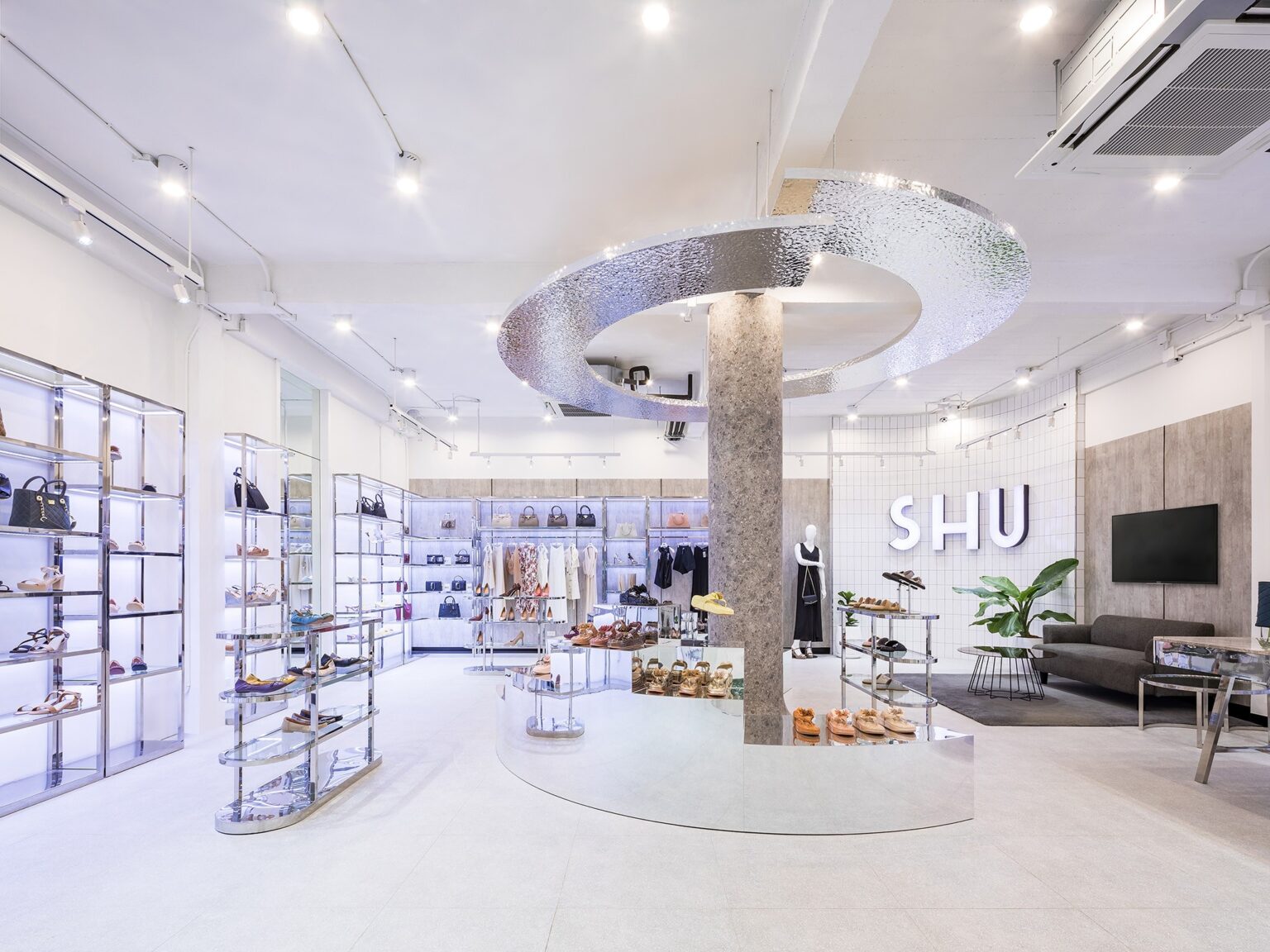
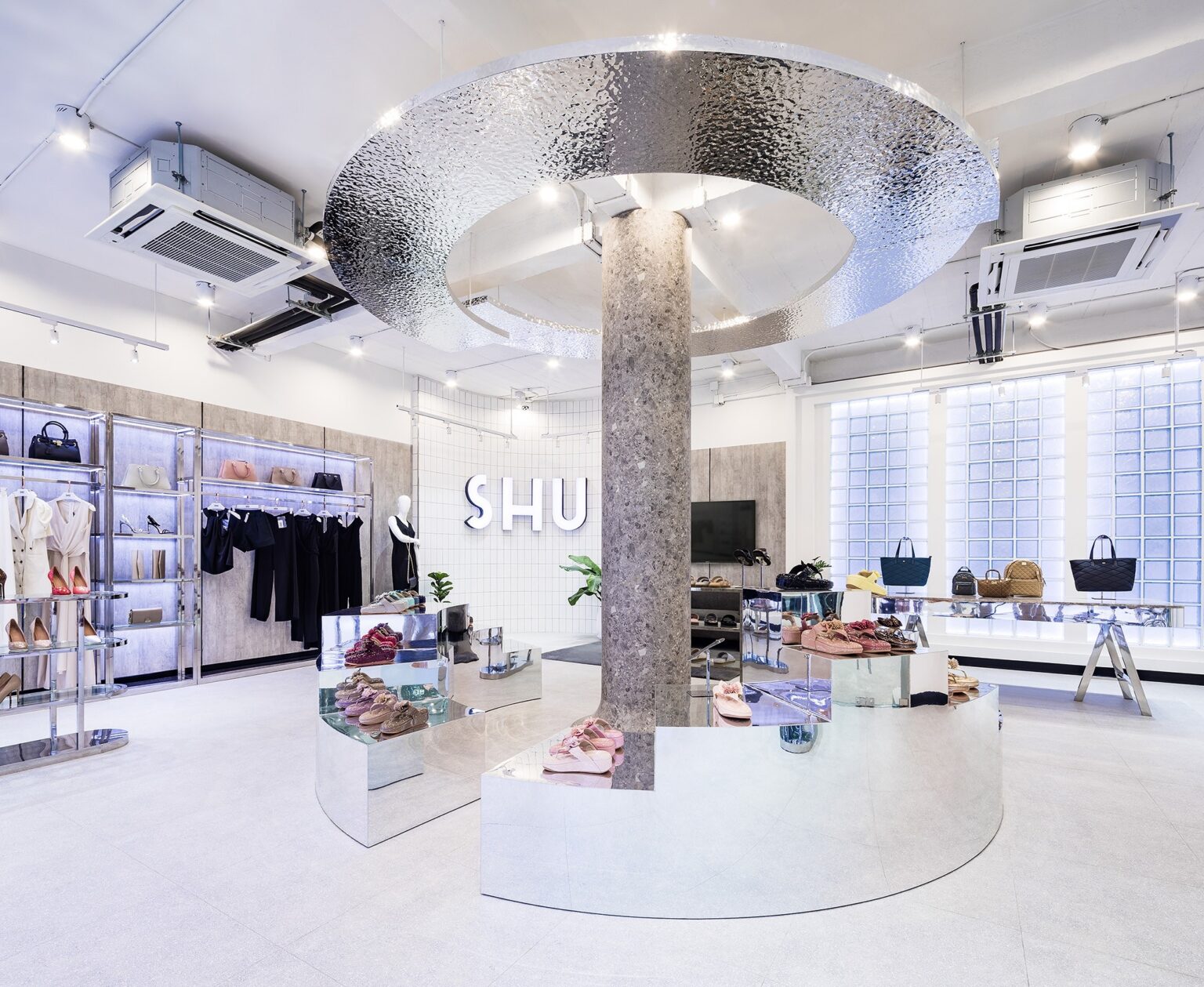
A ring of hammered stainless steel is hung around the existing terrazzo column and lit from within. The column could not move, so it was made the centre of the plan rather than an obstruction, and the ring gives the floor a middle to walk around.
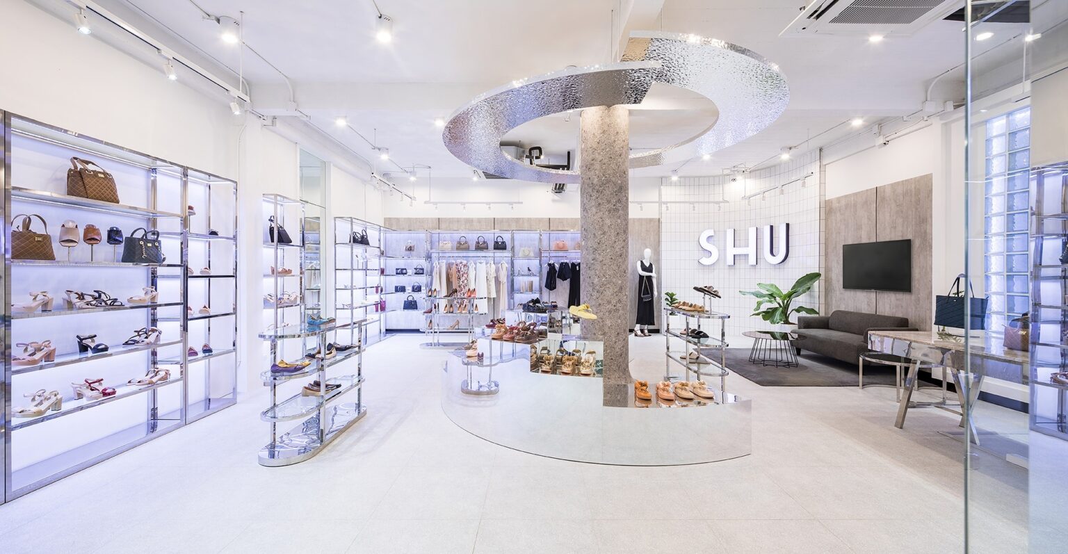
The mirrored plinth is the runway. It is low enough to see over from the door, long enough to hold a full season, and polished so the shoes on it are doubled from below — the same trick a catwalk plays with a lit floor.
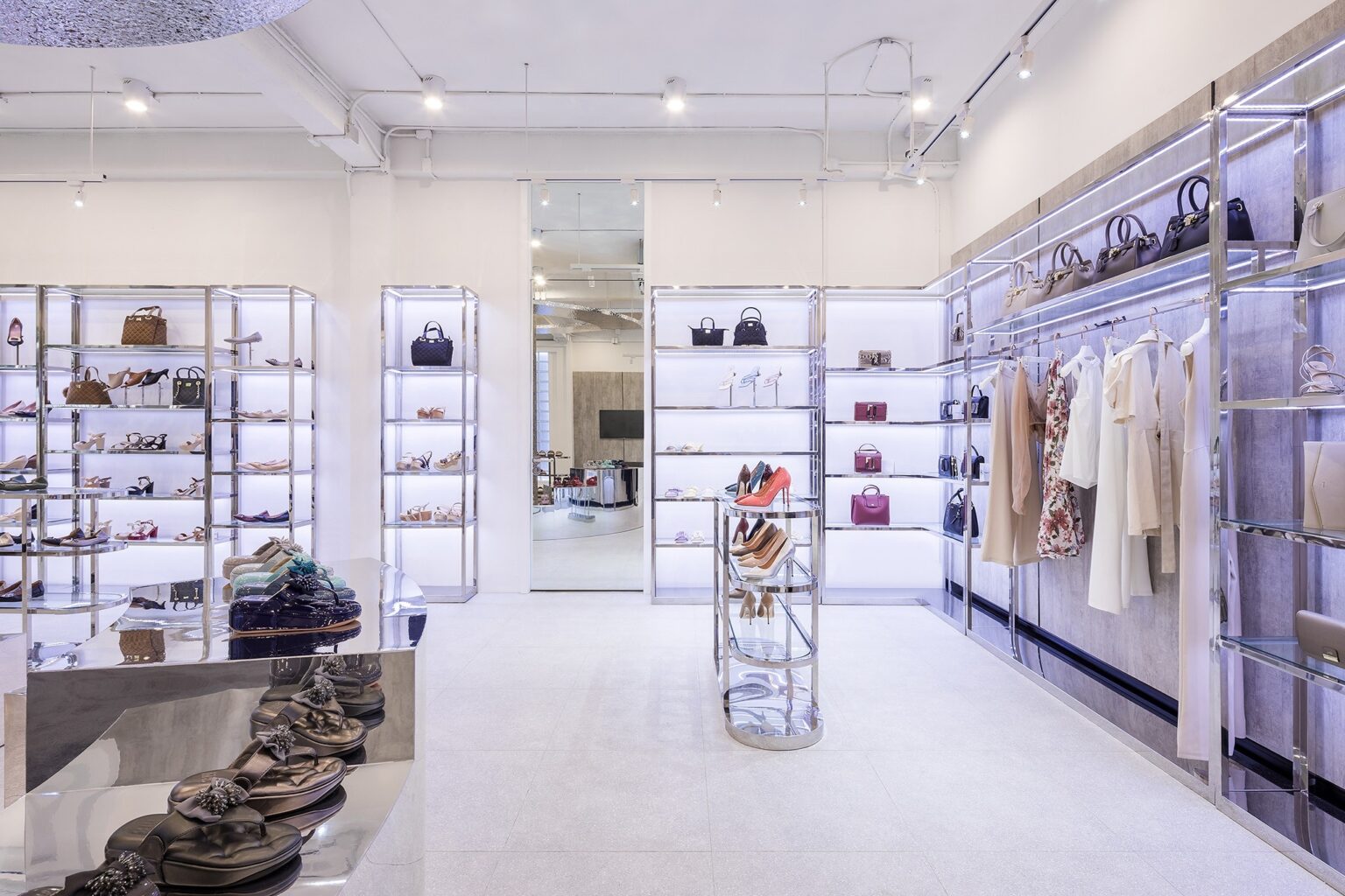
The perimeter is a single chrome-and-glass system with a lit panel behind it. Lighting the wall rather than the shelf means the glass edges disappear and the product appears to float, which is what allows a dense wall of stock to still read as calm.

Every shelf is set at a height staff can restock without a ladder, and the frame is deep enough for a box to sit square. A fixture that photographs well and cannot be refilled during trading hours has failed at the only job it has.
Apparel is carried on the same chrome frame as the footwear, one module wider. Using one fixture family across three product categories lets the floor be re-merchandised in a morning without new joinery.
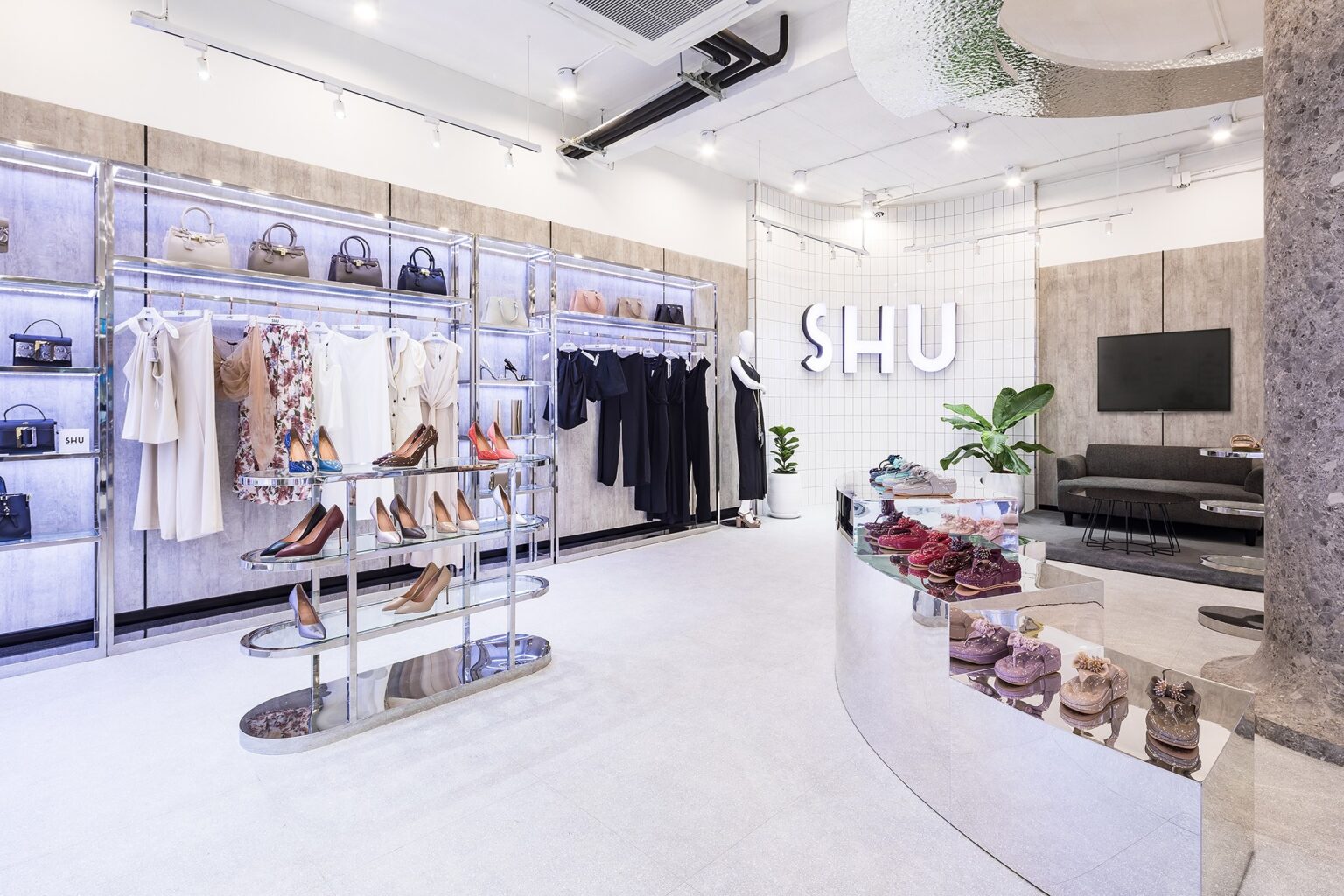
The lit logo wall sits at the deep end of the floor, not in the window. Putting the destination at the back pulls every customer past the full range to reach it.
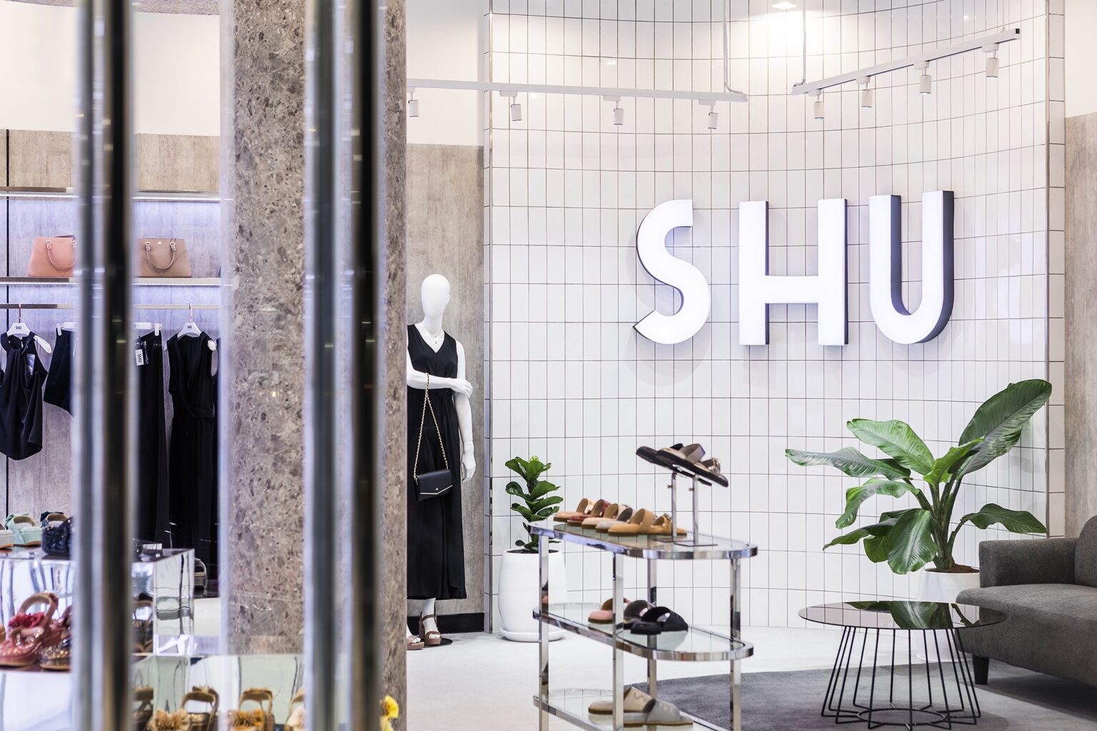
White square tile with a fine dark joint gives the brand wall a grain at close range, where a flat painted surface would give none. The letters stand off it and are halo-lit, so the mark holds from the door and from arm’s length.
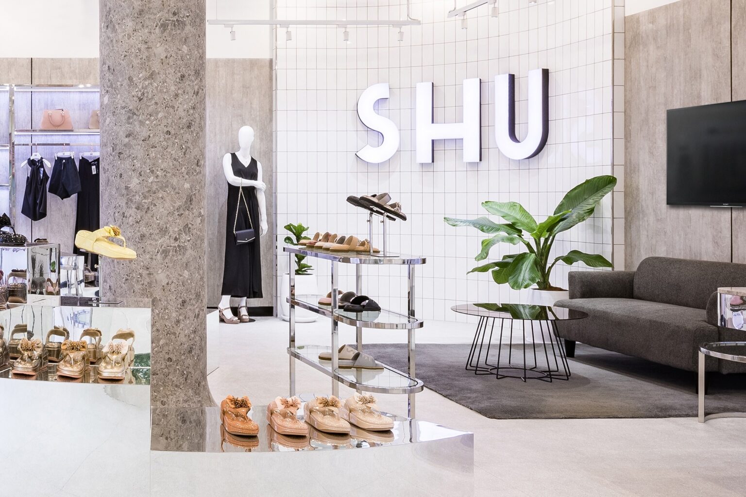
Footwear is the one retail category where the customer has to sit down before they will buy. The lounge is treated as merchandising rather than waiting: upholstery, planting and a low table, placed where the floor is best lit.
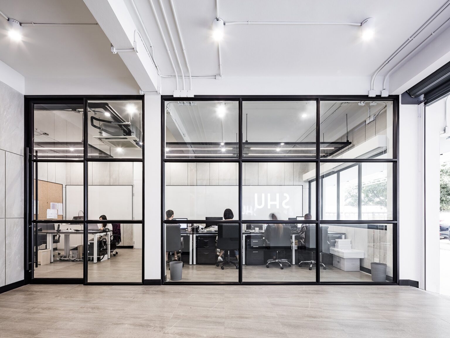
The office is enclosed in black steel and glass rather than plasterboard. The team works across product, buying and marketing on the same item at the same time, so the walls were made transparent above the sill and solid below it.
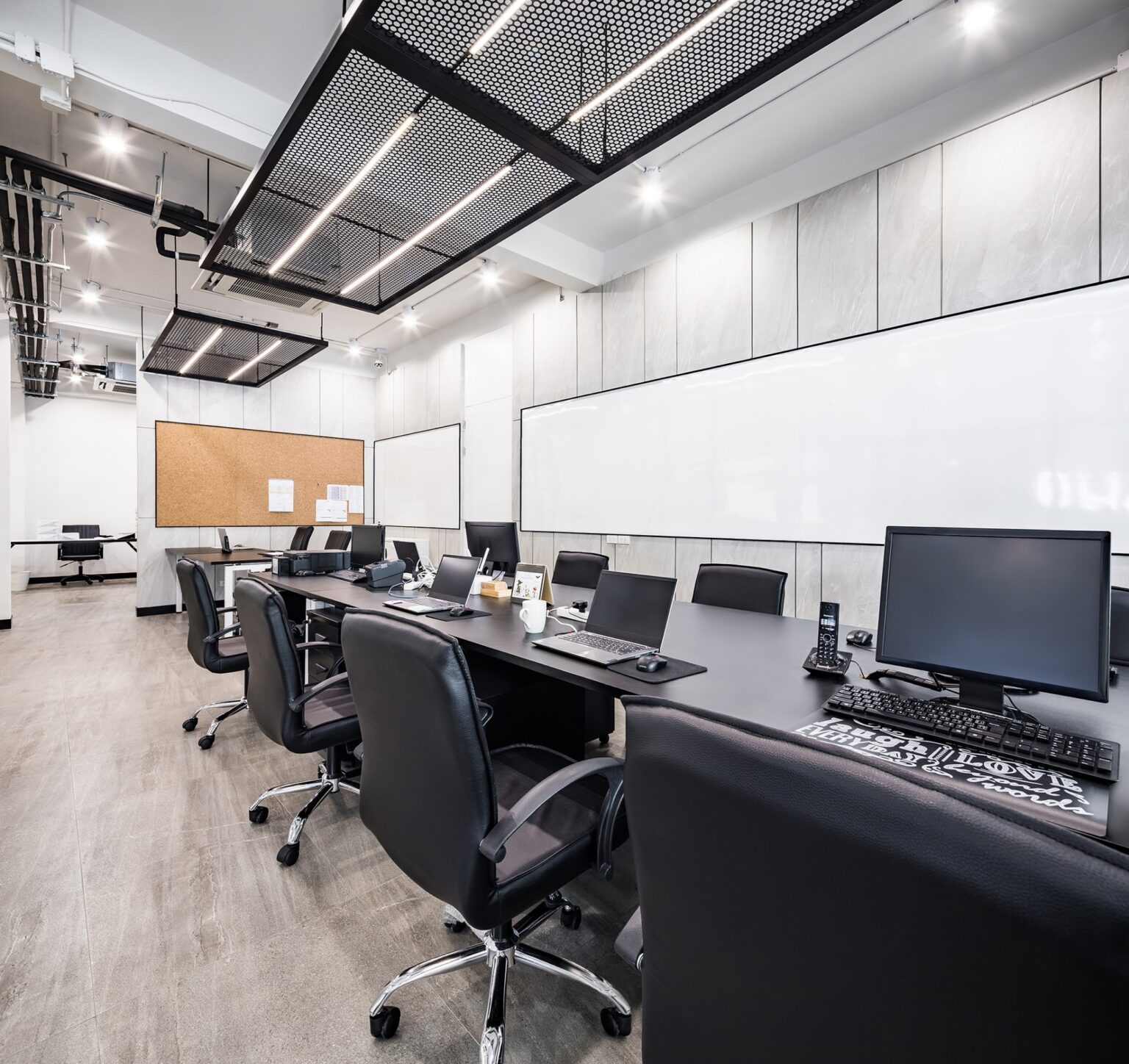
Services are left exposed and painted out, with black perforated rafts hung only where people sit. The raft carries the linear light and the sprinkler drops, and defines a work zone without dropping a ceiling across the whole floor.
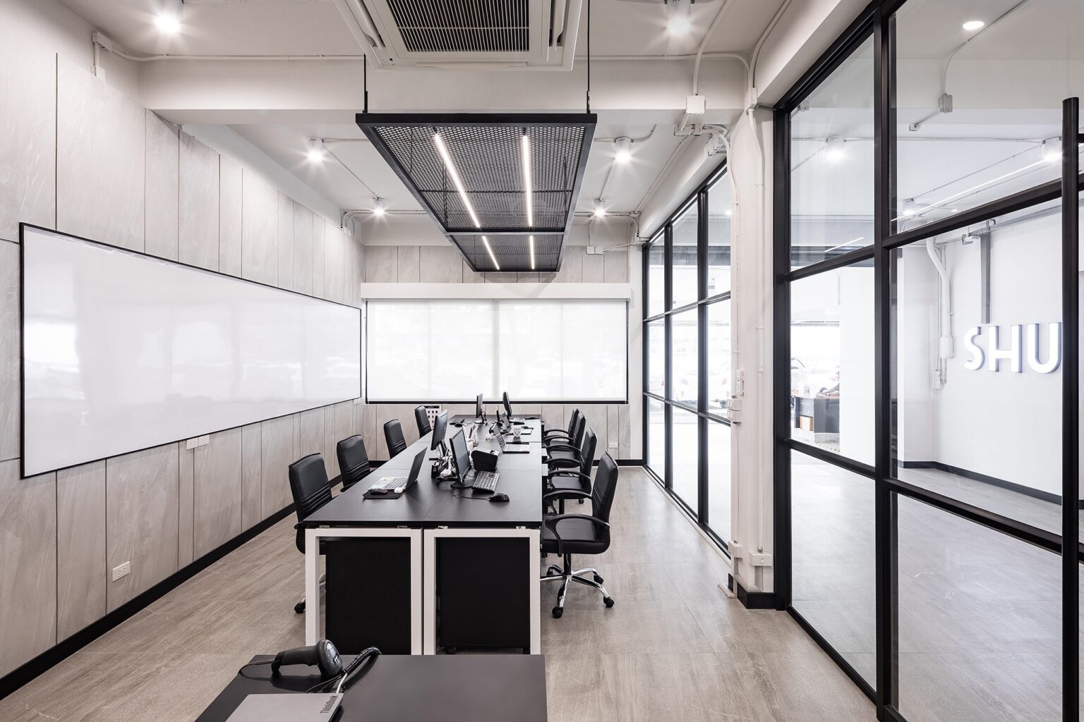
One continuous bench replaces individual desks, with a full-length writing wall opposite. In a business that reviews physical samples daily, the flat run of table is worth more than the partition it replaced.
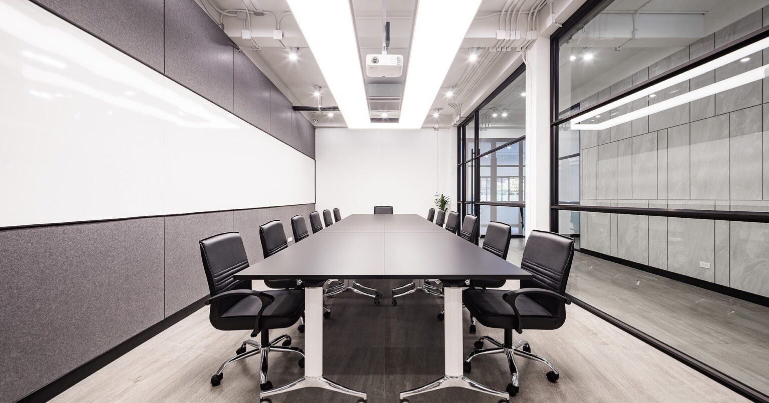
The boardroom is the only fully lined room in the building. Grey acoustic felt runs to door height with a whiteboard band above it, so the room absorbs a twelve-person conversation and still takes marker on the wall.
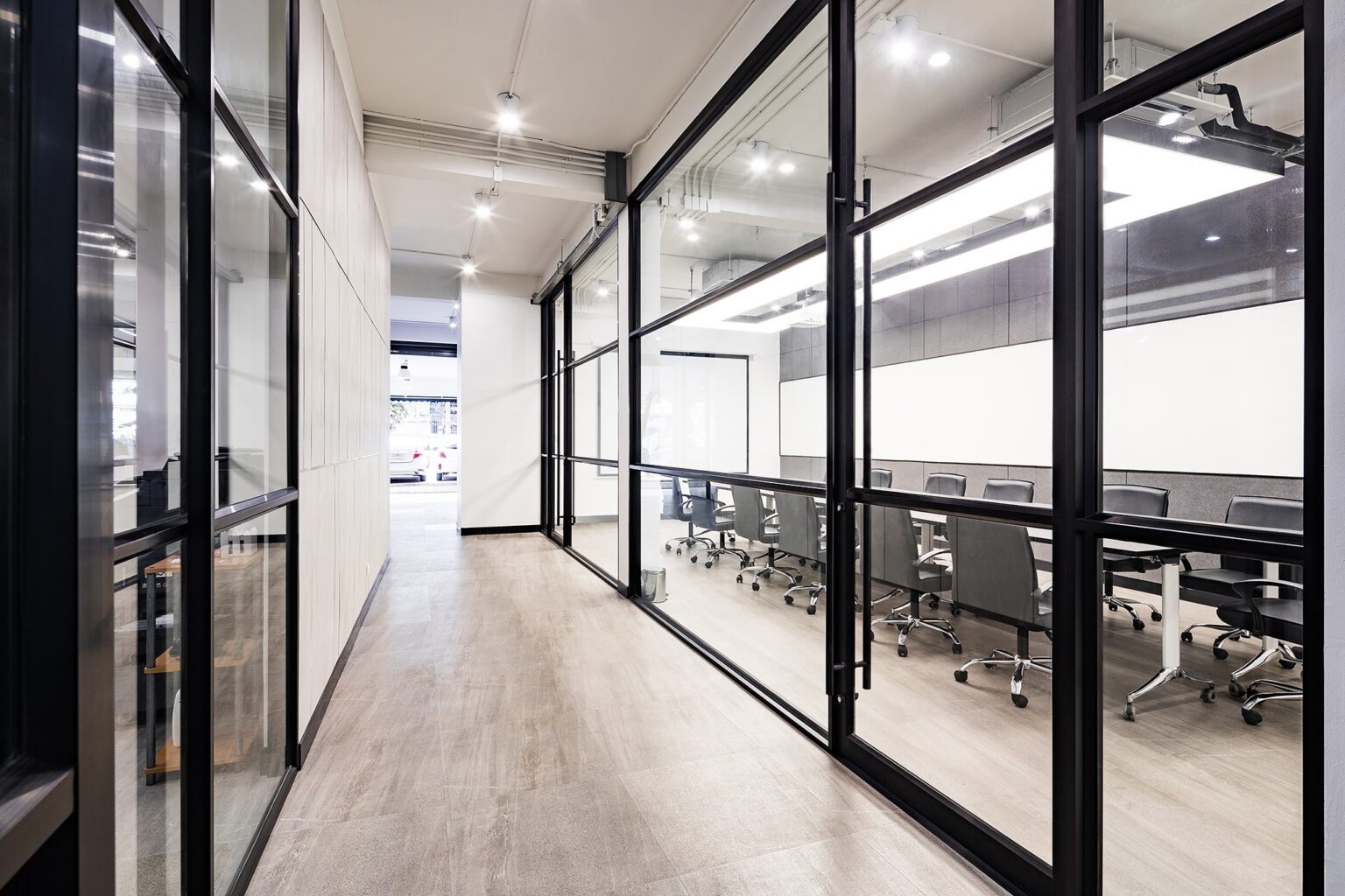
A single corridor serves the whole floor and is glazed on one side for its full length. Borrowed light from the meeting rooms means the deepest part of the plan never needs its own window.
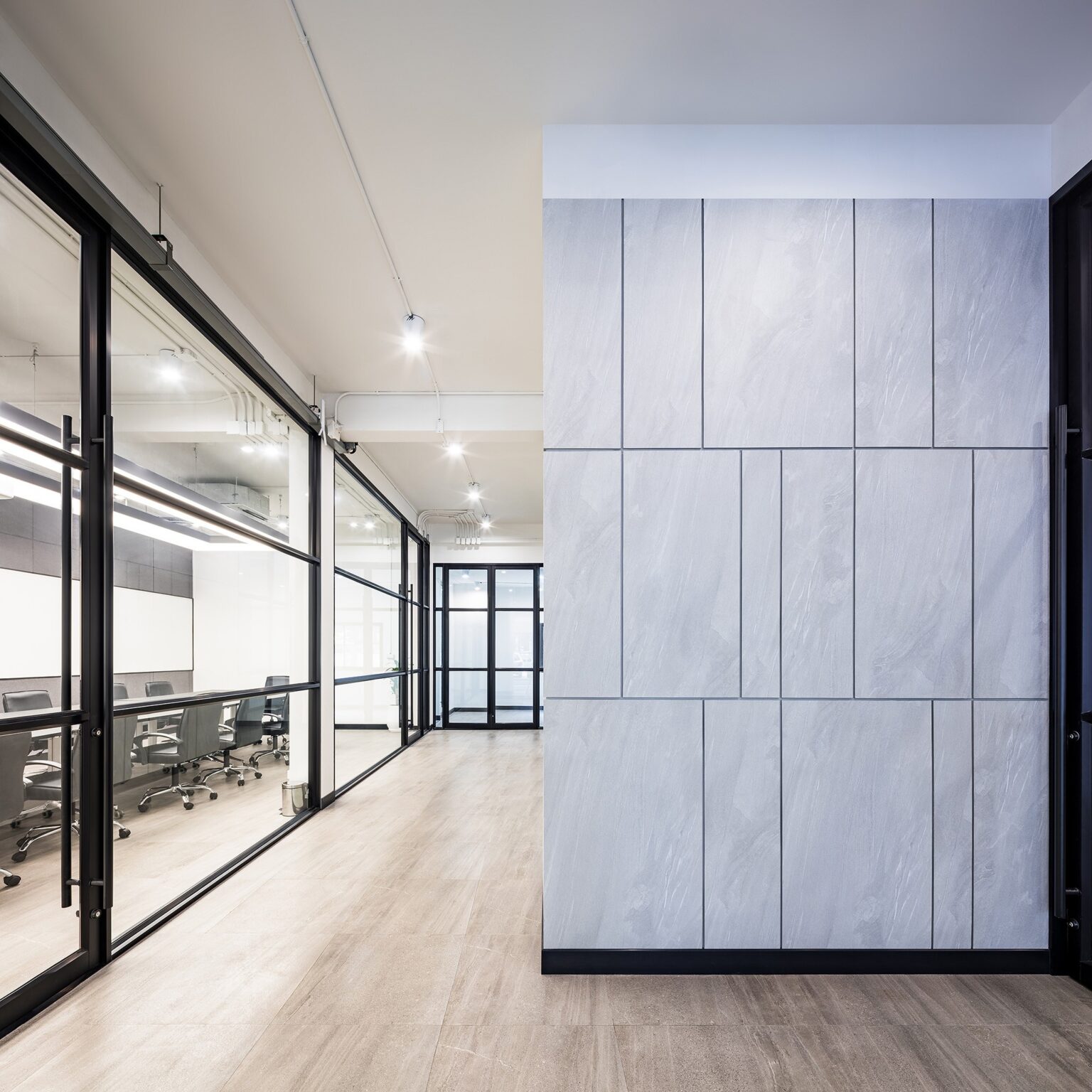
The core is clad in large-format stone-effect panel with a shadow-gap base. It reads as one solid volume against the glass, and gives the corridor a wall that will not mark in a building where sample boxes are carried through it all day.
Flagship store interior design in Bangkok
Flagship store interior design is a different problem from a mall unit. A shopping centre gives you a fixed shopfront line, a fixed fascia and a queue of neighbours doing the persuading for you. A standalone building gives you none of that. It has to stop someone on a street, from a car, at forty kilometres an hour, and it has to do it with one gesture rather than six. Here that gesture is a plane of perforated white metal and a bulb-lit sign — legible at distance, and quiet enough at close range to stay a shop rather than a billboard.
Putting the head office in the same building changes the retail brief as well. Staff move between the studio and the shop floor several times a day, samples come down and go back up, and the stockroom serves both. That traffic has to be planned as carefully as the customer route, and kept off it. The two circulations meet at one point only, behind the brand wall, which is what allows the shop to stay a shop during a working day.
The material palette does double duty. Concrete, stone-effect panel, black steel and brushed stainless read as street and workshop upstairs, and as gallery downstairs. Using the same four materials in both halves means the building holds together when a customer glances through the glazed partition, and it means a single trade package covered the whole job rather than two.
Light is where the runway idea is actually built. The shop floor is lit from three sources that never overlap: lit panels behind the perimeter shelving, a concealed cove inside the steel ring, and daylight through the glass block wall. Nothing is lit from directly overhead, so leather keeps its colour, mirror-polished steel never flares, and the plinth stays the brightest surface in the room from any position on the floor.
Upstairs the same restraint is applied in reverse. Exposed services, painted-out ceilings and rafts hung only over the desks keep the studio bright and flat, because product is checked there before it is ever shown downstairs. A design office that judges colour under a warm ceiling will keep getting colour wrong, and only find out in the shop.
Opening a flagship, or bringing your office and your store into one building? Talk to Gratitude Design about the site, the brand and the opening date.
Related work
More retail and workplace interior design from the studio: SHU – Fashion Island and Romrawin Head Office. The full record is on the portfolio, and the studio’s approach to retail interior design and office interior design in Bangkok is set out under services.
Planning a store, showroom or boutique? Tell us about the project.