
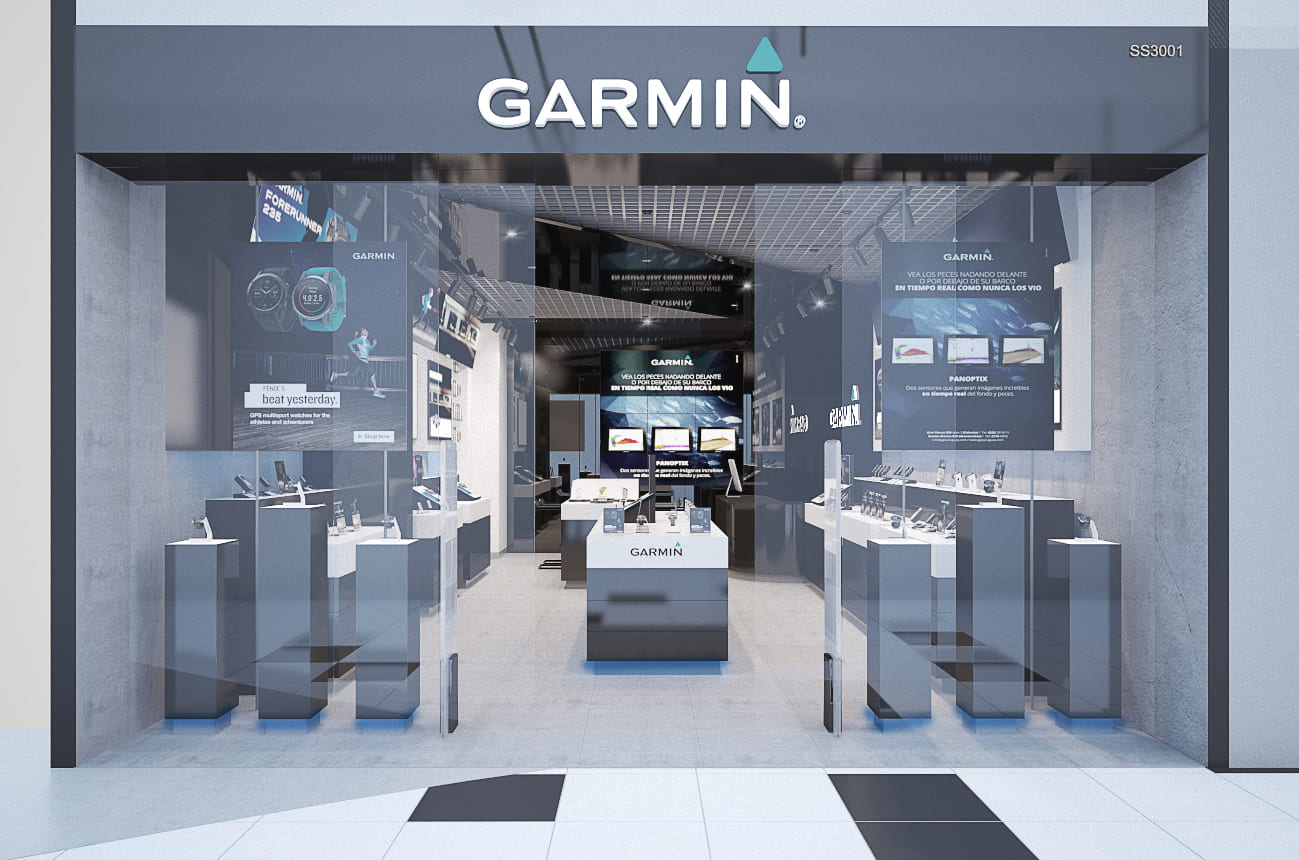
Retail interior design concept for Garmin Shop SQ1 — a 120 sq m competitive pitch exploring how small products can read clearly from across a shopping centre concourse.
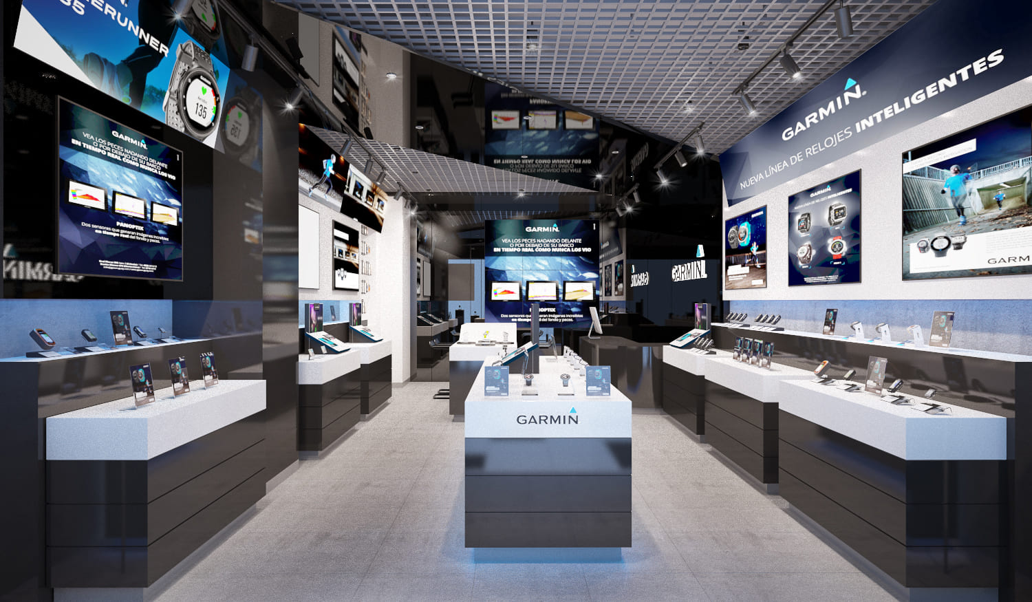
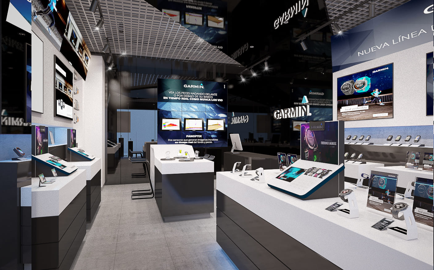
Selling watches and sports electronics is a problem of scale. The products are tiny, the margins are in the demonstration, and the competition for attention in a mall is loud. The design therefore works at two distances at once. A dark ceiling and a single blue graphic band carry the brand out to the concourse. Inside, pale stone-topped plinths bring the products up to the hand. Everything structural recedes into dark grey; everything you are meant to touch is light.
Project facts
- Location — Bangkok
- Typology — Brand retail store, shopping centre unit
- Scope — Retail interior design, fixture and display design
- Area — 120 sq m
- Status — Concept design for a competitive pitch
- Client — Competitive pitch
- Images — Gratitude Design
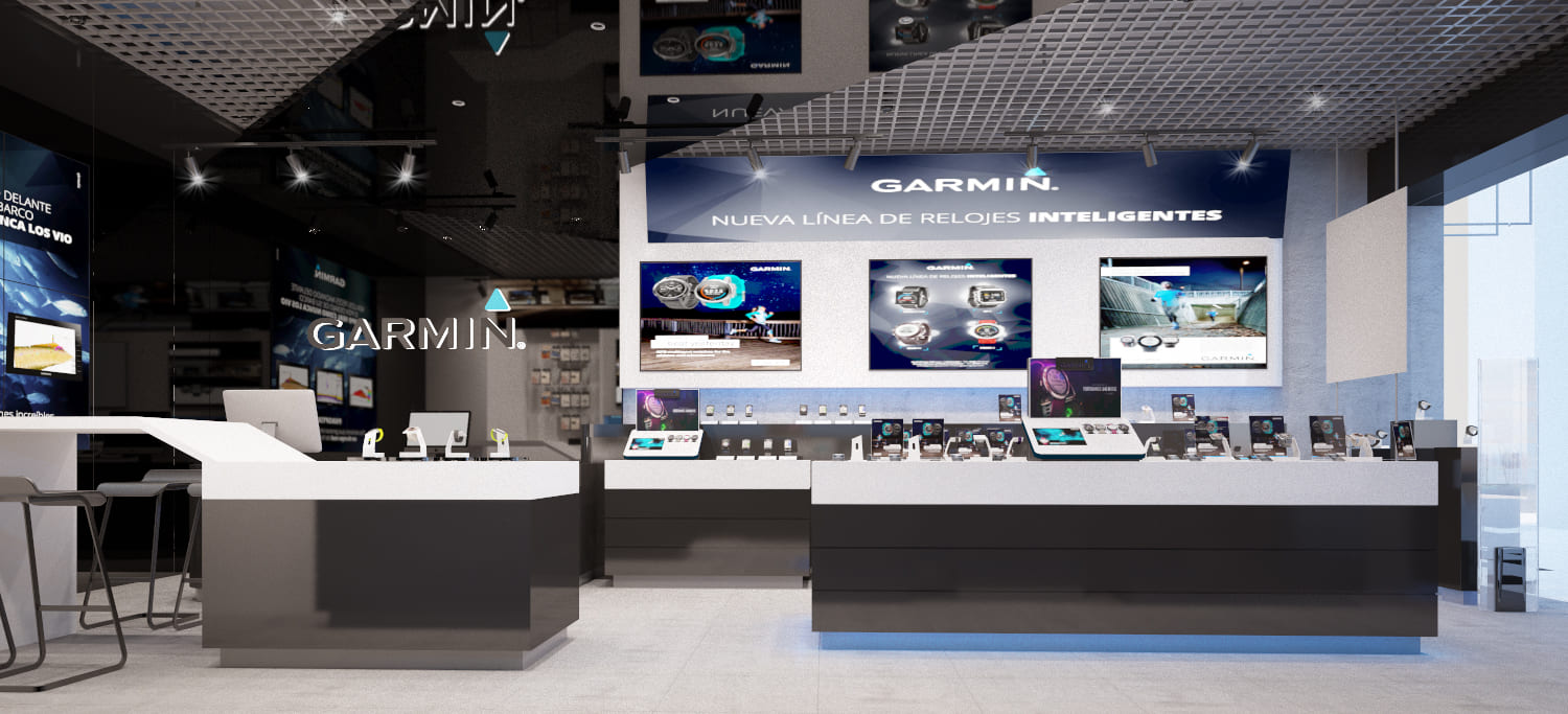
Retail interior design in Bangkok
Retail interior design in a Bangkok shopping centre is a negotiation with three parties before a single fixture is drawn. The mall sets the shopfront line, the fascia height and the hours you are allowed to build. The brand arrives with a global manual that was written for a different climate and a different floor plate. The operator has to run the shop with a small team on a long trading day. Good retail design reconciles all three without letting any of them win outright.
The single most valuable decision is usually where to spend the light. Mall concourses are brightly and evenly lit, which flattens everything, so a shop that simply matches the corridor disappears into it. Dropping the ambient level inside and putting narrow beams onto the products creates the contrast that pulls people across the threshold. It costs almost nothing extra; it just requires the discipline to leave most of the ceiling dark.
Small high-value products also change how the plan works. A fashion store can afford to let people wander; a technology store has to bring the customer to a stop within a few paces, because the sale depends on someone picking the thing up and being shown what it does. That is why the fixtures here are islands rather than a continuous run, and why each one is sized around a demonstration rather than around stock.
The unglamorous part is durability. In a mall unit the floor takes a beating, corners get hit by trolleys, and the fixtures are cleaned every night by someone in a hurry. Dark lacquer hides marks and pale stone tops resist them, so the palette is doing maintenance work as well as visual work. Cable routes, chargers and lockable stock drawers are planned into the joinery from the start, because on a trading floor anything left loose becomes a mess within a week.
We approach every retail, workplace and clinic interior the same way: understand how the space works on an ordinary trading day, not on the day it is photographed. Who opens it, who restocks it, where the queue forms at six in the evening, and what the staff will improvise if the design has not answered a question. Those answers shape the drawings long before anything is chosen for how it looks.
Opening a store or refitting an existing one? Talk to Gratitude Design about your unit, your brand standards and your opening date.
Related work
More retail interior design from the studio: SHU – Fashion Island and Petch Thailand. The full record is on the portfolio, and the studio’s approach to retail interior design is set out under retail interior design.