
Retail store interior design in Bangkok: layout, lighting and customer flow

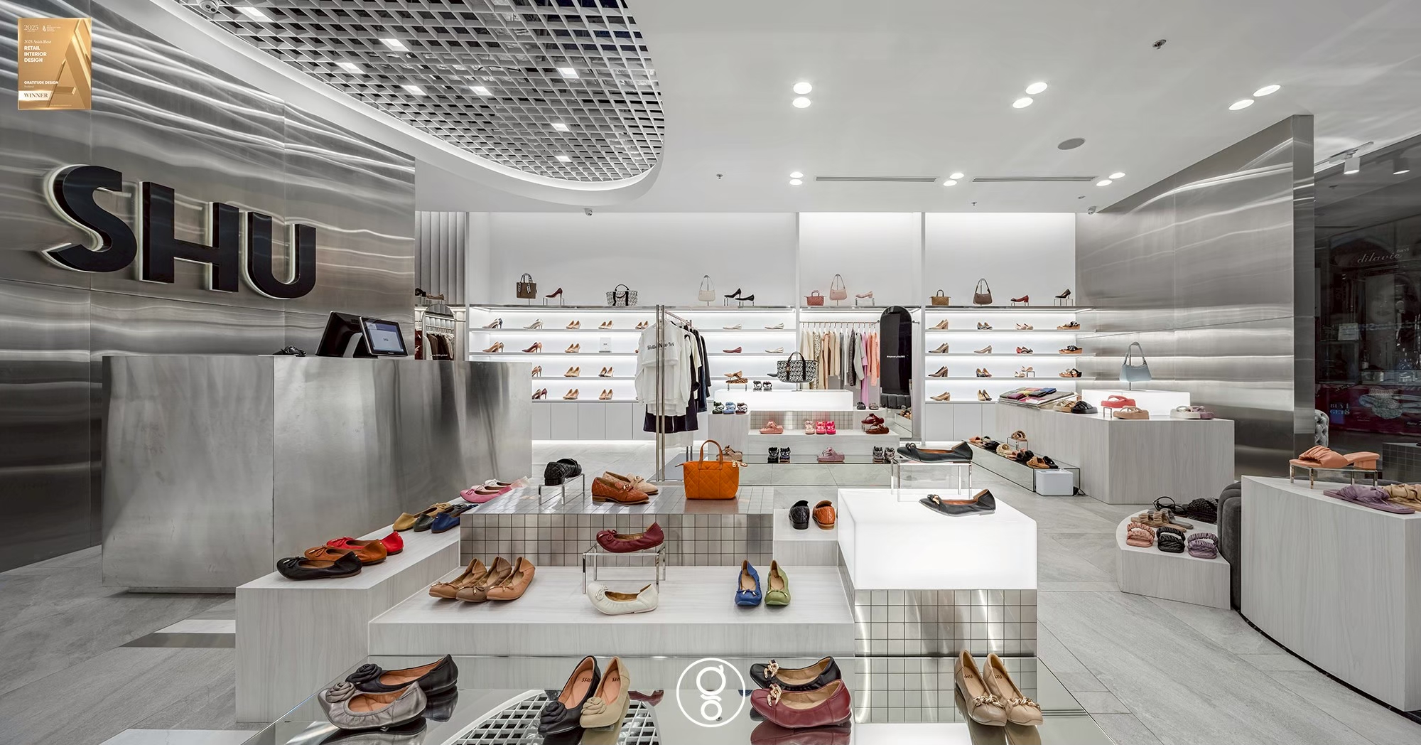
Shoe store interior design for SHU at Fashion Island — perimeter shelving with strip-lit tiers, SHU Fashion Island, Bangkok — interior design by Gratitude Design

Retail store interior design in Bangkok is judged on a single event: whether a person who was walking past decides to walk in. Everything after that, the display, the seat, the counter, the light, exists to turn that visit into a purchase without the customer feeling they have been handled. This article follows the visit in order, from the shopfront to the counter, through four of the studio’s retail projects: a footwear store in a shopping centre, a footwear flagship on a street, and two diamond houses on Surawong Road.

The shopfront is a poster read at walking speed

A mall concourse is bright, evenly lit and loud with neighbours, so a shop that simply matches the corridor disappears into it. The most valuable decision is usually where to spend the light: drop the ambient level inside, put narrow beams on the product, and the contrast pulls people across the threshold at almost no extra cost. At SHU at Fashion Island the whole range reads from the concourse because the perimeter is one uninterrupted run of lit shelving, and the brand holds from a distance on a wall of brushed stainless steel worked into a shallow ripple, with the logo standing proud and halo-lit rather than boxed in a lightbox. A standalone building has none of the mall’s help. The SHU flagship has to stop someone on a street, from a car, with one gesture: a single plane of perforated white metal that reads as a solid mass from below and is almost transparent from inside, over a grey board-formed concrete shopfront with one glazed opening and a bulb-lit sign on white tile. The concrete is not a backdrop for the brand; it is the reason the lit white interior reads.
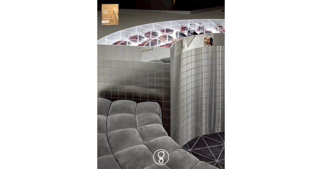
Channel-tufted grey velvet seating curved around a metallic mosaic display island in a footwear store
SHU, Fashion Island — trying on a pair happens in the best-lit part of the shop: a velvet ring set under the ceiling disc, not a bench in a corner.

The threshold: how far in before a decision is made

Inside the door the first thing offered should be space, not a counter. The instinct in high-value retail is to close the distance quickly, greet at the door, move the customer to a case, begin, and it is exactly wrong for a nervous buyer. At Petch Thailand, a diamond house where most customers are buying a stone for the first and only time in their lives, the plan gives ground before it takes any: a distance inside the entrance belongs to the customer, nothing is sold in it, and its only job is to let a first-time buyer stop performing long enough to ask a real question. At Scintillion, a lab-grown diamond house on the same road, the frontage was treated as an invitation with depth rather than a display window with a locked door behind it, so a visitor can see into the room, see people in it, and understand what kind of place it is before committing to entering. Nobody is intercepted on arrival; the room lets a visitor travel a short distance under their own steam before staff close the gap, which is the difference between browsing and being sold to.

Display as architecture, not furniture

Dense stock reads as calm only when the fixtures repeat. A 200-square-metre footwear unit carries more individual products than a fashion store three times its size, so the answer at Fashion Island was fewer kinds of fixture rather than more: one shelf detail around the entire perimeter, each with its own concealed strip under the lip, and one family of low stepped plinths in limewashed timber and metallic mosaic holding the centre. Stepping the plinths lets one fixture show three tiers at once and keeps the sightline to the back wall open from the door. At the flagship the display is the building’s own logic: a mirror-polished plinth runs the length of the floor as a runway, low enough to see over, long enough to hold a season, polished so the shoes are doubled from below, and the existing terrazzo column that could not be moved was made the centre of the plan under a lit ring of hammered stainless steel. The perimeter there is a single chrome-and-glass system with a lit panel behind it, and apparel hangs on the same frame as the footwear, one module wider, so the floor can be re-merchandised in a morning without new joinery. A display that photographs well and cannot be refilled during trading hours has failed at the only job it has; every shelf on both SHU floors is set at a height staff can restock without a ladder.

Flagship store and head office for SHU in Bangkok with a perforated white metal screen facade
SHU HQ and flagship store, Bangkok — one perforated white plane carries the whole elevation, the gesture a brand loses the moment it trades inside a shopping centre.

Fitting rooms and counters: the two rooms that close a sale

Footwear is the one category where the customer has to sit down, take something off and put something on before they will buy, which makes seating a merchandising decision and the middle of the floor as valuable as the wall. At Fashion Island a channel-tufted ring of grey velvet sits under a disc of open-cell metal grid cut into the ceiling, so trying on happens in the best-lit part of the shop and becomes its social centre; push the seats to the perimeter and they become a waiting area. Every seat has a mirror it can see, clear floor for an open box and a route past it wide enough for someone else. At the flagship the lounge is treated as merchandising rather than waiting, upholstery, planting and a low table placed where the floor is best lit, beneath the halo-lit brand wall at the deep end, which pulls every customer past the full range to reach it.

A diamond is not a counter transaction either. It is forty minutes of comparison, explanation and second-guessing, and a standing customer will cut that short out of politeness long before they are ready to decide, so at Petch every position at the counter is seated. The floor is sequenced the way the decision is made rather than the way the stock is categorised: orientation, comparison, selection, then the private end of the process, lifted to the mezzanine on a stair set close to the entrance so a client reaches privacy without being walked the length of the selling floor. Scintillion serves two audiences on one floor, the curious and unbooked on the open floor, the booked appointment in enclosed consultation rooms, and circulation is set so a client can move from one to the other without passing every other customer in the shop.
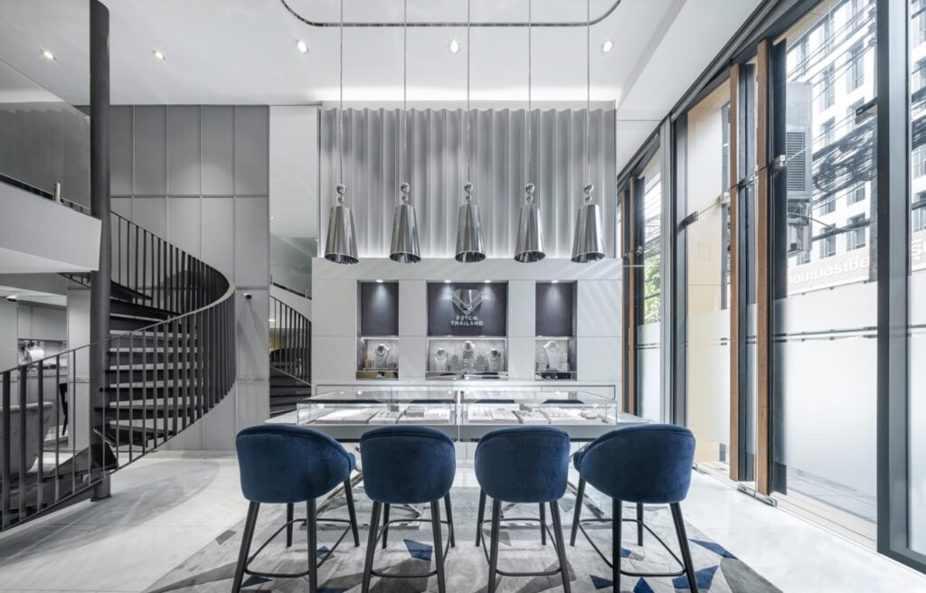
Seated diamond counter at Petch Thailand engagement ring store on Surawong Road, Bangkok
Petch Thailand, Surawong Road — distance at the entrance, the counter held back, and every position at it seated, because a ring takes the time it takes.

Lighting for product versus lighting for people

Leather and suede are bought on colour and finish, so the fittings in a shoe store have to be neutral and high in colour rendering: a warm ceiling makes a grey shoe look beige, and the customer discovers it in daylight outside the mall. Lighting each shelf from its own strip rather than washing the wall from the ceiling keeps the bottom tier as legible as the one at eye level, the difference between a customer crouching down and a customer walking past. At the flagship nothing is lit from directly overhead; the floor is lit from three sources that never overlap, panels behind the shelving, a cove inside the steel ring and daylight through a glass-block wall, so the polished plinth stays the brightest surface in the room from anywhere on the floor.

A diamond asks for the opposite arithmetic. Scintillation, the flash a stone throws as it moves, is not a function of how much light is in the room but of how many separate sources it arrives from; one large soft source gives a stone almost nothing to flash with. Scintillion is therefore bright by accumulation, a field of small sources in the ceiling and a pendant cluster over the central island, with intensity concentrated where a customer lifts a ring to the light and turns it, at hand height rather than case height. The palette stays pale and largely matt, the green onyx is lit from behind so it glows rather than reflects, and the only hard sparkle in the room is meant to be the diamond. Petch adds the less glamorous second register: an even, neutral working light over the comparison surface, treated as an instrument rather than a display, so the difference a customer sees between two stones is a difference in the stones. In both houses the private room is lit to the same standard as the floor, because a stone that fires outside and dulls where the decision is closed loses the sale in the room built to win it.

Mall constraints: landlord guidelines, services, hours

Retail design in a Bangkok shopping centre is a negotiation with three parties before a single fixture is drawn. The mall sets the shopfront line, the fascia height, the ceiling void, the permitted build hours and the handover date. The brand arrives with a global manual written for a different climate and a different floor plate. The operator has to run the shop with a small team on a long trading day. The work is to reconcile all three without letting any one win outright, and to document the unit so a contractor can price it accurately the first time. The unglamorous part is durability: boxes come out of the stockroom every few minutes, plinth corners and shelf edges take constant knocks, trolleys hit corners and someone in a hurry cleans the floor every night. Brushed stainless steel and small-format metallic mosaic absorb that wear in a way a painted finish never will, and large-format pale stone keeps the joints and the cleaning to a minimum. On the street the climate becomes the constraint: the fluted feature wall at Petch carries far more exposed edge than a flat one, and in a unit that opens onto Surawong Road an ordinary core would take up moisture and swell along the flutes, so it was built on moisture-resistant HMR board to hold the geometry sharp for the life of the fit-out. Security in both diamond houses was planned as part of the layout, staff positions set for natural surveillance and secure back-of-house on a route no customer crosses; handled afterwards, it arrives as grilles and signage and the room stops being somewhere anyone would spend an hour choosing a ring.
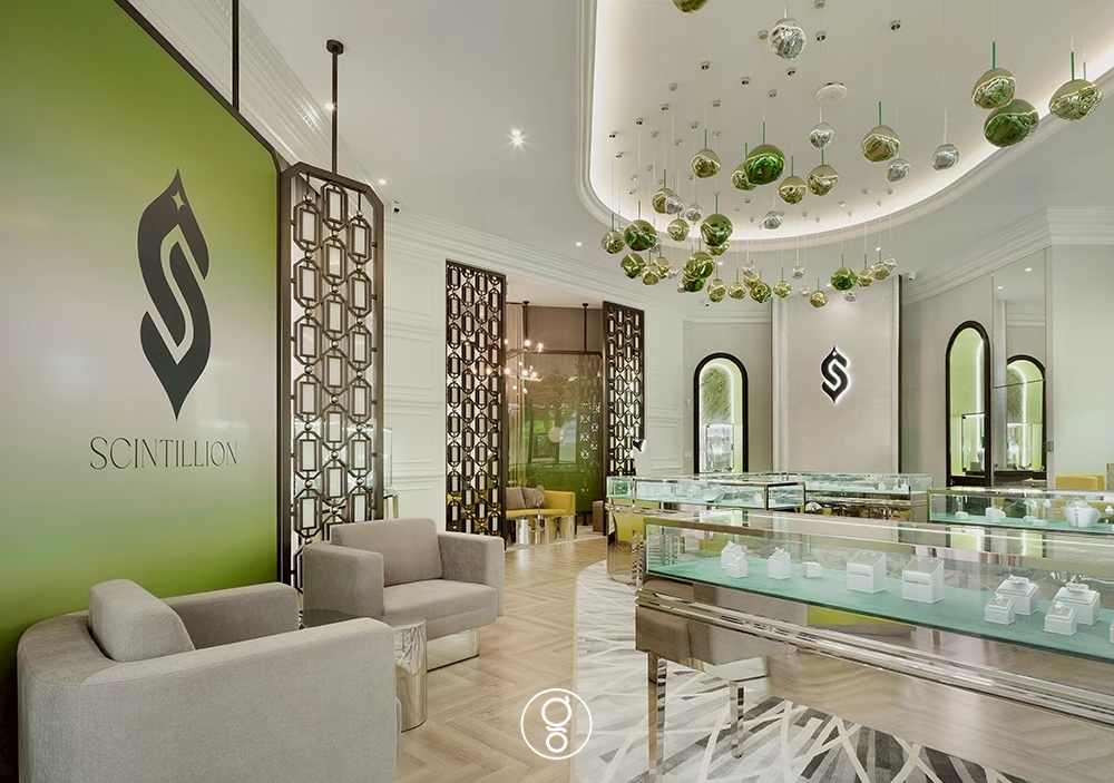
Retail floor and lounge seating beside the brand wall at Scintillion jewellery store, Surawongse Road, Bangkok
Scintillion, Surawongse Road — a pale, largely matt room, bright by accumulation, so the only hard sparkle in it is the stone.

SHU, Scintillion, Garmin and a jeweller

SHU at Fashion Island is a 200-square-metre footwear and accessories unit where several hundred pairs can be read in a single glance and the act of trying on sits in the middle of the shop; the SHU flagship puts the shop and the studio that draws it in one 600-square-metre building, concrete, stone-effect panel, brushed stainless and black steel doing all the work and the product the only colour. Petch Thailand is a 120-square-metre house over two levels on Surawong Road, planned around the least rehearsed purchase most people ever make and built on a single idea, the cut, carried in silver, white and grey from a fluted wall to a faceted marble floor. Scintillion is 210 square metres on Surawongse Road, engineered to produce the optical event the brand is named after. A fifth scheme, a concept for a Garmin store at SQ1, shows the same method applied to very small products: a dark ceiling and one blue band carry the brand to the concourse, pale stone-topped plinths at different heights bring watches to the wrist and screens to the hand, and the counter is turned side-on to the entrance with stools on the customer side, so fitting a strap is a seated conversation rather than a transaction across a barrier.

Working with the studio on a store

Retail fit-outs run to an opening date and inside a landlord’s rules on hours, lifts and services. The studio delivers them as design and FF&E commissions, concept, documentation and the specification, procurement and installation of the display systems and every loose piece on the floor, as at Petch and Scintillion, or as design-only where a brand has its own contractor. The approach to the type, and the projects that make the case, are set out under retail interior design in Bangkok; the delivery routes under turn-key interior design and build. Bring the lease, the product and how your customers actually arrive, booked, walk-in or both.


Gratitude Design is a Bangkok-based interior architecture and turn-key design studio, serving Bangkok, Nonthaburi, Greater Bangkok, Thailand and selected projects across Asia. Opening a store, showroom or boutique, or refitting an existing one? Start a project enquiry, or browse the retail projects.

Interior architecture vs interior decoration: which does your project need?

Office interior design in Bangkok: layouts people actually use
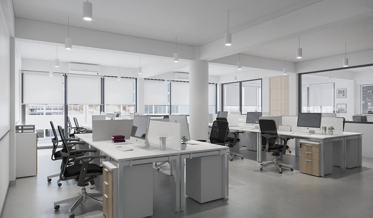
Office interior design in Bangkok: layouts people actually use
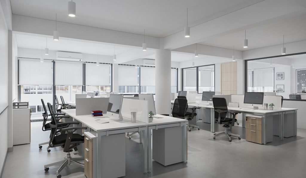
Open-plan workspace at Romrawin Office with white desks, privacy dividers and black task chairs.

Office interior design in Bangkok almost always begins inside a shell that has already been decided: the core is fixed, the slab-to-slab height is what it is, and the landlord has specified the ceiling, the sprinklers and the air conditioning. The design work is not fighting those constraints but choosing where the remaining budget will be felt every day, and being disciplined about everywhere else. What follows is how the studio makes that choice, drawn from two very different Bangkok offices: a clinic group’s head office rebuilt from four old buildings, and a serviced floor where nobody who works there chose the building.

What an office has to do now that it did not have to do before

An office used to be a place to keep people and files. It is now a place people choose to come to, a stage for visitors and partners, a training room, a canteen, a phone booth and a place to think, often on the same floor and sometimes at the same time. That means the plan is no longer rows of desks with a meeting room at the end; it is a set of rooms sized for the three things people do at work, focus, meet and gather, arranged around the way the organisation actually behaves on an ordinary Tuesday. The studio starts every workplace by asking who cleans it, who locks it, what happens when the team doubles, and which surfaces will be touched a hundred times a day. Those answers shape the drawings long before anything is chosen for how it looks.

Arrival: the office as the company’s first meeting

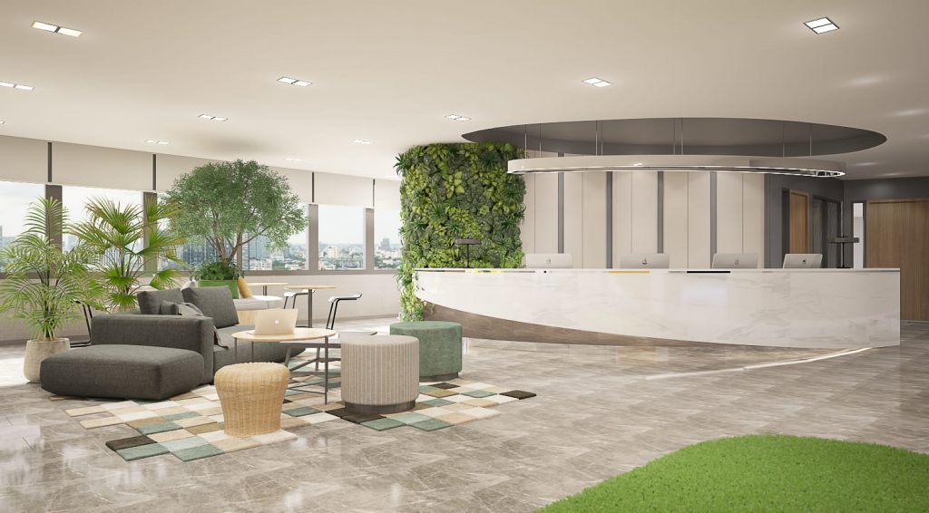
A visitor forms an opinion of a company in its reception, so the ground floor is the public face and everything client-facing happens there. At Romrawin Head Office, the headquarters of one of Thailand’s established aesthetic clinic brands, the reception desk meets visitors the way a Romrawin clinic would, composed, unhurried and recognisably part of the brand, with a waiting area beside it so a supplier arriving early and a franchise partner arriving on time are held comfortably in the same calm room. At The Urban Office the reception counter is a single curve in pale stone answered by a dark oval dropped from the ceiling directly above it; nothing else on the floor is curved, so reception is found without a sign.

Office reception with a curved pale stone counter, a dark oval ceiling feature above it, tall planting and a green wall behind
The Urban Office, Bangkok — the one curve on the floor: a pale stone counter under a dark oval, so reception is found without a sign.

Focus, meet, gather: sizing the three kinds of room

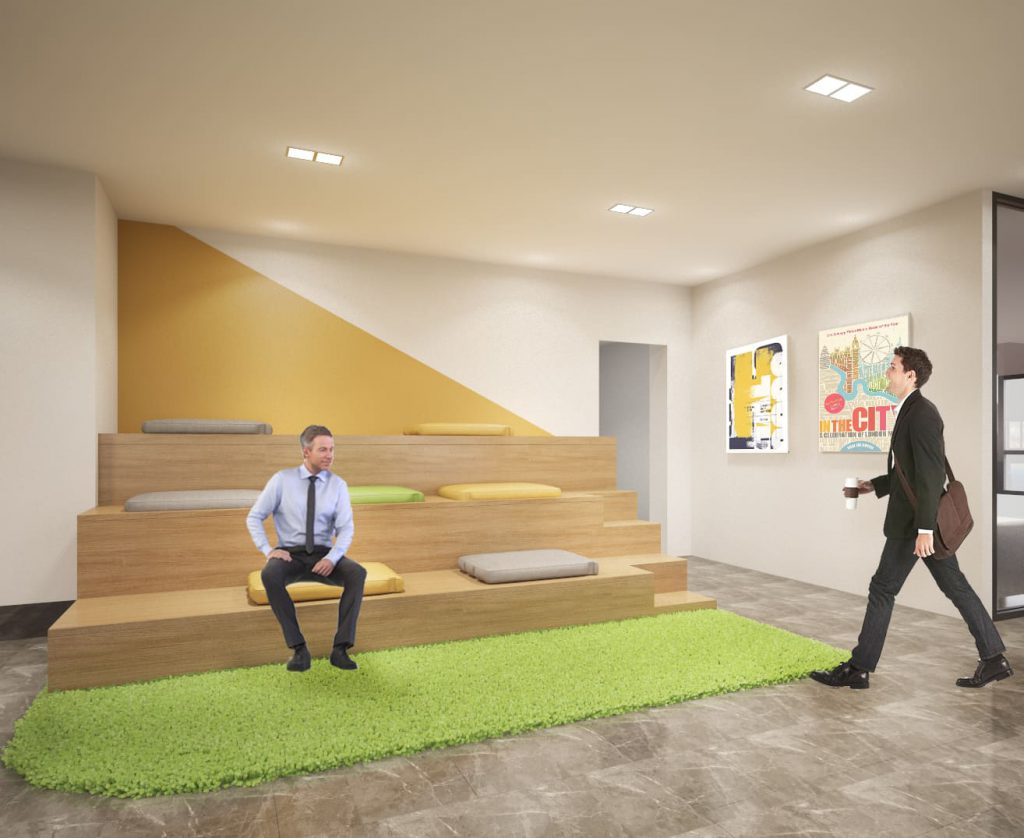
Most offices have too many large meeting rooms and too few small ones, and the large ones stand empty most of the day. The studio sizes rooms from the meetings that actually happen. At Romrawin the second floor takes the sessions that need a door, and a dedicated training room takes the sessions that need a screen and forty chairs, a working necessity for a clinic group that trains its own practitioners to a house standard. At The Urban Office a timber bleacher with loose cushions takes the place of a large meeting room that would have stood empty; a green rug marks exactly where seating stops and circulation begins. Focus is handled by adjacency rather than by walls: at Romrawin teams that speak daily now sit within speaking distance, and the manager’s room is placed to see the floor it manages rather than sealed away from it.

Daylight, acoustics and the desk you would choose

Daylight is the scarcest resource on a deep Bangkok floorplate, and it is usually spent badly, on a row of private offices along the window that leave the middle of the floor in permanent electric light. On the serviced floor the private suites are pushed to the façade but the partitions are full-height glass, so the light that arrives at the window travels all the way back into the corridor; privacy between suites is handled with a graduated dot film rather than solid walls, which appear only where a wall has to do something, conceal a riser, carry joinery or stop sound. At Romrawin the party walls between four buildings came out, and glazing now lets borrowed daylight travel deep into a plan that was once a row of dim, separate rooms.

Acoustics decide whether an open plan survives the team. Glass is honest about sight and poor about sound, so soft surfaces are placed where conversation collects rather than distributed evenly for effect: carpet tile inside the suites, upholstery in the lounge, planting at reception, cushions on the bleacher, all doing acoustic work while looking like furniture.

Head office interior design in Bangkok — third-floor open-plan office with rows of workstations
Romrawin Head Office — an open floor in clear daylight, planned with the adjacencies that four separate buildings had always denied.

The rooms between the work

What makes an office liveable is rarely the desks; it is the spaces between them. At Romrawin a canteen and dry pantry give staff a real lunch away from their keyboards, a room with its own character rather than a corner with a kettle; a shoe room at the entrance respects how people actually arrive and settle into a Thai workplace; a semi-outdoor terrace at the top of the building opens the office to the sky for a phone call or the kind of conversation that goes better standing up. Even the washrooms were designed rather than merely fitted, because a head office that hosts partners is judged in its smallest rooms as surely as its largest. On the serviced floor the shared lounge is the only room allowed a strong colour, a yellow wall of concentric lines at one end and a living green wall at the other, which is why it reads as a destination from the corridor instead of leftover floor area.

Materials that look better after five years

An office is touched constantly and refurbished rarely, so the finishes are chosen for the fifth year rather than the first photograph. Romrawin holds to one language across four floors that once contributed four eras of flooring and light: pale surfaces, warm timber tones, glazing, nothing that shouts. On a serviced floor the discipline is sharper still, because the tenant mix will change and anything specific to one company will be wrong within two years, so the money goes into the things that stay true for whoever moves in: the quality of the light, the width of the corridor, the durability of the floor, and shared rooms good enough that a four-person business feels it has an office rather than a desk.

Tiered timber bleacher seating with loose cushions, an ochre angled wall graphic and a bright green rug in a shared office area
The Urban Office — a timber bleacher in place of a large meeting room that would have stood empty most of the day.

Romrawin Head Office and The Urban Office

Romrawin began not with a floor plan but with four of them: four separate, ageing buildings joined at the walls, each with its own levels, stairs and idea of where a corridor should go. The project started with demolition, taking the interiors back to the structure, removing the party walls and treating the resulting 400 square metres over four storeys as a single site. The plan was then rebuilt around how a clinic brand’s head office runs, the daily traffic of staff, documents, deliveries and visiting partners, rather than the accidental geography of old buildings, and the four façades were drawn into one composed elevation. The Urban Office is the opposite brief on the same area: a 400-square-metre serviced floor where private suites sit off a single daylit spine and the shared rooms, reception, a planted lounge and the bleacher, are deliberately more generous than a small company could justify alone, so the floor reads as one practice rather than a corridor of strangers.

Working with the studio on a workplace

Office fit-outs run to a move-in date and inside a landlord’s rules on hours, lifts and services, which is why the studio prefers to carry them under one contract where the client allows it, and delivers design-only where a tenant has its own contractor. The studio’s approach to the type, and the projects that make the case, are set out under workplace and office interior design in Bangkok; the delivery routes under turn-key interior design and build. Where an office sits inside a clinic or a retail business, the studio’s clinic and retail work is planned to the same method.


Gratitude Design is a Bangkok-based interior architecture and turn-key design studio, serving Bangkok, Nonthaburi, Greater Bangkok, Thailand and selected projects across Asia. Planning an office, head office or serviced floor? Start a project enquiry, or browse the workplace projects.

Clinic interior design in Bangkok: patient flow, privacy and calm

How to choose an interior designer in Bangkok: 9 checks before hiring

Hotel interior design in Thailand: planning guest rooms and resort villas

Hotel interior design Bangkok - typical guest suite bedroom at The Sathon Vimanda

A hotel is judged in the room. The lobby makes the first impression and the restaurant makes the evening, but the review is written from the bed, about the shower, the socket that was where the laptop needed it, the wardrobe door that opened without hitting the bedside. Hotel interior design in Thailand therefore begins with the unit that will be built dozens of times, because every decision in it is multiplied, and so is every mistake. This is how the studio designs a guest room, from a city hotel suite to a villa on a river, and where the lobby and the arrival fit around it.

The room is the product

A typical unit is the most demanding drawing in a hotel. It is drawn once and built again and again, so the value of the design sits less in the hero view than in the details that survive a hundred rooms. The studio begins every unit by testing the plan against a day in the life of two guests arriving together: where do the cases land, who reaches the bathroom first, can one person sleep while the other works? Answering those questions usually reorganises the plan more than any moodboard does. At The Sathon Vimanda in Bangkok it is the reason the dressing wall sits outside the bathroom rather than inside it, so one guest can get ready while the other still has the shower.

Arrival sequence: door, bed, view

The first three seconds inside a room are a sequence, and it can be drawn. The entry is usually the narrowest part of the plan; at The Sathon Vimanda one side is mirrored floor to ceiling and the ceiling dropped in bronze, so the corridor reads twice as wide as it measures before the room opens. In a villa the sequence starts outside: at the River Kwai Village floating villa in Kanchanaburi a deep verandah keeps the sun off the glass and puts the first ten seconds of arrival over the water, so every room has a threshold before the river. Then the bed, then the view, and nothing pushed against the window wall to interrupt it.

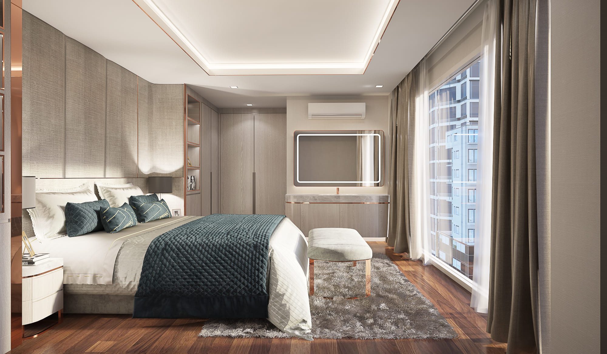
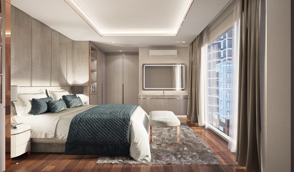
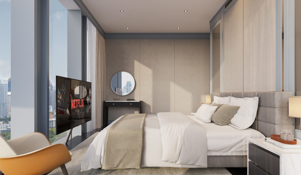
Hotel interior design Bangkok - typical guest suite bedroom with woven fabric headboard wall and city view
The Sathon Vimanda, Bangkok — a typical suite drawn once and built many times: pale oak, woven linen, copper used only as a line, and the window kept free of furniture.

The bed wall and everything it hides

The bed wall is the one surface a guest looks at longest, and it is also where most of the room’s services want to be: sockets, switches, reading light, the controls for the curtains and the air. The studio treats it as one piece of joinery that carries all of that invisibly. At The Sathon Vimanda the headboard wall is woven fabric with the bedside built in; on the River Kwai villa it is a graded woven panel lit from the cove above, with the roof left as structure and downlights kept out of it. The test is simple: a guest reaching for a light at midnight should find it without opening their eyes, and should never see a cable.

Bathrooms guests photograph

Hotel bathrooms date faster than any other room, and they date at the joints. At The Sathon Vimanda one stone runs from the shower floor to the vanity wall, which removes the tile junctions that usually age a bathroom in its second year; the shower screen is frameless except for a slim copper edge, and the vanity is cantilevered to keep the floor visually continuous. On the floating villa the two bathrooms are planned back to back on a single wet spine, the one place on a raft where drainage can be gathered rather than distributed, and the freestanding tub, the heaviest live load in the villa once filled, is set against a structural bay on the river side so that it does not put the raft out of trim. A bathroom that photographs well is, in every case here, a bathroom whose services were planned first.

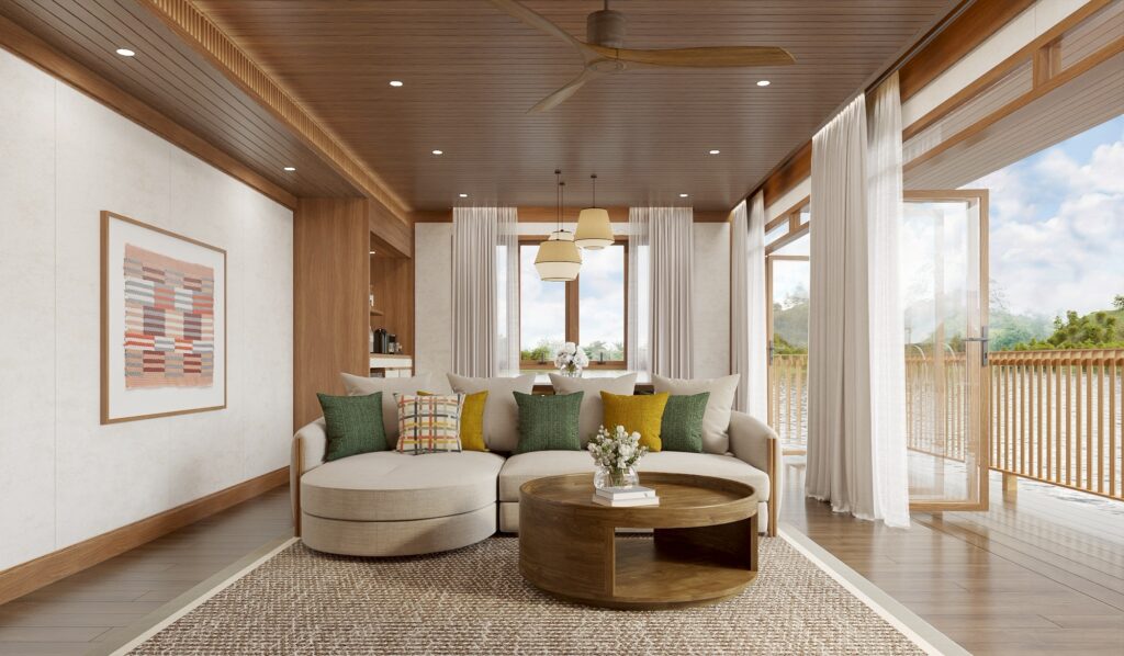
Living room of a floating villa opening onto a river verandah
River Kwai Village floating villa, Kanchanaburi — the living room opens the full river elevation; curved seating keeps circulation clear on a floor plate where every square metre carries a weight cost.

Terrace, verandah and the line between inside and out

In a Thai resort the outdoor room is half the product, and the threshold between inside and out has to work in monsoon rain and in afternoon sun without losing the air-conditioning. On the River Kwai villa the traditional Thai river house is kept for what it still does rather than for how it reads: a steep gable that sheds rain, a volume above the collar that stacks hot air away from the bed, and a verandah deep enough to shade the glass. Inside, the lighting is layered so the window stays a view after dark rather than turning into a black wall, and the verandah stools face upriver. The lesson travels to any resort room with a terrace: shade the glass, light the outside, and give the guest a reason to sit on the threshold.

Durability, housekeeping and the ten-year test

Material selection in a hotel is filtered through maintenance. Humidity, daily housekeeping and a replacement cycle measured in years rule out finishes that look beautiful in a render and fail in year two. Large-format stone reduces grout lines. Oak veneer is specified with a solid lipping on every exposed edge that a suitcase will hit. Metal is used as a slim reveal rather than a surface. Where the building imposes its own limit, the discipline tightens further: on the floating villa the teak joinery is panel-faced and hollow wherever hollow is invisible, because weight saved in a carcass is weight available somewhere else, and every component arrived by water because the site has no road.

The lobby: the two hours a day that decide the arrival

Around the room sits the arrival, and a resort lobby is a queuing problem before it is a decorating one. At La Miniera Pool Villas in Chonburi, a 66-key villa resort, guests arrive in family groups, by car, at roughly the same hour, with luggage for several nights, children already dressed for the water park, and the dog. The lobby was planned from that sequence backwards: where the car stops, where luggage is set down without blocking the door, where a buggy waits, where a parent can complete a registration card while still seeing their children. Registration is a single long counter so several families are served in parallel without a visible line; waiting is designed as seating rather than standing; a gelato cart inside the lobby gives children a destination that is not the front desk. The floor is large-format stone along the whole arrival path, because wheeled luggage, wet feet and paws all cross it, and softness is introduced only where it can be lifted and cleaned.

Long marble reception counter with crystal chandeliers at La Miniera Pool Villas Pattaya
La Miniera Pool Villas, Chonburi — one long counter so several families check in at once, and a room that offers somewhere to sit before it offers a desk.

Three Thai properties, three answers

A 60-square-metre city suite in Bangkok, planned as a calm apartment with a separate living space and a dressing wall pulled out of the bathroom. A 120-square-metre villa moored to a pontoon on the Kwai Noi, where the plan was settled by load before it was settled by adjacency. A resort lobby and bar in Chonburi, resolved as an arrival sequence and as one room serving two audiences, families at three in the afternoon and adults at ten at night. The method is constant: test the plan against the guest’s day, put the services where they belong before choosing a finish, and specify for the year the photographs are no longer new.

Working with the studio on a hotel

Hotel work can be delivered design-only, with the studio producing the typical-unit drawings, joinery and FF&E specification for the operator’s contractor, as on the River Kwai villa, or with procurement and installation carried by the studio, as at La Miniera. The studio’s approach to the type, and the projects that make the case, are set out under hotel and hospitality interior design in Bangkok; the delivery routes under turn-key interior design and build. Where a resort asks for the building as well as the rooms, see architecture and landscape.


Gratitude Design is a Bangkok-based interior architecture and turn-key design studio, serving Bangkok, Nonthaburi, Greater Bangkok, Thailand and selected projects across Asia. Planning a hotel, resort or villa property? Start a project enquiry, or browse the hospitality projects.

How to make a house feel like a luxury hotel: 5 design decisions

Restaurant interior design in Bangkok: planning the dining experience

Clinic interior design in Bangkok: patient flow, privacy and calm

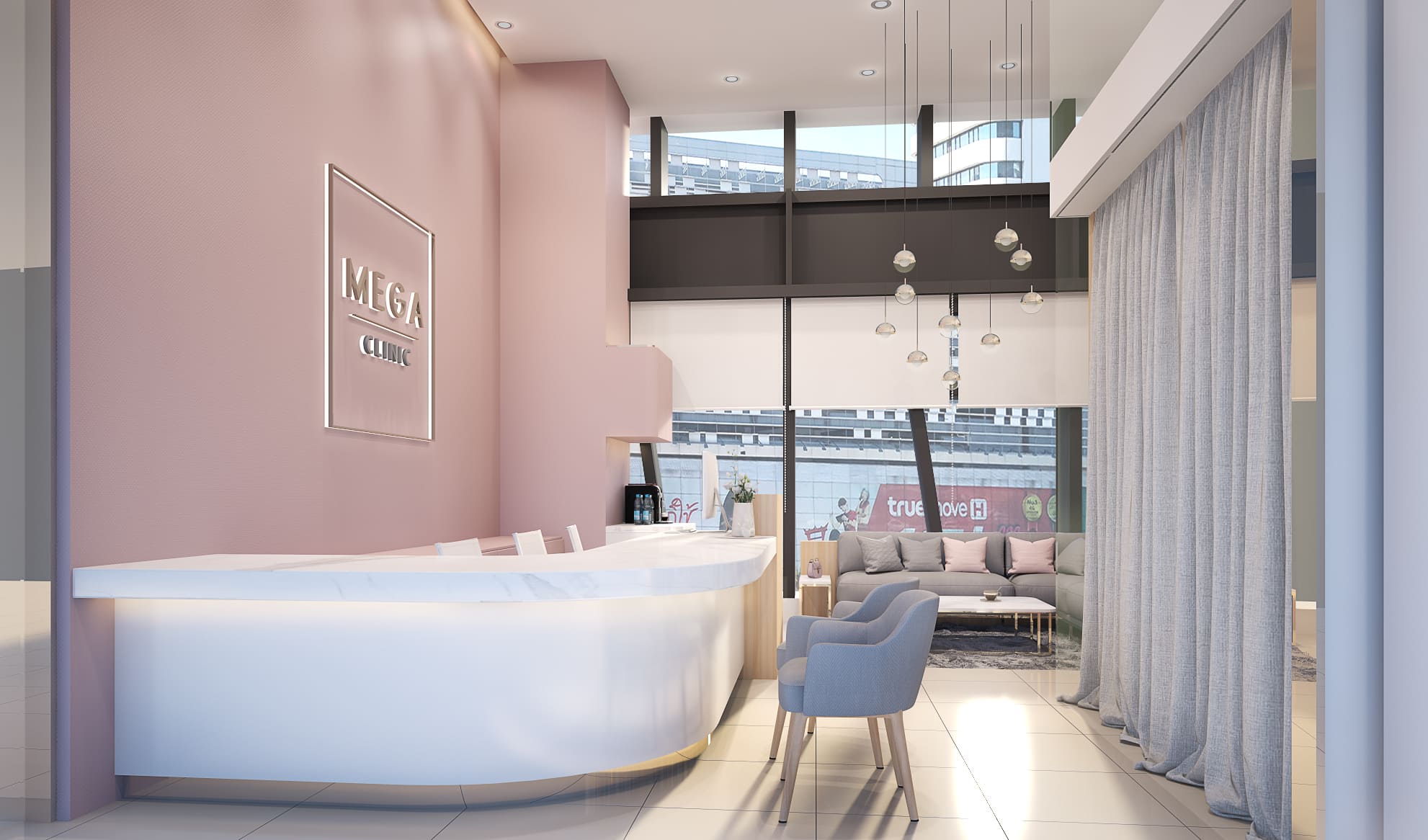
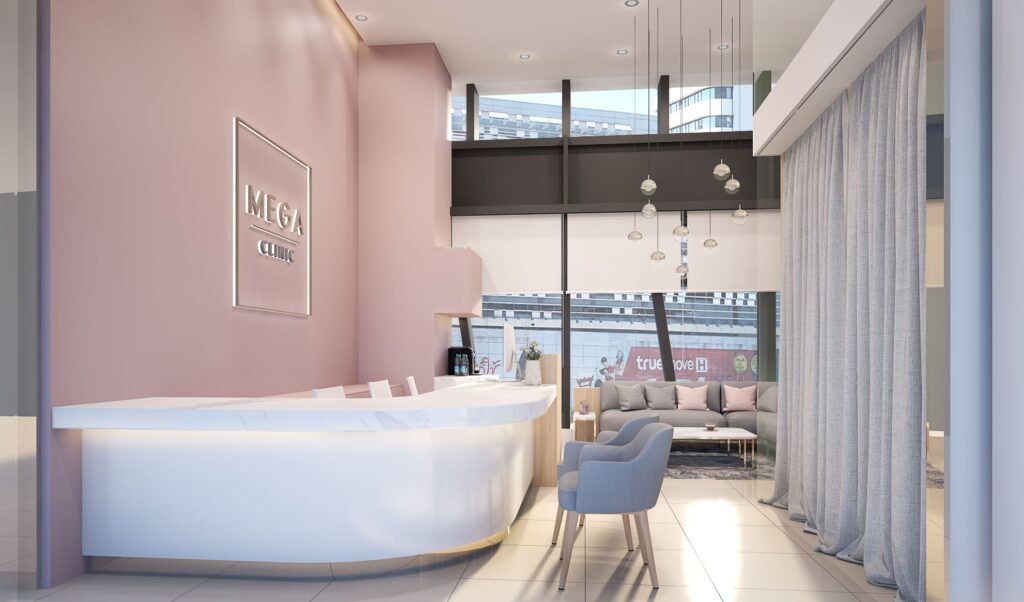
Clinic interior design at MEGA Clinic in Bangkok, a curved back-lit reception counter against a blush pink wall with a debossed logo and a glazed waiting lounge beyond, MEGA Clinic, G Tower Bangkok — interior design by Gratitude Design

A clinic has two audiences that pull in opposite directions. The licensing inspector wants minimum room sizes, basins where the standard expects them, clear door widths and finishes that wipe down. The patient wants somewhere that does not feel like a hospital, and would rather not be recognised while they are there. Most of the craft in clinic interior design in Bangkok lies in satisfying the first audience so completely that the second never notices it. The way the studio does that is to design the patient’s route through the building before designing any room on it, and then to design the staff’s route behind it. Four clinics from the portfolio show the method.

Arrival: what a clinic reception should not feel like

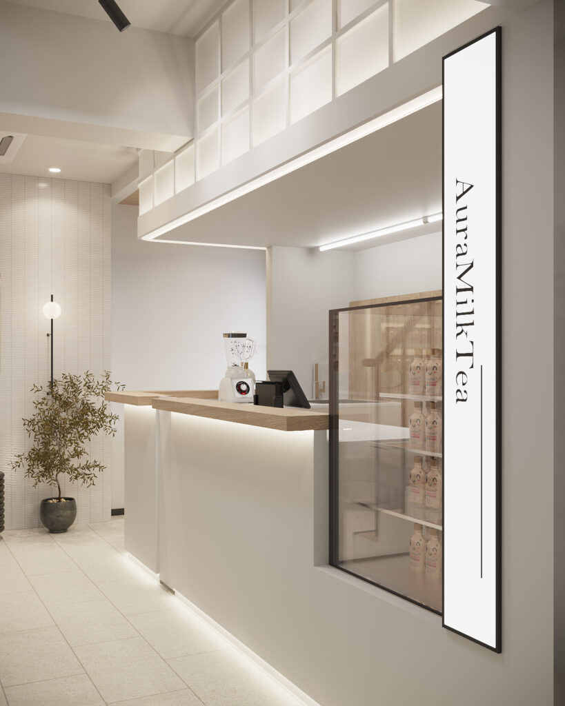
A reception that reads as a counter with a queue tells a patient they are a case. The alternative is a threshold that reads as hospitality. At Aura Bangkok Clinic in Bang Khae the ground floor of a stand-alone building is given over to parking and a milk tea counter, open to anyone; the clinic itself begins one flight up, and a single obvious stair does the filtering that a long corridor would otherwise have to do. Nothing at street level announces why a person is there. At Mega Clinic, inside a tower, a timber pod stands in front of the reception counter so a patient is greeted by someone standing up rather than across a barrier, and the same run of joinery handles paperwork, payment and a cup of coffee. In both, the first thing a patient meets at eye level is not advertising.

Aesthetic clinic interior design — the Aura Milk Tea counter in white lacquer and oak with a backlit product display
Aura Bangkok Clinic, Bang Khae — a milk tea counter as the clinic’s public face. A waiting room that hands you something is a different proposition from one that hands you a number.

Waiting without being watched

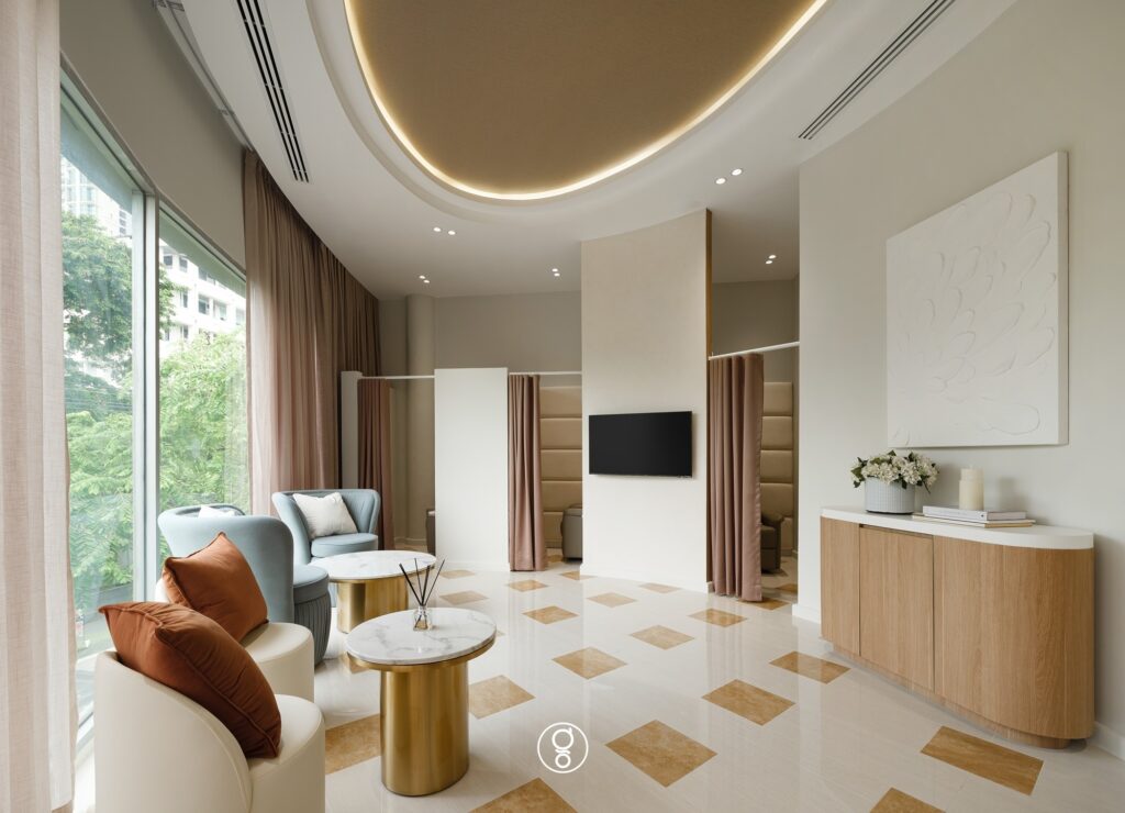
Sightlines decide whether a clinic feels private. An aesthetic clinic needs a frontage confident enough to be noticed from a busy circulation route, and rooms private enough that nobody minds being seen walking into them; at Mega Clinic a single soft, curving wall sits between the two, screening the waiting area from the corridor while leaving a clear line to the reception desk. The lounge is pushed out to the glass and given a cluster of pendants dropped through a double-height void, so the wait happens in daylight with something to look up at rather than under a flat run of downlights. At Fleur de Lys, a hair wellness clinic at K Village, the lounge is likewise pulled to the window against the trees on Sukhumvit 26, and the treatment bays sit behind curtains off it, lined in padded leather, so a patient can sit out a forty-minute session without being visible from the corridor. The palette stays cream the whole way in, so each remove reads as quieter rather than darker.

The consultation room: proportion, light, discretion

The consulting room is where the difficult conversation happens, and it is designed for that. At Mega Clinic it is small on purpose and turned away from the door, so a conversation about someone’s face cannot be followed from the corridor; the desk is kept slim and open underneath, which puts the doctor and the patient on the same side of the furniture. Light in a consulting room is held to the same standard the studio uses over a restaurant counter, neutral and high in colour rendering, because it is where skin, hair and teeth are judged. Mirrors are placed where they do work, at the wash chair or in the consulting room, and nowhere else: in a hair clinic the mirror is both the diagnostic instrument and the thing a patient is least keen to face at the start of a programme.

Clinic interior design at MEGA Clinic in Bangkok, a curved back-lit reception counter against a blush pink wall with a debossed logo and a glazed waiting lounge beyond
Mega Clinic — one curving wall between the corridor and the lounge: the brand outside it, a blush-pink calm behind it that gets quieter the further in you go.

Treatment rooms and the services behind the wall

A treatment room is judged from a chair, lying down. At Mega Clinic the fluted pink panel sits at the head of the chair because that is the one surface a patient looks at for the whole procedure, and the ceiling is a single back-lit panel rather than spotlights, so the light is even and there is nothing to stare into. Behind the finished wall the room is equipment: water, drainage, medical gas where it is needed, power for devices, extract, and the basin where the standard expects it. Those positions are fixed in plan before the finishes are chosen, and treatment bays are made compact and repeatable so the clinical team works the same way in every room. At Thonglor Dental Hospital in Ramintra the treatment rooms are glazed so a nervous patient can see in before being asked to go in, and imaging is kept off the patient route altogether.

Staff routes and the clean and dirty logic

The second route through a clinic is the one the patient never sees. Instruments, linen and waste move in one direction, from dirty to clean, through a sterile room with separated in and out doors; staff reach every treatment room without crossing the lounge; the corridor of doors is arranged so that a door never opens onto another patient’s sightline. At Fleur de Lys the treatment rooms sit along one corridor with a curtain closing the end, and the ceiling cove runs continuously rather than breaking into downlights, because someone walking that route tends to be looking up. At Thonglor Dental Hospital two hospitals, one for adults and one for children, run on a single service core and one licensing standard; the two atmospheres are spent entirely at the front of house, and the discipline underneath them is identical.

Materials for hygiene that do not look clinical

Every surface in a clinic is specified for a cleaning regime as well as for appearance, and the trick is to make the two coincide. Large-format stone and fluted panels wipe down and read as hospitality; padded leather in a treatment bay absorbs sound as well as light; ribbed white tile behind a product display cleans like a splashback and photographs like a boutique. Cream plaster, oak and brass at Fleur de Lys, blush pink and fluted panels at Mega, white lacquer and oak at Aura: none of them look like a hospital, and all of them pass the inspector. The wash bay at Fleur de Lys is the one room allowed to break the palette, in oak, deep brown leather and the clinic’s own cushion, because it is where a patient lies back with their head in a basin and warmth matters most.

Clinic waiting lounge with a gold illuminated ceiling disc, blue and cream tub chairs, brass and marble side tables and a travertine chequer floor
Fleur de Lys, K Village — the lounge pushed to the window so the wait happens in daylight; after dark the gold ceiling disc becomes the warmest light in the room.

Four clinics, four briefs

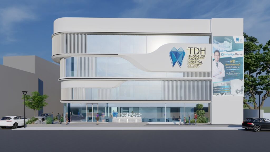
Aura Bangkok Clinic is a neighbourhood building read from a moving car, split cleanly into a public café at grade and a clinic above. Mega Clinic is a 200-square-metre tenancy in a tower, resolved with one curving wall between promotion and privacy. Fleur de Lys is a 160-square-metre hair wellness clinic planned as a sequence of withdrawals, bright reception, daylit lounge, curtained bays, a corridor of doors. Thonglor Dental Hospital is a 550-square-metre building where the studio held both the architecture and the interior, so the curve that shapes the elevation is the same curve that organises the plan, and recurs upstairs at a child’s scale as arches, portholes and rounded corners. Different sizes, different specialisms, one method: the patient’s route first, the staff’s route second, the licensing standard satisfied before a finish is chosen, and the generosity spent where the patient can feel it.

Thonglor Dental Hospital Ramintra exterior, curved white façade with TDH signage
Thonglor Dental Hospital, Ramintra — architecture and interior held by one studio, so the arc of the elevation is the arc of the plan.

Working with the studio on a clinic

Clinics can be delivered design-only, as at Thonglor Dental Hospital, where the studio produced the architecture and interior documentation and the client’s contractor built it, or turn-key under one contract. Either way the licensing standard is part of the brief from the first meeting, not a check at the end. The studio’s approach to the type, and the full record of clinic and wellness work, is set out under clinic and wellness interior design in Bangkok; the delivery routes under turn-key interior design and build.


Gratitude Design is a Bangkok-based interior architecture and turn-key design studio, serving Bangkok, Nonthaburi, Greater Bangkok, Thailand and selected projects across Asia. Planning a clinic, dental practice or wellness space? Start a project enquiry, or browse the clinic and wellness projects.

Office interior design in Bangkok: layouts people actually use
Retail store interior design in Bangkok: layout, lighting and customer flow

Bar interior design in Bangkok: counters, lighting and the flow of a night

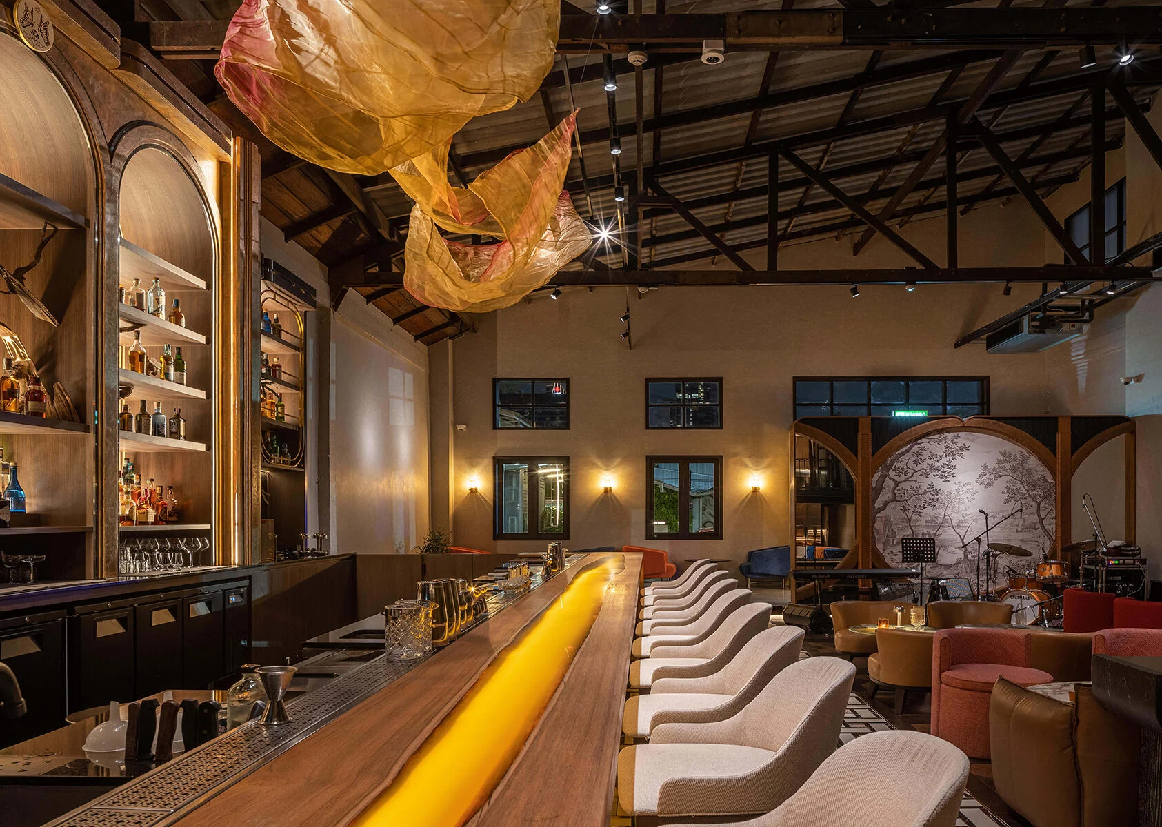
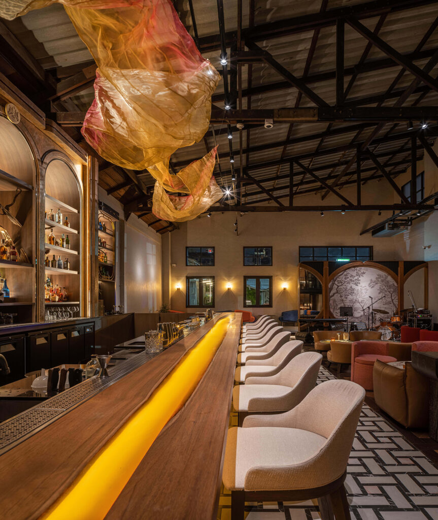
Live-edge timber bar counter with recessed amber lighting at Kilik Social Club, Bangkok

A restaurant is designed around a table. A bar is designed around a counter, a crowd that is mostly standing, and a room whose mood has to change three times between the first drink at six and the last one after midnight. Bar interior design in Bangkok is therefore a different problem from dining-room design, even when the two share a kitchen: the plan is about density and flow rather than covers, the lighting is a performance rather than a setting, and the finishes have to survive a Friday that a dining room never sees. This is how the studio approaches it, drawn from four rooms that trade on very different terms.

The counter is the building

Everything in a bar organises itself around the counter: where guests wait, where they perch, where the light is warmest, where staff spend the whole night. It is drawn first, and it is drawn as equipment before it is drawn as furniture. At CRU Chidlom the bar, the walk-in wine room and the back-of-house were planned as one piece of machinery, then dressed so that none of the logistics is visible from a seat; the wine room is glazed and lit from within so the bottles do the signage, and the product is the first thing a guest sees. At Beer Collection in Hua Hin the counter is curved and low with a coffered timber soffit dropped over it, sized for a flight set down and a conversation across it rather than a queue three deep. At Kilik Social Club a ribbon of amber light is set into the live-edge counter so it lights drinks and hands rather than the room: the service stays visible, the machinery does not.

Live-edge timber bar counter with recessed amber lighting at Kilik Social Club Bangkok
Kilik Social Club, Phrom Phong — a live-edge counter with a ribbon of amber light set into it, lighting drinks and hands rather than the room.

Standing, perching, sitting: three densities in one room

A bar has to work for a pair on a Tuesday and a crowd on a Saturday without being rebuilt between them, which means planning three densities at once. Standing room near the counter and the door, where the evening starts and where people meet. Perching, stools at the bar and ledges along walls, for the hour that is neither arriving nor settled. Sitting, banquettes and low tables, for the group that has decided to stay. The proportion between them is the real design decision. Kilik gives most of its floor to loose lounge seating, sofas and armchairs rather than two-tops, which is rare in the city and is precisely why guests settle in for the whole evening. Beer Collection is deliberately unequal, bar stools, booths, loose chairs and a terrace under a striped canopy, so a weekday pair and a weekend full house each find somewhere the room feels made for them. At CRU the mix of banquette, loose table and bar stool lets the room run at full covers on a Friday and still feel occupied on a quiet Tuesday, which is usually the difference between a bar that lasts and one that closes in its second year.

Lighting that changes with the hour

In a bar, light is the primary material. There should be no bright general light anywhere in the main space. The counter is lit from beneath and from behind the bottle display, tables carry only low pendants or candles, and one object in the room is allowed to be the brightest thing visible from a seat: at CRU it is the wine room, at Kilik the arched back bar with its backlit shelves, at Beer Collection the refrigeration treated as display along one wall. That imbalance is deliberate. It pulls attention towards the product, flatters faces at the table, and lets one room feel like three different places between an aperitivo at six and last orders at midnight.

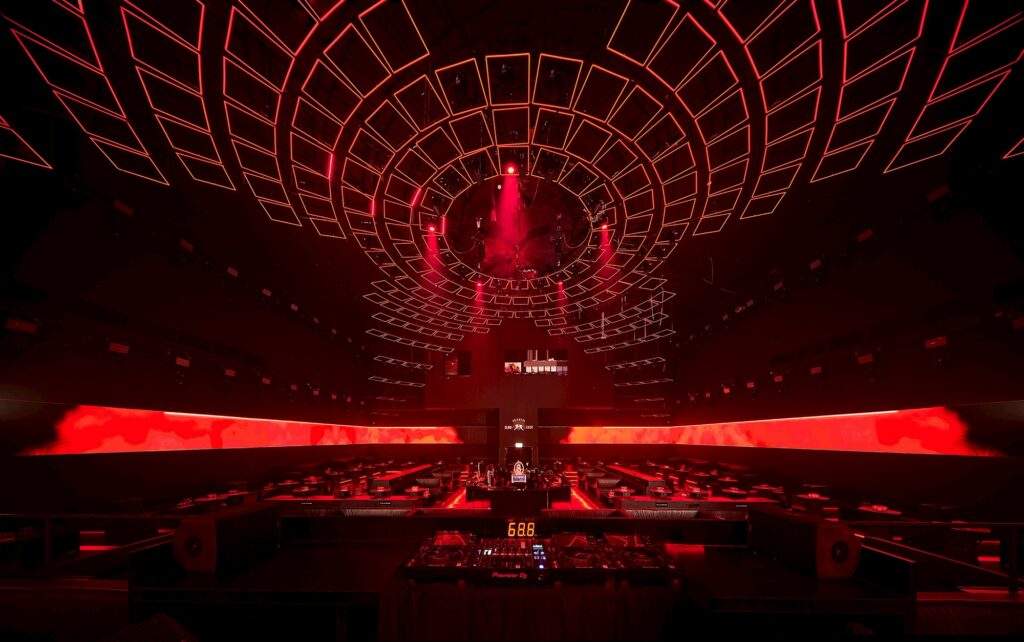
At the far end of the scale, MU:IN in Thonglor treats light not as a finish but as the architecture: geometry and reflection carry the room, its character changes across the night rather than holding one setting, and the domed ceiling over the main hall is the performance. Few bars need that, but every bar needs the principle, which is that the lighting plan has scenes, and the scenes are switched in one action rather than by walking the room.

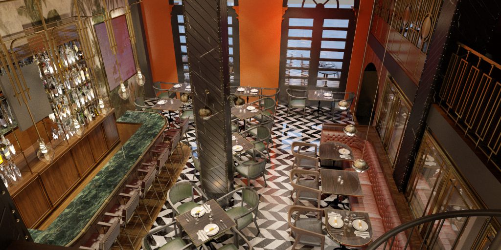
Wine bar interior design at CRU Wine Bar Chidlom seen from above, with a green marble bar counter, terracotta walls and a graphic tile floor
CRU, Chidlom — no bright general light anywhere; the counter lit from beneath, the tables by pendants and candles, and the wine room as the brightest thing in the room.

Sound, glass and the neighbours

Hard finishes make a bar sound alive and, unmanaged, make it exhausting. Acoustics and turnover are designed together: upholstered banquettes, curtained openings and a slatted timber ceiling absorb just enough for a table of four to hold a conversation without leaning in, while the room keeps the hum that tells a guest it is somewhere worth being. Where music is part of the offer, a stage or a booth is positioned first and the plan grown around the routes between it, the bar and the door. Where the venue has neighbours, and in Bangkok it usually does, the glazing, the doors and the terrace are planned for the sound that leaves as carefully as for the sound that stays.

Back of house: storage, cold, the path behind the bar

A drinks-led venue is a technical brief before it is an aesthetic one. Line runs, storage temperature, glassware and turnaround have to be resolved in plan before a finish is chosen, because refrigeration positioned for looks rather than for service will work badly for the life of the lease. A wine bar has to store, chill and serve several hundred labels without the service ever crossing the guest. A beer bar has to hold a working collection without turning into a warehouse; at Beer Collection the answer was to make the fridges the display, fronted with cane joinery and a planted shelf so they never read as a convenience store. The path behind the counter, from cold store to well to pass, is drawn before the path in front of it.

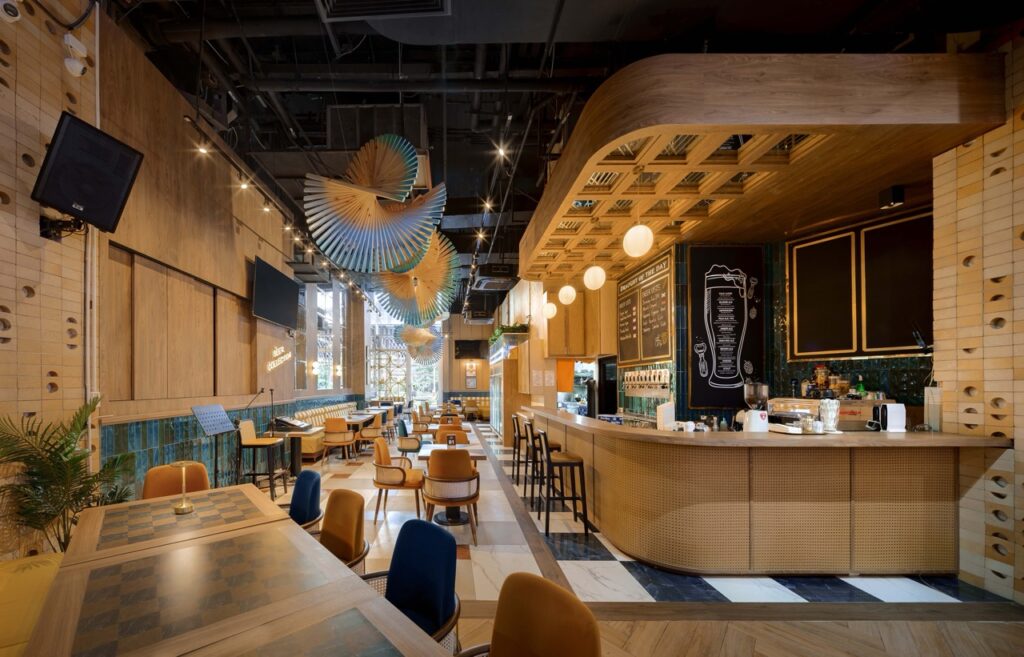
Curved timber bar with a coffered soffit at Beer Collection, craft beer bar interior design in Hua Hin
Beer Collection, Hua Hin — a curved, low counter under its own coffered soffit, a room within the room without closing it off from the tables.

Wine bar, beer hall, cocktail lounge, club: four rooms, four answers

The same principles produce very different rooms, because the product is different. CRU is built around the idea that the wine is the architecture: a double-height volume kept warm and low with terracotta plaster, aged brass, a green marble counter and a graphic tile floor, so it feels like a European bar that has stood on the street for decades. Beer Collection went bright rather than cellar-dark, petrol-teal tile, yellow-striped banquettes and a run of pleated fans across the ceiling, because a seaside town in Hua Hin asked for a coastal register rather than a basement one. Kilik kept its warehouse roof and made a night garden beneath it, with a painted mural, suspended organza and a private lounge on the mezzanine. MU:IN separated an energetic dance floor from VIP lounges held apart from it, in polished metal, textured surface and premium fabric that read as luxury under moving light rather than daylight. Four briefs, one method: counter first, densities second, light as the material, sound and cold resolved before the finishes, and only then the room a guest will remember.

Working with the studio on a bar

Bars open on a date and trade or fail in their first season, which is why much of the studio’s hospitality work is delivered turn-key, with the team that drew the room accountable for building it under one contract. Design-only remains open for operators with their own contractor, as at Beer Collection. The wider practice, and the projects that make the case, are under restaurant and bar interior design in Bangkok; the delivery routes under turn-key interior design and build. For the private-membership model specifically, see designing a private club in Bangkok.


Gratitude Design is a Bangkok-based interior architecture and turn-key design studio, serving Bangkok, Nonthaburi, Greater Bangkok, Thailand and selected projects across Asia. Planning a bar, lounge or club? Start a project enquiry, or browse the restaurant and bar projects.

Restaurant interior design in Bangkok: planning the dining experience

Hotel interior design in Thailand: planning guest rooms and resort villas

Restaurant interior design in Bangkok: planning the dining experience

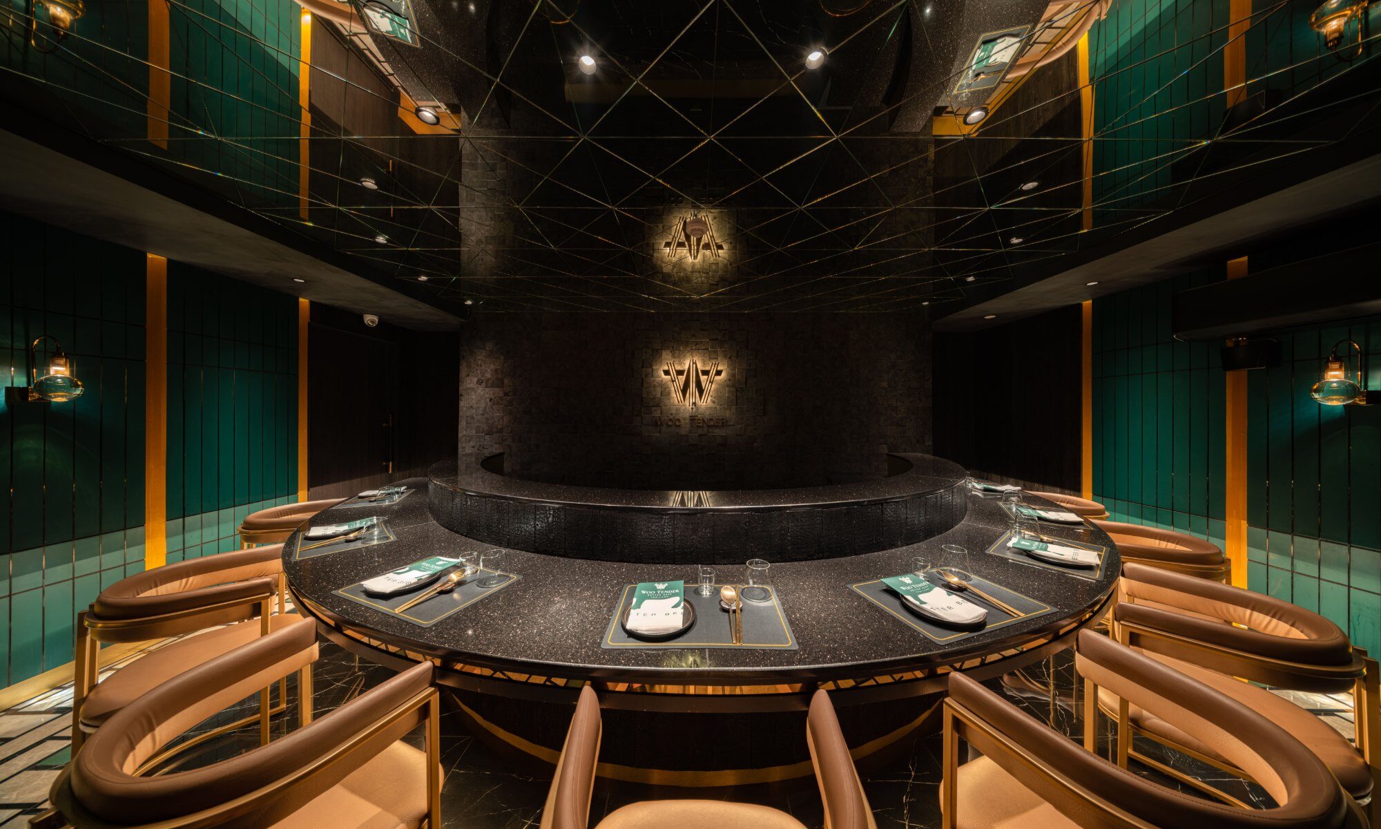
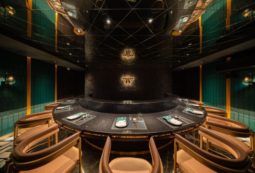
Curved omakase grill counter beneath a dark dome at Woo Tender

A guest forms an opinion of a restaurant before the menu arrives. The route from the pavement to the chair, the table they are given, how bright the room is, how loud it is, whether the kitchen is a smell or a spectacle: all of it is decided in plan and section months before the first service. Restaurant interior design in Bangkok is often discussed as styling, but the decisions that make a dining room work on a Tuesday as well as a Saturday are older and quieter than any finish. This is how the studio makes them, in the order they are made.

The first ten seconds: frontage, threshold, the view into the room

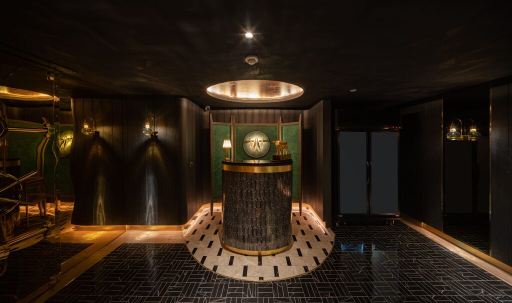
The frontage is a promise, and the interior has to keep it. It can give everything away or almost nothing. At Woo Tender on Soi Ruamrudee the street sees a single plane of pale marble with one gold bull on it: no menu, no window into the dining room, no photograph of food. The door is green lacquer and reeded glass lit from behind, so all a passer-by sees of the interior is a glow. Arrival is then a circular podium under one light at the end of a dark corridor, which does the work a host stand usually does badly: it tells a party where to stop without a sign, and holds them while rooms are sorted.

The opposite strategy is just as valid. On the sand at Bangsaen the Seafood Club opens completely to the sea breeze, and the sea is visible from every table. What matters is that the threshold is designed, not left to happen: the point where a guest slows, the first thing they see, and the first change of temperature, light or sound that tells them they have arrived.

Seating plans that give every table a good seat

Most dining rooms have a best table and a worst one, and the worst one is where the unhappy review is written. The plan should try to abolish it. A curved banquette against a wall gives every seat a back and a view; a round bar lets staff serve in every direction at once; a counter arranged so that all guests face the same work, the chef, the cut and the fire, turns a row of seats into a single audience. At Woo Tender the centre of the plan is exactly that: a curved counter under a dark dome, grill positions set flush into the stone, private rooms opening off the spine behind it. At Bangsaen a single curved banquette wraps the pink wall and does the work of twenty loose chairs, which matters on a floor that is swept clear of sand several times a day.

Seating density is the other decision. Loose lounge seating, sofas and low tables rather than rows of two-tops, is rare in Bangkok and is precisely why guests settle in for an evening. Kilik Social Club was planned that way, and it holds a full Friday house or a quiet Tuesday with equal grace because the bar, the kitchen and the stage were positioned first and the furniture arranged around the routes between them.

Curved omakase grill counter beneath a dark dome at Woo Tender
Woo Tender, Soi Ruamrudee — a curved counter under a dark dome, so every guest faces the chef, the cut and the fire rather than one another.

Light levels through the evening

A restaurant is lit twice: once for the room and once for the plate. The room can be as dark as the concept wants. The plate cannot. Over the table where food is presented the light should be neutral and tightly focused, with high colour rendering, so that what arrives looks the way the chef intended; the studio holds the same standard over a beef counter as it does in a clinic consulting room, and for the same reason. Everything around that pool of light can fall away. At Woo Tender the room is dark from the door onwards and every object after that is lit individually, so nothing competes with the counter. The background palette is warm enough to flatter faces without tinting what is on the plate.

Light also has to move with the day. A room that trades from lunch to late needs a daylight setting, an early-evening setting and a late one, and the switching should be planned so that a manager can change the mood in one action rather than by walking the room.

Acoustics: why the room gets loud and how to stop it

Hard floors, stone tables and a full house make a room that guests shout across. The remedies are decided early: upholstered seating and padded banquettes that absorb sound as well as light, a ceiling that is not one flat hard plane, soft material in the places guests do not look, and rooms that can be closed when the noise is wanted but not shared. Korean dining is long and loud by design, so at Woo Tender each private room is built as a sealed acoustic box: the noise is part of the pleasure, and none of it belongs to the room next door.

The kitchen line and the path of a plate

Every plate travels from the pass to a table and every empty plate travels back, and those two routes should never cross a guest’s route to the washroom or the door. The kitchen line is drawn first, the pass placed where a server can see the room, and the dining plan grown outward from it. Where the cooking is part of the show, the plan changes again: at Bangsaen the grill is pulled outside onto a timber deck under its own thatch, which keeps smoke and heat out of the dining hall and turns the cooking into the entertainment. At Woo Tender every table is a cooking station, which means extraction at every seat, make-up air that does not leave the room cold, and gas or induction routed to furniture rather than to a kitchen wall. All of that is resolved in section before a finish is chosen, because a restaurant that solves it late spends the rest of its life apologising for a bulkhead.

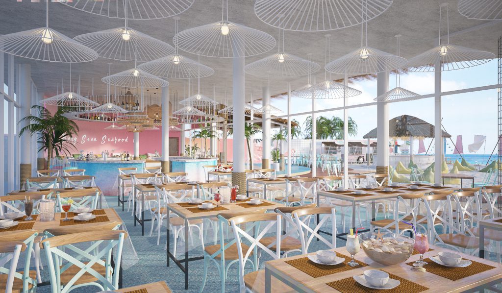
Main dining hall of the Bangsaen seafood club with white parasol pendants and a sea-blue terrazzo floor
Seafood Club, Bangsaen — one uninterrupted hall so the sea is visible from every table; parasol pendants low enough to enclose each group without blocking the view.

Materials that survive service

Finishes in a restaurant are chosen for the wash-down cycle, not the photograph. A grill room needs surfaces that survive smoke and oil at close range for a decade. A beach club needs terrazzo because sand does not scratch it and a hose cleans it, tiled counters at every wet point, and rope, rattan and thatch only where they can be replaced cheaply after a season. A dark room needs texture more than colour, because in low light texture is the only thing that reads: at Woo Tender split black stone runs through the darker parts of the plan, chosen for how it takes raking light. The rule is the same everywhere: specify for year five, and let the concept be carried by the few surfaces guests actually touch.

Woo Tender: how these decisions were made in one room

Woo Tender is a Seoul beef house opening its second restaurant in Asia, in 250 square metres on Soi Ruamrudee. The concept was given a name before it was given a plan, a journey of cuisine, and the plan is written as a sequence rather than a floor: marble and a gold bull on the street, a green door that gives away only a glow, a circular podium under a single light, a corridor of lit thresholds, and then the counter where the fire is. The servicing for table-top grilling was resolved first, in section, and the ceiling designed to hide its own machinery, because the ceiling is what a guest looks at while waiting for beef to cook. The light over the stone is neutral and focused; the private rooms are deep green, lit only at the table, and sealed for sound. Every decision in this article was made in that room, in that order, and the guest experiences them as one thing: an evening that feels inevitable.

Woo Tender Korean restaurant Bangkok — dining hall overview
Woo Tender — the dining hall: dark room, lit objects, and a ceiling that hides the extraction it carries.

Design-only or turn-key on a restaurant

A restaurant has an opening date, and every substitution on site costs a trading week. That is why much of the studio’s hospitality work is delivered turn-key, with the team that drew the room also responsible for building it under one contract with an agreed price and date. Design-only remains open where an operator has its own contractor. How the studio approaches the type, and the projects that make the case, are set out under restaurant and bar interior design in Bangkok; the delivery routes under turn-key interior design and build.


Gratitude Design is a Bangkok-based interior architecture and turn-key design studio, serving Bangkok, Nonthaburi, Greater Bangkok, Thailand and selected projects across Asia. Opening or refitting a restaurant? Start a project enquiry, or browse the restaurant and bar projects.

Bar interior design in Bangkok: counters, lighting and the flow of a night

Retail store interior design in Bangkok: layout, lighting and customer flow

Multi-storey house design in Bangkok: layouts, stairs and daylight

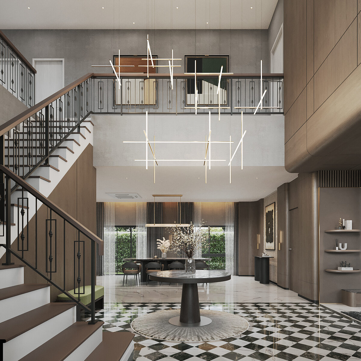
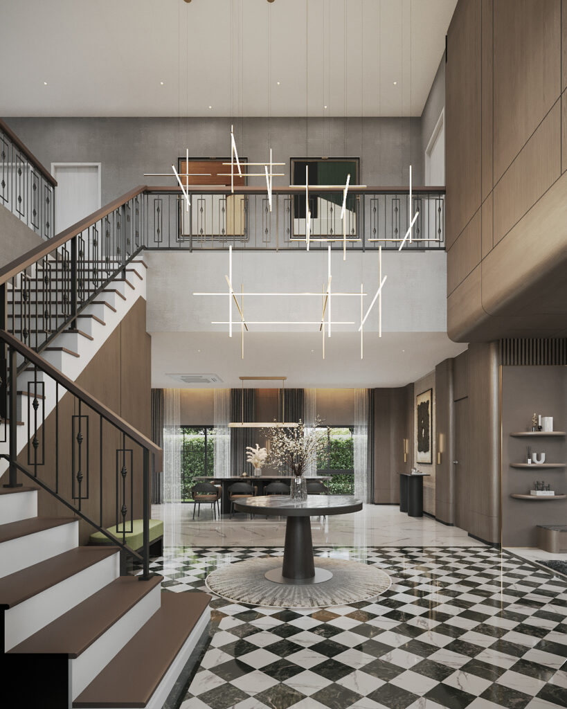
Setthasiri Donmuang double-height foyer — chequerboard marble floor, round pedestal table, black iron balustrade and a suspended constellation of linear lights, interior design by Gratitude Design

A house in Bangkok is almost always a stack. Land is narrow and expensive, so the plan goes up: two floors in a housing estate, three or four in the city, sometimes a basement beneath. That changes the first drawing. An apartment is designed in plan; a house is designed in section, because the decisions that matter most, where the volume is spent, where the stair sits, which floor the family actually lives on, are vertical ones, and none of them can be revisited once the structure is poured.

Start at the section, not the plan

The section is the drawing that shows the house cut through from roof to foundation, and it is where a multi-storey home is won or lost. It settles ceiling heights floor by floor, whether any room is allowed to rise through two storeys, where the stair goes and how much floor it takes, and how daylight from the roof or the façade reaches the middle of a deep plan. A developer’s standard house arrives with a section already decided; a house drawn from the ground up gives the client the rare chance to decide it. Either way, it is the first thing the studio draws, before a single room is planned.

Spend the volume in one place

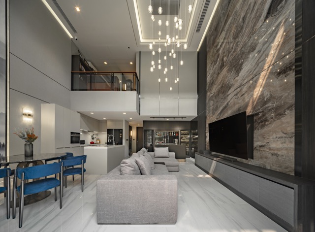
Height is expensive, and a house that spreads it evenly ends up with rooms that are all a little too tall and none that is memorable. The better use is to spend it in one place and keep everything else at a domestic scale. At Quarter31, a four-storey house off Sukhumvit 31, the double-height volume holds the dining table and the living room, and it is given exactly three things to do: a full-height ink-wash mural, a two-storey wall of figured marble, and a fall of seeded-glass pendants between them. Everything else in the four hundred and ten square metres is held to furniture scale, which is why a large house reads as calm rather than grand.

A double-height room also fails in a particular way: when everything inside it stays single-storey scale, the volume simply looks empty. Lighting at chandelier scale, a wall treatment that runs the full height, a mezzanine that reads as a bridge across the room, these are what let the height carry.

Double-height living room at Quarter31 private house in Bangkok — two-storey marble feature wall and cascading glass pendants, designed by Gratitude Design
Quarter31, Sukhumvit 31 — the height spent once: a two-storey marble wall and pendants that fall the full drop, with the mezzanine reading as a bridge.

Floors as registers, not storeys

The most useful idea in a multi-storey house is that each floor has a different job, and should feel like it. The studio calls these registers. In both of the houses described here the ground floor is the public floor: stone underfoot, darker and more polished materials, the dining room and the bar, the rooms a guest will see. The floor above turns domestic. At Quarter31 that means teak boards, a piano corner and shelves built around the family’s own objects; at Setthasiri Donmuang, a two-storey house in the north of the city, the upper floor steps down in tone to lime-washed oak, woven panels and linen walls so each bedroom is composed as a suite with its own lounge and dressing room.

Registers do two things. They let a house hold three or four different atmospheres without any of them competing, and they tell the people who live there, without a sign, where the day happens and where it ends.

The stair is the transition

In an apartment the corridor connects the rooms. In a house the stair does, and it is the one element every member of the family uses many times a day. It deserves to be designed as a room rather than a fitting: where it lands, what it looks onto, how it is lit, whether it is the moment the house changes from public to private. At Setthasiri Donmuang the arrival is a double-height foyer on a chequerboard marble floor with a black iron balustrade and a constellation of linear pendants hung through the void, and the stair is the transition from the polished ground floor to the softer floor above. At Quarter31 the mezzanine walkway does the same work, crossing the living volume so that moving between floors is part of the view rather than a service route.

Setthasiri Donmuang double-height foyer — chequerboard marble floor, round pedestal table, black iron balustrade and a suspended constellation of linear lights, interior design by Gratitude Design
Setthasiri Donmuang, Don Mueang — a developer’s standard plan given a double-height foyer, so arrival registers and the stair becomes the change of register.

Daylight in the middle of the plan

A tall, deep house has a dark middle. Windows on the front and back façades light the first few metres; the stair, the bathrooms and the corridors in between rely on whatever the section gives them. The remedies are architectural: a void that lets light from an upper window fall into the floor below, a stair placed against glass rather than against a party wall, a roof light over the top landing, full-height sheers that let the daylight cross a marble floor rather than stop at the window. At Quarter31 the double-height volume is also the house’s light well, which is the reason the ground floor reads in one glance from the sofa: dining beneath the mural, the kitchen behind, the walkway above.

Kitchens, wet areas and the services stack

Everything wet in a house wants to sit in a vertical line: kitchen below bathroom below bathroom, so the drainage falls and the risers run straight. It is the least glamorous drawing in the set and the one that saves the most money. The plan of every floor is tested against it before the joinery is drawn, and where a client wants a bathroom or a bar somewhere the stack does not reach, the cost of getting it there is put on the table at the section stage, not discovered on site.

Design-only or turn-key on a house

Both routes are open on a house, and the two projects here took one each. Setthasiri Donmuang was carried from concept through design development to full documentation, interior architecture, bespoke joinery and complete FF&E specification, and issued to the owner’s contractor to build. Quarter31 was delivered turn-key, with the studio responsible for the joinery, the stone, the lighting and the site under one contract. On a house of several floors the difference is largely about sequence: the trades arrive from different directions and a single party carrying the programme is what keeps a four-storey site from stalling. How each route is organised is set out under turn-key interior design and build, and the wider practice under residential interior design in Bangkok.


Gratitude Design is a Bangkok-based interior architecture and turn-key design studio, serving Bangkok, Nonthaburi, Greater Bangkok, Thailand and selected projects across Asia. Planning the interior of a new house of two floors or more? Start a project enquiry, or see architecture and landscape for houses where the studio designs the building as well as the interior.

Penthouse interior design in Bangkok: light, views and privacy

How long does it take to design and build a luxury home in Bangkok?

Penthouse interior design in Bangkok: light, views and privacy

Living room turned inward from the window wall at The Bangkok Sathorn condominium by Gratitude Design

A penthouse is not a larger condominium. The plan is bigger, but that is the least of it. What changes at the top of a tower is the relationship between the home and the sky: glass on more than one side, a ceiling that may rise past the standard slab height, a terrace that is part of the plan rather than an afterthought, and a view that is the reason the apartment was bought. Every one of those advantages arrives with a problem attached, and a penthouse interior in Bangkok is largely the work of solving them without losing what they offer.

The plan starts with the sun path, not the furniture

Bangkok’s sun is high and hot, and on a high floor there is nothing to shade it. The first drawing we make for a penthouse is not a layout but an orientation study: which façades take the morning, which take the afternoon, where the west light lands at five o’clock and how far into the room it reaches. That study decides where the bedrooms go, which side the living room faces, where a study can sit without a screen becoming unreadable, and which glass will need the heaviest layering. A plan drawn before the sun has been understood is a plan that will be corrected with curtains.

The same study settles the daily rhythm of the home. A breakfast table facing east, a lounge that softens as the afternoon goes, a bedroom that stays cool because it never takes the western sun: these are decisions about orientation dressed as decisions about lifestyle.

Glass on more than one side: glare, heat and the layers that manage them

Floor-to-ceiling glass is what sells a penthouse and what makes it hard to live in at three in the afternoon. The answer is not one heavy curtain but a set of layers, each doing a different job. A sheer takes the edge off glare while keeping the view. A blackout or a dense weave handles sleep and screen work. Where the glazing turns a corner, the layers have to turn with it, which is a joinery and track problem as much as a fabric one, and it is far cheaper to solve in the ceiling detail than after the ceiling is closed.

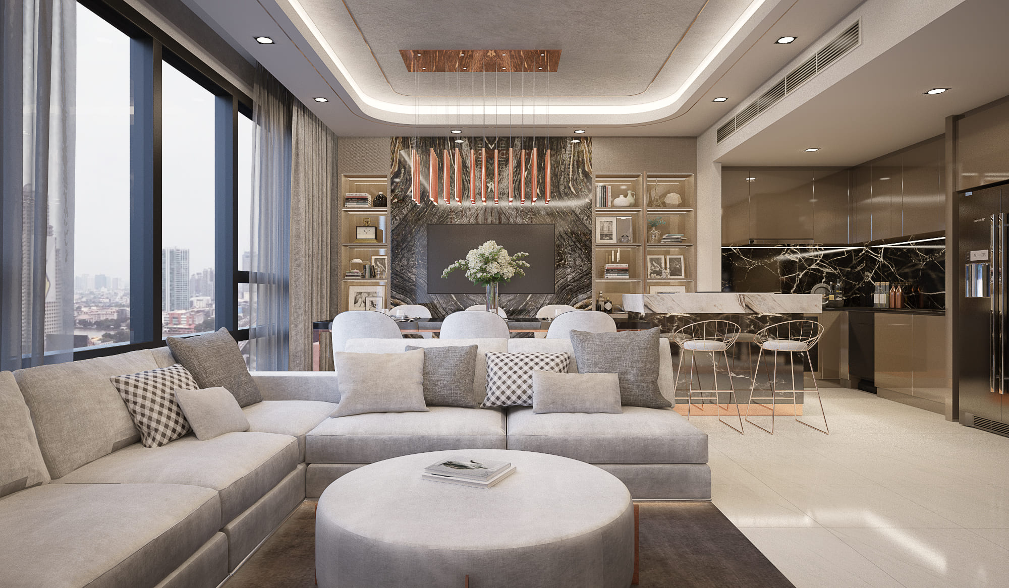
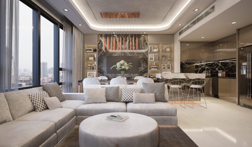
Heat is managed the same way: by orientation first, by the layers second, and by the material choices third. Pale floors and matt surfaces near the glass read cooler and avoid the mirror-glare that a polished stone throws back into the room at midday. Furniture is pulled away from the window line so the glass stays a view rather than a backdrop for a sofa; in the studio’s high-floor residence on Sathorn the sofa is turned inward and a clear walking line is kept along the window, and almost all of the light is indirect so the city outside stays the brightest thing in the room.

Living room turned inward from the window wall at The Bangkok Sathorn condominium by Gratitude Design
The Bangkok, Sathorn — the sofa pulled off the glass, the walking line along the window kept clear, and the light hidden in coves so the skyline stays the brightest thing in the room.

Views you keep and views you frame

Not every view deserves the whole wall. A penthouse usually has one outlook that is the reason for the purchase and two or three that are simply large. The plan gives the principal view to the rooms that are used longest and most often, usually the living room and the master bedroom, and treats the others as framed pictures rather than panoramas: a window at the end of a corridor, a slot beside a bath, a low sill in a study that shows the river but not the roof of the building next door.

Framing also means deciding what sits in front of the glass. In the studio’s high-floor homes, living, dining and kitchen are drawn as one continuous room along the window so the view belongs to the whole home and not to one corner of it. Storage and services are pushed to the inner walls; the glass line stays free from the front door to the far end of the plan.

Privacy at height

Height feels private and often is not. Neighbouring towers look across at the same level, and inside the home a penthouse has more people moving through it than an ordinary apartment: family, guests, and in many households staff who arrive, cook, clean and leave. Privacy is planned in three layers.

Between the home and the city, the layers on the glass do the work, along with the placement of bedrooms and bathrooms on the façades that are not overlooked. Between guests and family, the plan separates a public sequence, entrance, living, dining and a guest cloakroom, from a private wing that a visitor never has a reason to enter. Between the household and its staff, a service route runs from a second entrance through the kitchen and utility rooms so that meals, laundry and deliveries never cross the living room. Where the plan allows, a staff room and bathroom sit on that route. Get the three layers right and the home feels calm on a day when eight people are in it.

Master bedroom with stone-panelled walls at the Ritz-Carlton Residences Bangkok by Gratitude Design
Ritz-Carlton Residences, Sathorn — the master bedroom wraps its corner glazing with stone-panelled walls, and the dressing point sits in the window’s light rather than against a wall.

Materials that read well at scale

A large room under a lot of daylight is unforgiving. Small-format finishes, busy veneers and a long list of materials all turn to noise when they are seen across twelve metres of floor. The studio’s high-floor residences hold to a short palette: one floor material end to end, a single stone allowed to define the few walls that matter, timber and one metal used as a line rather than a surface, and at most one saturated colour in each room. In the Four Seasons riverside residence the living room holds to four finishes; in the Ritz-Carlton apartment the building’s classical panelling is kept and everything inside it is soft and tactile. The discipline is the same whatever the size: fewer materials, larger formats, and a ceiling that carries the light without a visible fitting.

How the condominium and penthouse service works

Every tower home the studio takes on begins with the building: the structure, the services and the juristic office’s rules on working hours, lifts, noise and waste. Those decide how a site can run before any design is drawn, and a penthouse adds its own questions about terrace waterproofing, ceiling voids and the routes by which large pieces reach the top floor. From there the work runs through concept, design development and full documentation, and can be delivered design-only for the owner’s contractor or turn-key by the studio. The service is described in full under condominium and penthouse interior design in Bangkok, and the wider residential practice under residential interior design.


Gratitude Design is a Bangkok-based interior architecture and turn-key design studio, serving Bangkok, Nonthaburi, Greater Bangkok, Thailand and selected projects across Asia. Planning a penthouse or high-floor residence? Start a project enquiry, or see how turn-key delivery works.

Condominium renovation in Bangkok: what owners should plan before design

Multi-storey house design in Bangkok: layouts, stairs and daylight

Interior architecture vs interior decoration: which does your project need?

Overhead view of blue, red and cognac lounge seating around the live-music stage at Kilik Social Club

Most people who commission an interior in Bangkok have used a decorator before, and most of them were satisfied. The trouble begins on the next project, when the brief includes a wall that has to move, a ceiling that is too low, a kitchen in the wrong place, or a building that was never meant to hold a restaurant. At that point the words on the appointment letter matter. Interior decoration and interior architecture are not two grades of the same service; they are two different jobs, and choosing the wrong one is how a project ends up beautifully finished and fundamentally unresolved.

What interior decoration does well

Decoration takes the room as it is and makes it better. Furniture, fabric, colour, art, lighting fittings, rugs, the hundred decisions that turn a finished shell into a place someone wants to sit. Done well it is a serious discipline with its own craft, and a great deal of what a client falls in love with in a photograph is decoration.

Its limit is the wall face. A decorator works with the plan they are given: the position of the windows, the height of the ceiling, the route from the front door to the table, the location of every drain and duct. If those are right, decoration is all a project needs. If they are wrong, no sofa will fix them.

Where a project stops being decoration

There are four points at which a project crosses into interior architecture, and they are worth recognising early because each one changes who should be in the room.

Structure. A wall comes out, a mezzanine goes in, an opening is cut, a floor is stepped. The moment the plan changes, the building has to be understood before the room can be drawn, and the drawings have to be good enough for someone to build from.

Services. Kitchens, bathrooms, treatment rooms and bars all live where the water, drainage, extract and power can reach. Moving them is an engineering decision dressed as a planning decision, and it has to be resolved before the finishes are chosen, not after.

Light. Daylight is decided by orientation, window size and ceiling height. Artificial light is decided by the ceiling void, the structure above it and the circuits below. Both are set at the architectural stage; a decorator can only choose fittings.

Circulation. How a guest arrives, how staff move behind the scenes, how a family passes through a house on an ordinary evening. Circulation is drawn in plan, and it is the single decision that most determines whether a space works after the photographs are taken.

Main hall of MU:IN nightclub, Bangkok — domed LED ceiling in full performance over the dance floor, interior design by Gratitude Design
MU:IN, Thonglor — the routes past the door, cloakroom, bar and washrooms were fixed before the concept was drawn. The ceiling came later.

How an interior architecture studio works with the building

An interior architecture studio starts on the other side of the wall. The first drawings are plans and sections, not mood boards: what the building allows, what it resists, where the structure and services sit, how far the ceiling can be opened, where daylight can be brought in. The concept grows out of those constraints rather than being applied over them.

Where a building has its own architect, the interior architect works alongside them, and the division is usually clear: the envelope, the structure and the statutory approvals belong to the building’s architect; the plan, the internal fabric, the joinery, the lighting and every finished surface belong to the interior. Where the studio is asked to take the envelope as well, as on a beach club or a floating villa, the same argument simply continues outward. Our architecture and landscape work describes when that makes sense.

The output is also different. Decoration ends in a schedule of furniture and finishes. Interior architecture ends in a construction set: demolition and builder’s-work drawings, reflected ceiling plans, joinery details, lighting layouts, specifications precise enough to be priced and built by a third party without a conversation. That set is what protects the design once it leaves the studio.

Two projects where the architecture was the interior

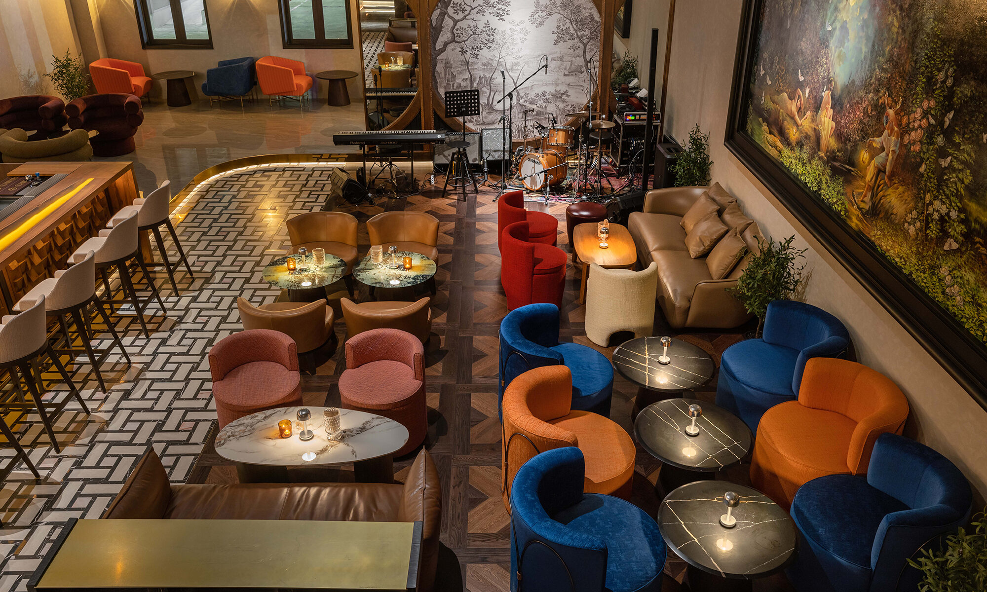
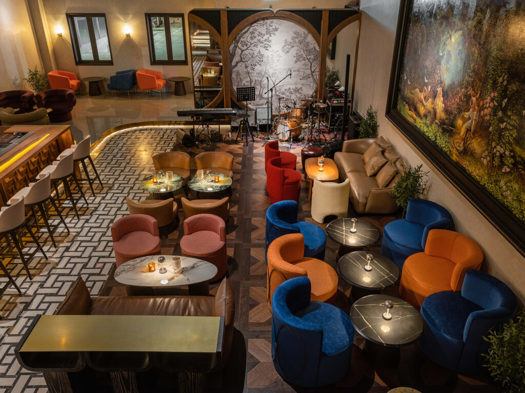
Kilik Social Club in Phrom Phong began as a high-ceilinged warehouse. The first decisions were architectural: the timber trusses were kept and left exposed so the roof reads as a canopy; the gable facing the street was rebuilt as a lattice of stacked brick; a mezzanine was introduced to hold a private lounge for twenty over the stage. The bar, the kitchen and the stage were positioned before any furniture was considered, and the loose lounge seating that guests remember was arranged around the routes between them. The mural, the suspended organza and the amber light in the counter came last. Take those away and the room would still work; take away the plan and the decoration would have had nothing to hold on to.

Overhead view of Kilik Social Club lounge seating in blue, red and cognac around low tables, with the bar and stage beyond, Bangkok
Kilik Social Club — the exposed roof, the mezzanine and the positions of bar, kitchen and stage were decided before a single chair was chosen.

The Ritz-Carlton Residences apartment at Sathorn is the opposite case, and just as instructive. A branded tower hands its residents a finished, formal shell, and the building’s classical wall panelling was kept. The interior architecture here was not demolition but sequence and fabric: living, dining and pantry drawn as one run along the glass, a cove ceiling that carries light down the room without a visible fitting, a study that is used as a study, a nursery given the same attention as the master suite. The studio produced the full set, from interior architecture through bespoke joinery drawings to complete FF&E specification, and the owner’s contractor built from it. That is interior architecture delivered design-only, and it is only possible because the documentation was complete enough to be built without us on site.

Panelled living room with a travertine media wall at the Ritz-Carlton Residences Bangkok by Gratitude Design
Ritz-Carlton Residences, Sathorn — the tower’s panelling kept, everything inside it drawn, detailed and specified for the owner’s contractor.

Design-only or turn-key: how the scope is defined

Interior architecture can be bought two ways. Design-only means the studio carries the project from brief to a complete construction set, and a contractor appointed by the client builds it. Turn-key means the studio that drew the space is also accountable for building it, under one contract with an agreed price and date, with its own site supervision, trades, procurement and installation. The design work is identical; what changes is who is responsible when a drawing meets a site.

Neither is the right answer for every project. A branded residence with a management office and an approved contractor list often suits design-only. A restaurant fit-out on a fixed opening date, where every substitution on site costs a trading week, is where turn-key earns its keep. The scope should be settled at the first meeting, in writing, before any design begins. How each route is organised is set out in turn-key interior design and build and in interior designer vs turn-key contractor.

Questions to ask before appointing anyone

Will the plan change? If a wall, a level, a kitchen or a bathroom is moving, you need interior architecture, whatever the appointment is called.

What will I receive at the end of the design stage? A furniture schedule and a mood board is decoration. A construction set that a third party could price and build is interior architecture.

Who talks to the building? If the answer is nobody, the services and structure will be discovered on site, at the client’s expense.

Who is accountable when the drawing meets the site? That is the design-only or turn-key question, and it belongs in the appointment letter, not in a dispute six months later.


Gratitude Design is a Bangkok-based interior architecture and turn-key design studio, serving Bangkok, Nonthaburi, Greater Bangkok, Thailand and selected projects across Asia. Every commission can be taken design-only or turn-key. See what we design, browse selected work, or start a project enquiry.

Retail store interior design in Bangkok: layout, lighting and customer flow

Clinic interior design in Bangkok: patient flow, privacy and calm

How long does it take to design and build a luxury home in Bangkok?

Living and dining room at the Ritz-Carlton Residences Bangkok, a family residence in Sathorn by Gratitude Design

Owners ask for a date the way they ask for a price, and the answer deserves the same honesty: a well-run residential project has a sequence with a logic to it, and the total depends less on how fast anyone works than on how many decisions are made early, how much has to be made by hand, and what the building allows. What follows is that sequence as the studio runs it, stage by stage, with the things that stretch or shorten each one. We have deliberately left out week counts; a number given before the brief and the site are known would be a guess dressed as a promise.

Stage one — brief and survey

Every project begins with two conversations and one measurement. The first conversation is about how the home will be used on an ordinary day — who cooks, who works from home, where the children are at four in the afternoon, what the household cannot live without. The second is about scope and route: a full re-plan or a fit-out, design-only or turn-key. The measurement is the site survey, which in a condominium means recording the fixed points — risers, drains, ceiling heights, sprinkler and detector positions — and in a house means the structure, the roof and the ground. This stage is short when the owner arrives with a floor plan, the building’s fit-out rules and a clear account of the household, and long when the brief keeps changing. It is the cheapest stage in which to change your mind, and the last one in which changing it costs nothing.

Stage two — concept

The concept fixes the plan and the idea before a single finish is chosen: which rooms get the view, where the volume is spent, how the household moves through the home, and the material temperature of each room. At Quarter31 the concept decided that a double-height living room would be given exactly three things to do with its height and everything else would be held to furniture scale; at The Bangkok Sathorn it decided that living, dining and kitchen would read as one room and that every wardrobe, riser and door would be stacked away from the window wall. Once an owner approves a concept, the plan is settled. Reopening it later is the single most common reason a residential programme slips, because everything downstream — joinery, lighting, services — is drawn from it.

Double-height living room at Quarter31 private house in Bangkok, designed by Gratitude Design
Quarter31 — the concept decided how a double-height volume would be spent; every later stage was drawn from that decision.

Stage three — design development

Here the concept becomes rooms: joinery designed piece by piece, the lighting plan drawn around the ceiling’s fixed points, materials and finishes selected and sampled, bathrooms and kitchens resolved to the tile. This is the stage where the material list either stays short or grows, and where lead times begin to matter — a stone slab selected from a yard, a European kitchen system, a bespoke piece of furniture, each with its own clock. The studio’s discipline of four or five finishes per home is as much about time as about calm: every additional material is another supplier to co-ordinate and another delivery to wait for.

Stage four — documentation and approvals

On a well-run project, documentation is the project. Interior architecture drawings, joinery shop drawings, lighting and electrical layouts, plumbing where it changes, and a complete FF&E schedule are issued as one set, so that the work can be priced from a finished picture and built without improvisation. In a condominium this set is also the renovation application: the management office reviews it, the building’s engineer may comment on anything touching services, and the contractor is admitted only when it is approved. This stage is where a condominium and a house diverge most. A house can move to site as the set is completed; a managed tower waits for the office, and an incomplete submission is the most common way to lose a month before anything starts. The Ritz-Carlton residence was documented in full — every surface, fitting and loose item drawn and scheduled — before the building’s calendar was booked, which is what kept the site period inside it.

Stage five — construction

Construction time is governed by three things: the scope, the site and the sequence. A full re-plan with new ceilings, new services and joinery throughout takes longer than a fit-out over a developer’s finished shell. A managed tower works only in permitted hours, moves everything through a booked service lift and stops for noise restrictions; a house works continuously but exposes structure and weather. And the sequence matters more than the pace: joinery, stone, lighting and landscape arrive from different trades, and a project that has to wait for one of them stalls entirely. Turn-key delivery exists largely to hold that sequence — one party carrying the programme from bare shell to the last cushion, as at Quarter31 and the Four Seasons residence. On a design-only commission, the owner’s contractor carries it, and the owner carries the co-ordination.

Living and dining room at the Ritz-Carlton Residences Bangkok, a family residence in Sathorn by Gratitude Design
Ritz-Carlton Residences Bangkok — documented in full before the building’s calendar was booked; the site period stayed inside the window the office approved.

Stage six — fit-out, installation and handover

The last stage is often underestimated. Loose furniture, lighting fittings, curtains, rugs and art have their own lead times, some of them longer than the construction that precedes them, and the studio orders them during design development precisely so that they land as the site finishes rather than months after. Installation is followed by snagging — the walk-through in which every drawer, hinge and dimmer is tested — and by a period in which the home is styled and photographed. A handover that feels calm is one in which nothing is still on order.

What actually makes a project longer

In our experience the programme is stretched by five things, in roughly this order: decisions reopened after the concept is approved; a material list that keeps growing; an incomplete or late renovation application in a managed building; a single long-lead item — a stone, a kitchen, a piece of furniture — that nobody ordered early enough; and co-ordination between separate parties on a design-only commission. None of these is about the speed of the work. All of them are about when decisions are made and who is accountable for the sequence.

And what makes it shorter

The mirror image. A complete brief and the building’s rules at the first meeting; a concept approved and then left alone; a short material list; documentation finished before pricing; long-lead items ordered in design development; and one party carrying the programme. A luxury home does not have to be slow. It has to be decided early.

What to bring to a first meeting

A floor plan if you have one, the building’s fit-out guidelines if it is a condominium, a date that matters to you — a move, a birth, a lease ending — and an honest account of how the household lives. With those, the studio can tell you which route and scope your date can support, and what would have to change if it cannot. A first meeting costs nothing and commits no one.


Gratitude Design is a residential interior design studio in Bangkok delivering homes design-only or turn-key. See Quarter31, how the studio works, the companion article on what moves the cost, or tell us about your residential project.

How to choose an interior designer in Bangkok: 9 checks before hiring

Multi-storey house design in Bangkok: layouts, stairs and daylight

ไทย